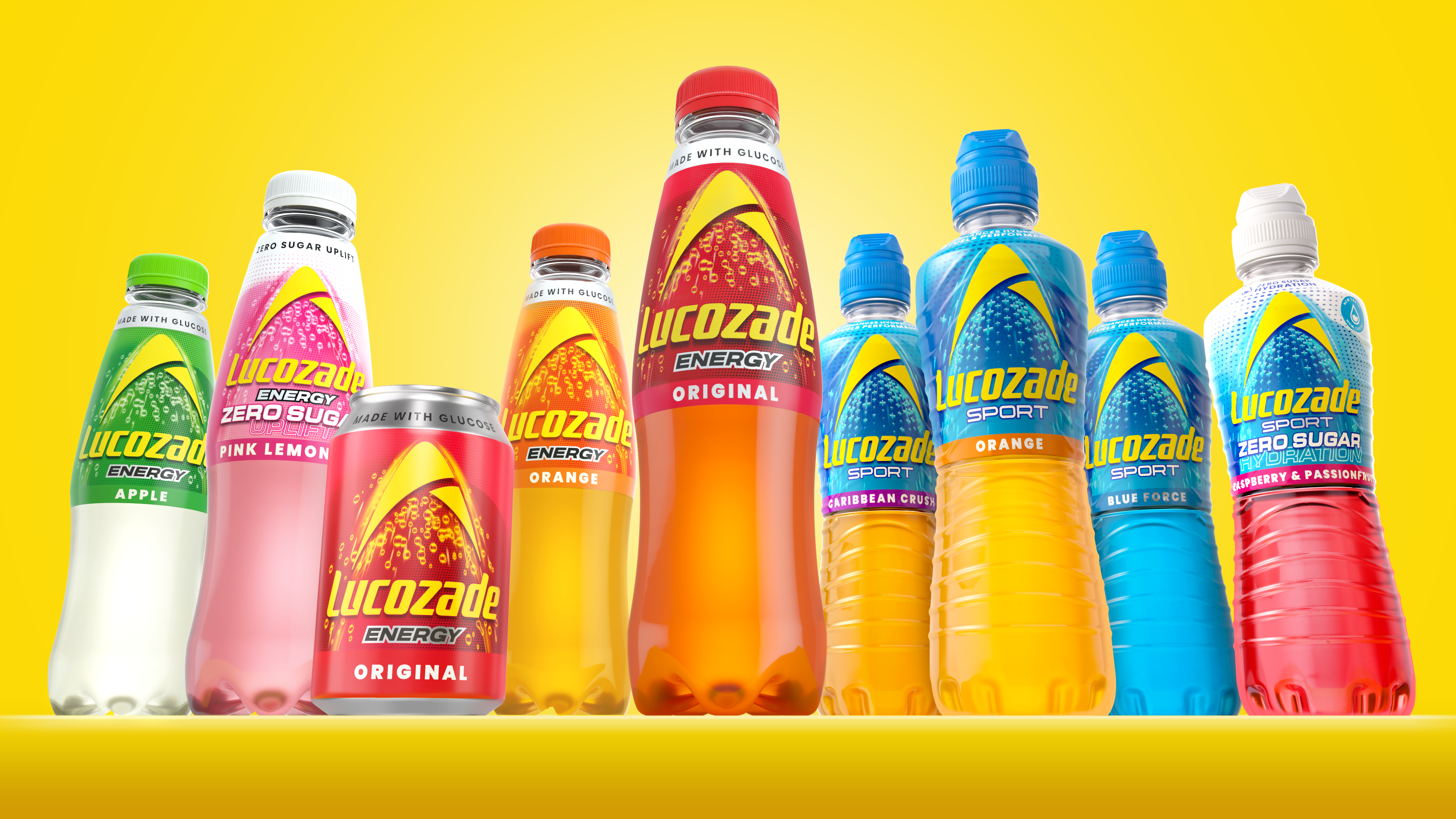

The arc, a symbol of Lucozade’s energy, has been redrawn and modernised. It now radiates with an optimistic, vibrant yellow, enhancing the brand’s credibility. This change not only makes the masterbrand more prominent, but also adds a powerful sense of momentum. The wordmark, once positioned vertically inside the arc, now sits horizontally, propelling the arc upwards with a dynamic sense of movement.
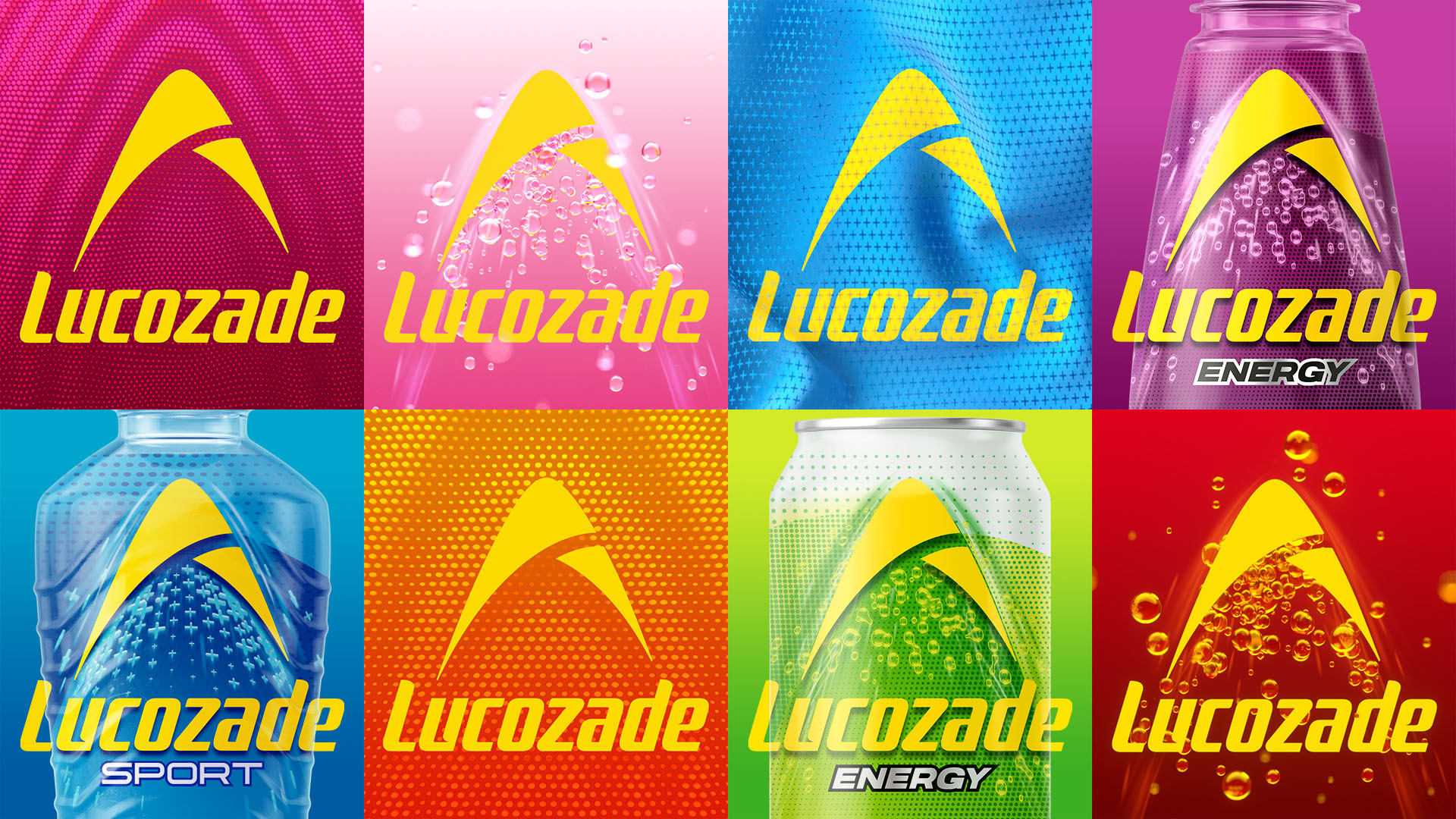
The new, flexible graphic system differentiates between product ranges. For Energy, a background of pure bubbles. For Sport, an athletic mesh-like pattern, akin to sportswear. And for Zero, the introduction of white at the top of the pattern, to evoke lightness. Now, under the consistency of the energising arc, there is an extra layer that communicates the benefits and differences of every Lucozade drink. The end result is a design unified under the inherently vibrant energy and dynamism of Lucozade, which creates a powerful and cohesive brand presence that resonates with long-standing fans and appeals to new shoppers.