Why did Coopertone Change Their Logo? Understanding the Evolution of an Iconic Brand
Achieving icon status in today’s world is so much harder than it once was. For starters, there are simply more brands in existence than ever before, making it harder to stand out in what have become incredibly crowded categories. And even if you launch in an uncompetitive market, it still takes time – a lot of time – to build equity, recognition, and trust in your brand. Add to that the ability to endure the ups and downs of culture and withstand the winds of change without losing sight of who you are, it quickly becomes clear why iconicity is so coveted and revered.
The Coppertone Logo Change
Given what is almost an insurmountable task, one might think iconic brands get to cross their arms behind their heads, throw their feet up, and chill. Well, one would be wrong, because preserving icon status is almost as challenging as achieving it—a truth that made our work with Coppertone such a delicate dance. When evolving iconic brands, the likes of Coppertone—a brand that invented its category—you have to balance the familiar with the exciting; to maintain those transcendent equities that meaningfully connect people to the brand, while also determining how best to evolve them into a category leader for today’s consumer.
Our approach to Evolving the Coppertone Logo
In order to evolve an iconic brand, especially one with as rich a history as Coppertone, we look back at the Coppertone logo history to move forward. That’s why our approach began where all brand evolutions should begin – in the archives. As we dug through the brand history as well as our own personal memories of childhood summers spent slathered in Coppertone, we realized that, with its invention of SPF, Coppertone was what allowed us to safely love the sun. Over time, however, the design semiotics and language of the category suggested the sun was something to fear, with sunscreen resembling things like bug spray and disinfectant. It was this insight upon which our strategy was built. Only a brand that once defined our relationship with the sun could have the power and authority to redefine it—to reintroduce us to the wonders of the sun.
In order to effectively wield this power, we needed to successfully leverage and evolve what was already so trusted with this brand; the distinctive brand equities that had become symbols of authority and ownership in the category. And for Coppertone, that meant the girl – Little Miss Coppertone – and the dog.
Evolving an Icon During Social Change
When considering the category, the decision to retain these brand icons actually defied the emergent design trends of sun care, which are currently dominated by simplicity and minimalism. Furthermore, it was also a bold move considering the cultural climate at the time of our work. Spring of 2020 was a moment of social reckoning in America. The early days of Covid and the unlawful death of George Floyd created a surge of social activism, with people demanding immediate reform and action be taken against the entrenched social and racial inequities of our country. For brands, this meant a long overdue critical lens was suddenly cast upon them. No longer given a free pass or allowed the weak defense of, “it was a different time”, brands were forced to evolve their offensive, out-of-date imagery or risk extinction. And the controversial, previously sexualized, blonde Coppertone girl on the old Coppertone logo was no exception. As Debbie Millman put it, “What remains mostly overlooked in today’s supermarket is the abundant use of white, conventionally attractive characters and mascots to signify the ‘ideal.’ Blonde, white females, from infants to women of a certain age, pervade every corner of the supermarket, and include the Gerber baby, the Coppertone girl, Morton Salt’s umbrella girl and Betty Crocker.”
A New Coppertone Logo for a New Era
Given this need for cultural change, it would not only have been easy but also understandable to divorce the brand from the controversial female icon —much like they did with their “Don’t Be a Paleface” messaging in the 1960s. But knowing full well how rare and important iconicity is in today’s topsy turvy world, we made the bold move not to throw the baby out with the bathwater.
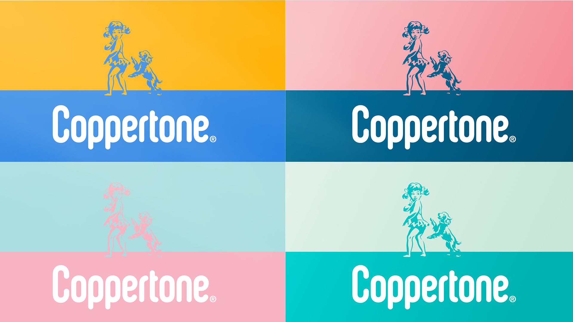
Instead, we evolved her to become a more universal and inclusive symbol for the brand. One without a defined ethnicity and without an overt, sexualized gender. We removed skin tone altogether and made her a tonal illustration that would change depending on the touchpoint. By changing her outfit and allowing the dog to playfully jump next to her rather than bite her clothing, we got rid of any suggestion of undressing or unwanted aggression. These moves may seem small, but if you look at her visual progression you can see that these subtle changes are what allowed her to evolve into a more relevant and timeless symbol for the brand while maintaining icon status.
With this evolution, Little Miss Coppertone has not only become a more inclusive brand asset, but also a more useful part of the identity system. Whereas she was previously only present on select products, she now takes pride of place on pack and has become a more central storytelling device in the brand world communication, symbolizing the brand’s newly crystallized big idea “to seize more moments in the sun.”
Balancing Nostalgia with Innovation in the Coppertone Sunscreen Logo
In a world of constant change and uncertainty, there is an undeniable need for trust and comfort. It’s no wonder why nostalgia dominated the zeitgeist of the pandemic as people turned to the familiar and memories of happier times—a boost for iconic brands that already held important places in the hearts of many. But that’s not to say things don’t need to change. As important as consistency is, it is equally important for brands to respond to the demands of the time and adapt to the evolving needs of consumers. At Pearlfisher, we Design for Life, and that means looking back as much as we look forward. Because in order to understand the needs of tomorrow, we have to understand what brought us to today. And the most powerful brand stories are those that understand this, embracing the delicate dance of balancing introspection with innovation.
Find out more about our work for Coppertone sunscreen logo, here.


