

This article originally appeared in The Dieline.
Apparently, it’s the year of the redesign.
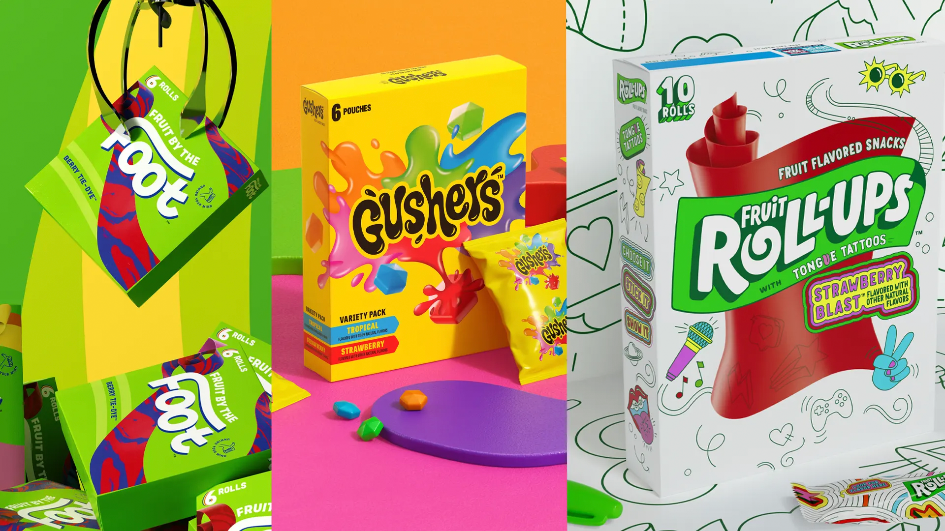
We’ve seen soda brand after soda brand update their packaging designs. This time, everyone’s favorite childhood snacks have just received a brand refresh from none other than independent brand design agency Pearlfisher.
Led by Hamish Campbell and Matt Sia, General Mills has revamped its fruit snacks portfolio, comprising three cherished brands—Gushers, Fruit By The Foot, and Fruit Roll-Ups. Because each brand’s demographic is the teenage crowd, the new packaging design portfolio seeks to connect to an entirely new generation of “the kids.”
“As a team who all grew up with these iconic brands and can vividly recall our own experiences eating these snacks, it felt particularly special and incredibly nostalgic to be able to reimagine these brands for today’s teens,” reflects Hamish Campbell, VP executive creative director at Pearlfisher, in a press release. “Our consumer-first approach to brand building was especially imperative to not only pay homage to the cherished equities of the brands, but do so in a way that celebrates the lives of these distinctive age groups and their ever-evolving interests.”
An Updated Packaging Design
The updated branded packaging design for each product features a new, contemporized logo. And while each wordmark receives a significant overhaul, many of the key packaging design elements remain, keeping consumers’ emotional bonds to the snacks intact. For example, Fruit By The Foot’s logo keeps the “fruit by the” tag above a much larger “foot.”
A Change to Packaging Color
The packaging color palettes also remain consistent across the packaging, keeping the visual changes to a minimum so as not to cause disruptive, drastic changes for the snack-crazed youth of today. Gusher’s box remains yellow, but the new, black logo pops beautifully against the brighter splashes behind it. The Fruit Roll-Ups’ box remains white, but the illustrations get taken down a notch, allowing for white space and breathing room.
A Modern Brand Refresh
“Creating an expressive and immersive brand experience for each of these brands was really important to us,” said Ta’mora Fuhrmann, brand design manager for General Mills. “Brands today need the ability to connect meaningfully with consumers across a variety of touchpoints. For teens specifically, it’s imperative we fit seamlessly into their lives and deliver benefits that extend beyond the product.”
Pearlfisher’s updated, dynamic design and modern branding relates to the present kid and teenager without implementing a visual identity that’s off-putting. Instead, by making nuanced changes, a cleaner look, and some vastly improved wordmarks, there’s a renewed sense of relevance, adding an element of intrigue without ridding the brands of their sugar rush-tinged nostalgia.