This article originally appeared on Muse by Clio.
Yes, nostalgia is having a moment—and has been for the last few years.
And it’s no secret why. Political turmoil. Economic uncertainty. A global pandemic. Burnout. People want to see, hear, touch and taste things that are familiar and comforting—reminiscent of times when life, overall, felt less complicated. When the world around you feels like it’s going to hell, nostalgia—when employed as a design tool—can be just what the doctor ordered.
But nostalgic branding is more than just retro typefaces and aesthetics. It’s a way of crystallizing a brand’s authenticity, reimagining iconic attributes in the fresh light of the moment.
To do this successfully, you look back, but then move forward with intention.
Brands, like people, are products of their cumulative experiences. They carry the imprints of their past, from origin stories to campaigns and logos.
But you don’t gain iconic status with the mere passage of time. You do it by tapping into your history consistently, as a means of informing your future. You don’t ignore or compartmentalize all that came before; you absorb it and carefully reflect it—mirroring for a new generation. To do this well necessitates grasping the total context in which you’re operating.
Fun in the sun with Coppertone
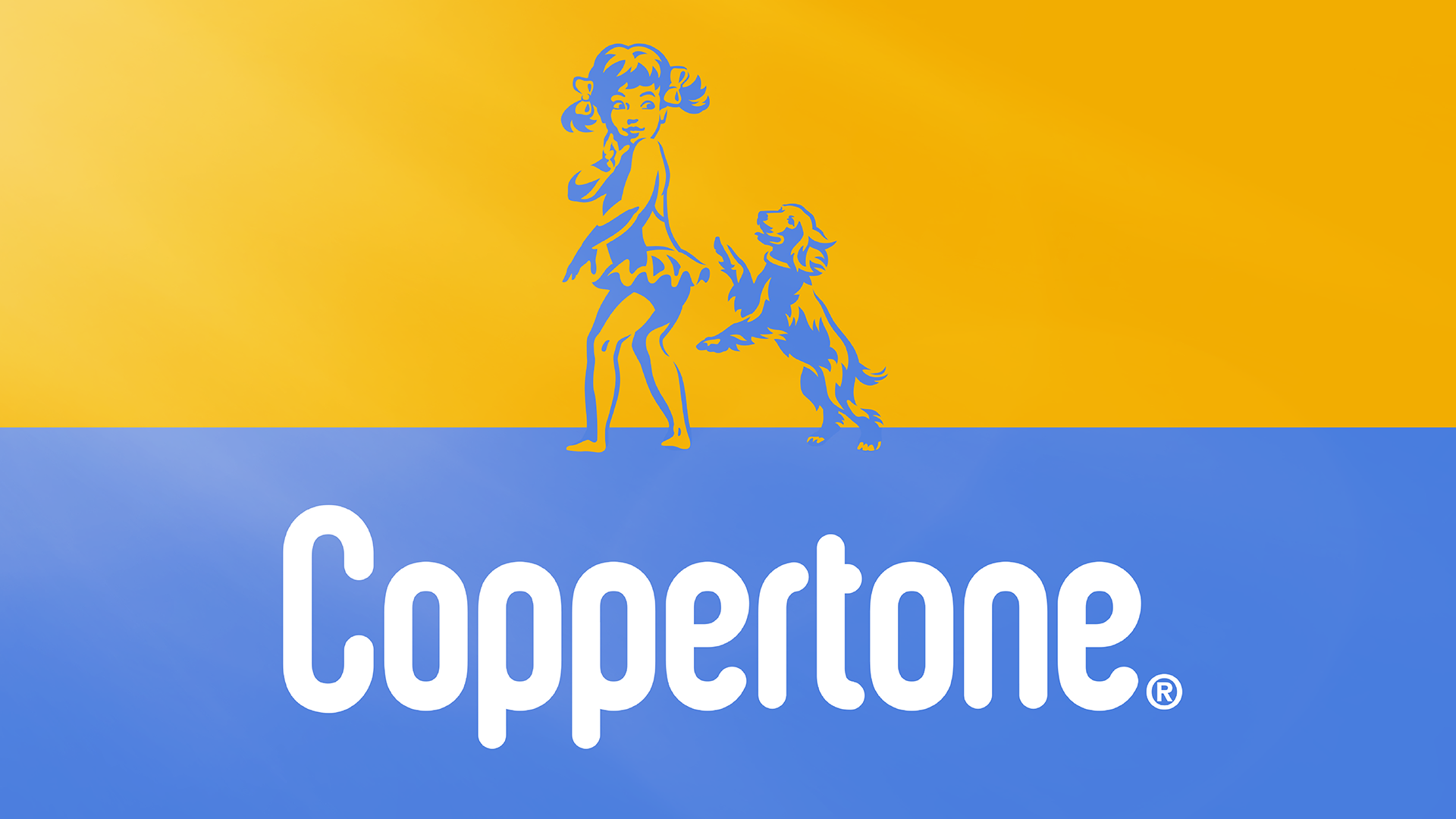
Case in point, Coppertone. As the first sun-care brand to introduce SPF, they were category pioneers, with a powerful POV and iconic equities. Little Miss Coppertone became a universal symbol. But by the dawn of the millennium, that equity no longer felt like a timeless asset, but rather a dated, problematic and sexualized representation of female youth.
In 2001, Coppertone removed that girl and her dog from their logo, replacing warm, familiar designs with utilitarian codes of protection. A misstep? Most definitely.
Impactful nostalgic design should create a new visual language that honors a brand’s heritage in a thoughtfully modern way.
That’s likely why the latest Coppertone design sought to redefine the brand’s relationship with the sun, bringing back Little Miss and her pup. We redesigned the icon in a contemporary and universal way; the new logo removed her skin tone and clothed her, and her dog is playfully jumping by her side instead of tearing off her swim bottoms. A modern interpretation which, instead of casting the brand’s roots aside, honored them.
It’s essential to understand the values emerging or evolving with your target audiences, then explore the gaps in the competitive landscape and consider which cultural shifts you can tap into and ride with conviction.
Pepsi harkens back to the swingin’ ’70s
Pepsi’s decision to build upon its identities from the ’70s and ’80s during its redesign last year wasn’t just a fitting move for the brand, but it demonstrates how—by looking to the past—you can still move decidedly forward. Drawing from their authentic self and connecting to the symbolism of a balanced world was a powerful and effective design choice. It showcased a return of confidence by getting back to their roots and behaving like the iconic brand they are.
But even then, Pepsi knows full well that you must always tip your hat to the future. As a brand, you must show how your history is informing what comes next, which often means writing a new immersive chapter for consumers beyond visual equities.
Pepsi’s IRL throwback diner was a savvy extension of the concept that built plenty of buzz.
Courting success with Converse All-Stars
What was vintage or old, is cool again—such is often the cycle of trends, especially in the realm of fashion. Those brands that stand the test of time are the ones that endeavor to share a new narrative and perhaps even for new audiences.
Consider Converse All-Stars, which went from basketball courts and the Rocky franchise to everyday wear across streets and schools. By tapping into the simplicity and “rawness” of the shoe’s unchanged design, they became a symbol for rebels and punks alike, not to mention skateboarders, preps and hipsters.
And today, they’re a universally donned shoe that embraces a universal, effortless appeal. After all, everyone can be an All-Star.
Bottom line: Brands that effectively tap into nostalgic elements don’t merely copy and paste the old. Through retrospective storytelling, Coppertone, Pepsi and Converse gently resurfaced steadfast brand truths.
By doing so in ways that felt unforced and genuine, their recent initiatives honor the past but feel powerful and relevant for today’s picky consumers.


