Bowl & Basket
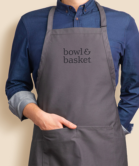
We partnered with Wakefern on the brand creation, brand strategy, visual identity, packaging, portfolio redesign and roll-out of ShopRite’s new own brand for high quality food – called Bowl & Basket.
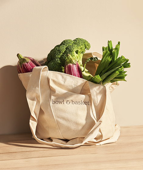
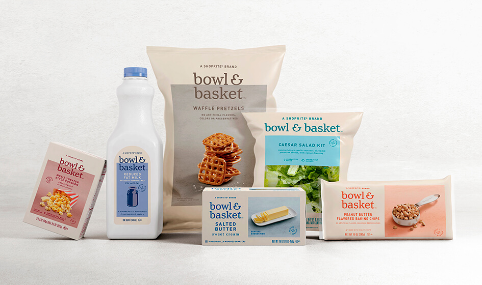
Bowl & Basket’s Visual Identity System
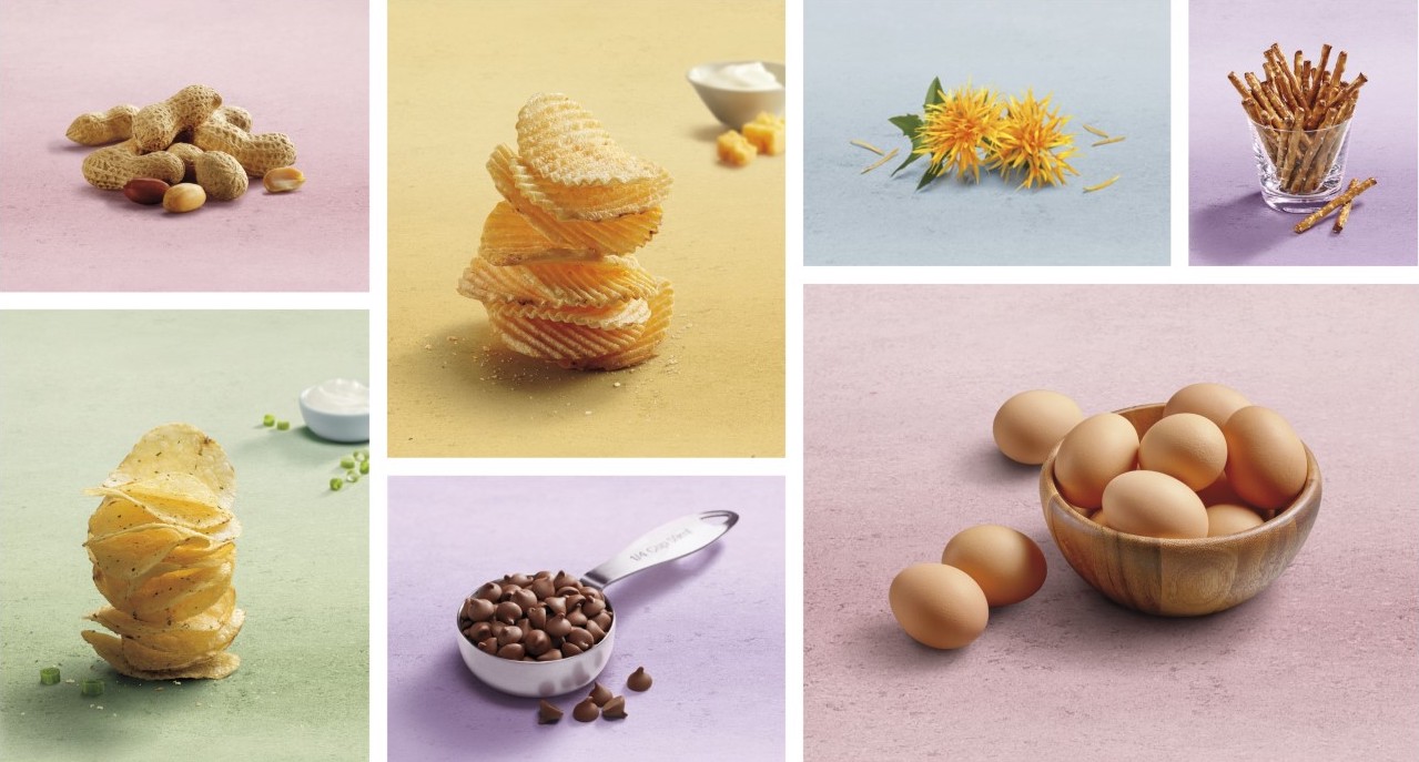
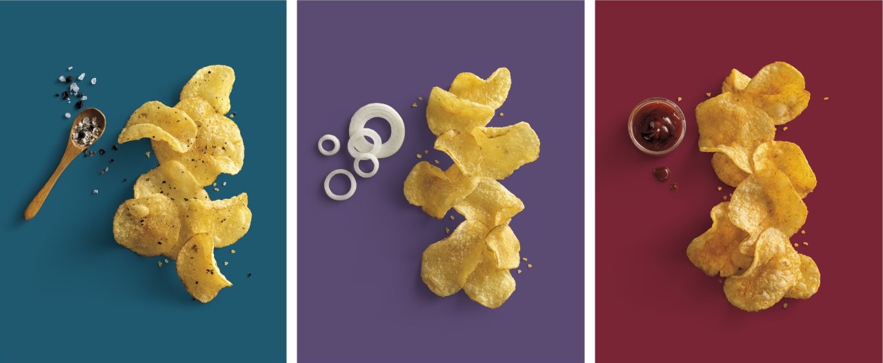
With a fresh and elevated design, Bowl & Basket disrupts the look of this category, presenting a new opportunity for consumers to resonate with packaging that has a design-forward family of products. The fluid, organic and optimistic nature of the visual identity system and what it represents informs the brand expression – including the addition of an ampersand that doubles as a visual icon resembling a bowl and a basket. The rectangular placemat surrounding the identity signifies the center of the table, shareability and community with modern, stylish, and real-food photography cueing freshness, quality and authenticity.
The art direction for the food photography style and illustrations that appear on the packaging’s design is distinct and complementary of the series’ soft color scheme adding to the total brand expression.
At the center of Bowl & Basket, an ampersand symbolizes a starting point for moments of joy. This point of connection extends the brand purpose of togetherness beyond the name to make many quality combinations such as: Milk & Cereal, Saturday & Pajamas, Friends & Family, Bowl & Basket.
