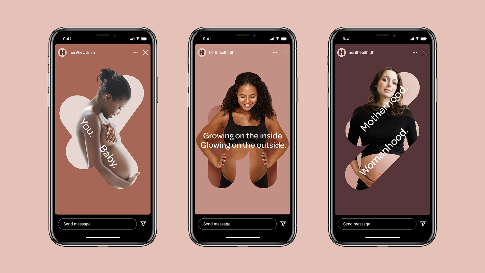
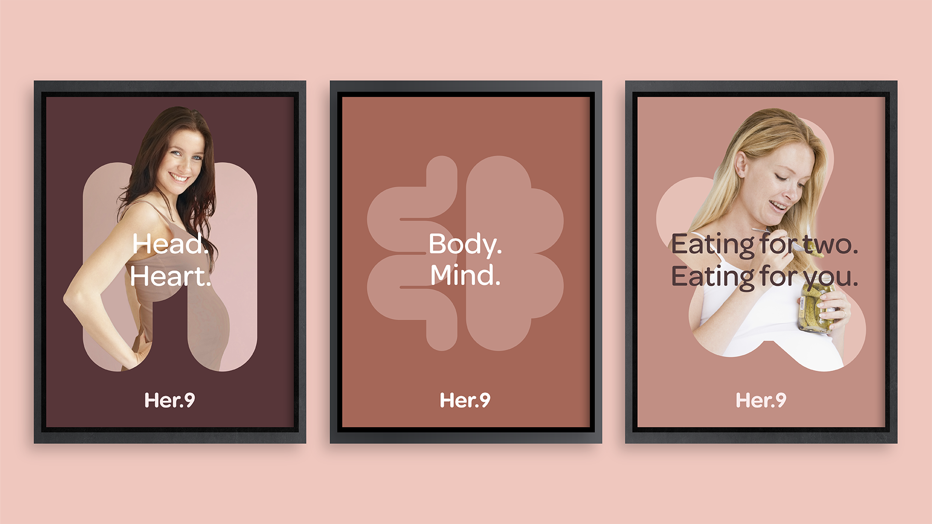
A new brand design for a new generation of mothers
Her.9 is a direct-to-consumer pregnancy nutrition brand led by a powerhouse of notable experts and doctors pioneering a more holistic take on pregnancy that puts 'HER' – the mother-to-be – front and center.
Get in touch.
Subverting a dated category that traditionally focuses on the needs of the baby, our strategic approach, identity, digital brand touchpoints, and packaging design bring a sense of duality to the Her.9 brand: supporting both mother and baby, mind and body and celebrating the fact that womanhood is equal to motherhood.
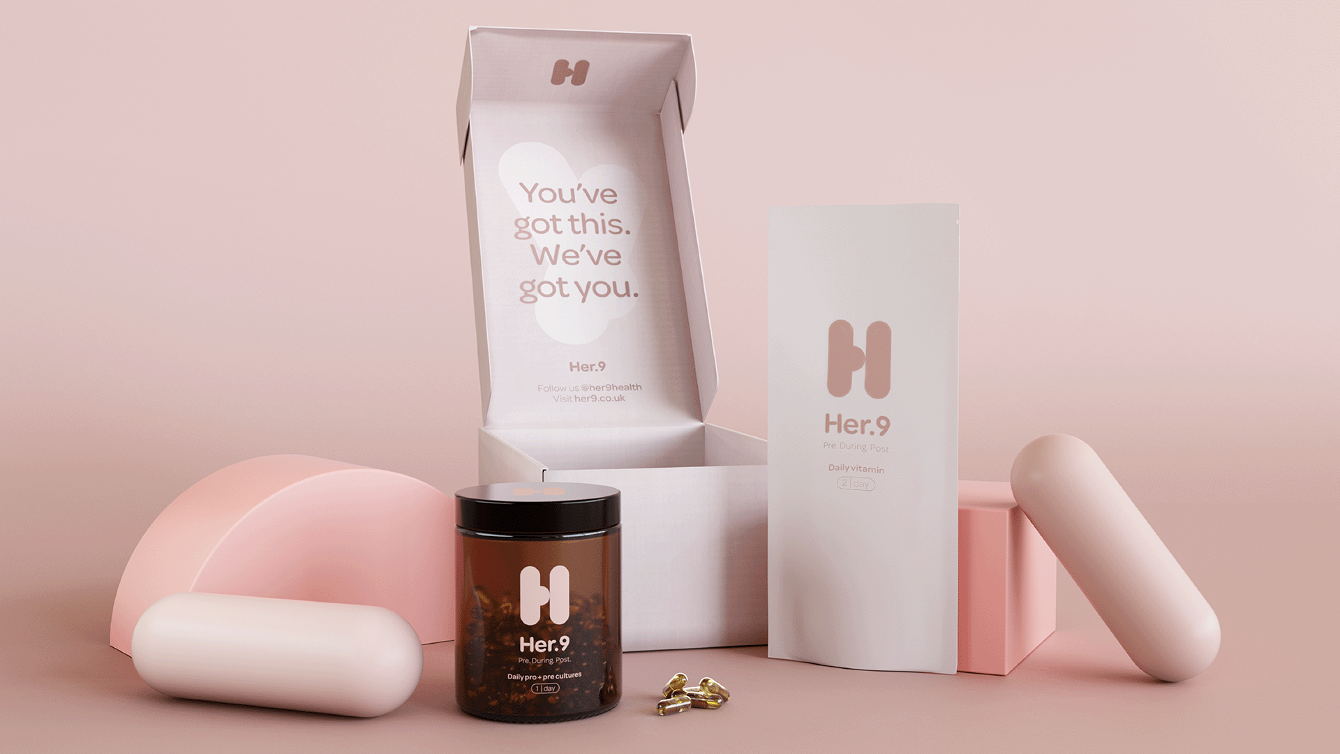
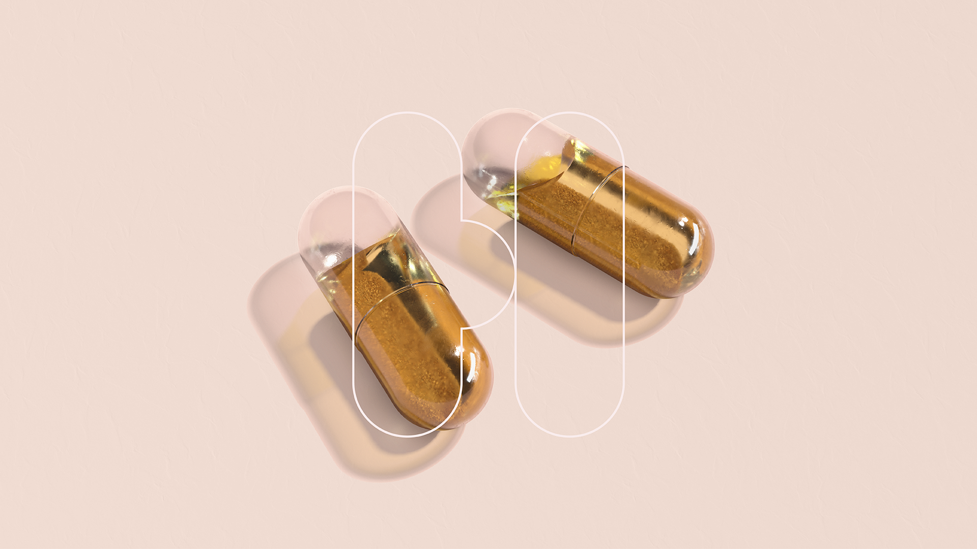
The contemporary and recognizable brand identity symbolizes a pregnant woman’s body and the shape of the two vitamin pills, displayed side by side, to support the mother’s journey and well-being. The sustainable, apothecary-style, brown glass jars protect the contents and can be reused from the entirely compostable refill pouches. With a feminine and modern color palette that represents the diversity of mothers’ skin tones, the design stands out against the traditional brands in the pregnancy sector.
Related projects