McDonald's
McDonald’s Redesign: Transforming Fast Food Into Memorable Moments
McDonald's boasts a menu full of famous favorites with over 60 million people served every day. Our multi-year collaboration to redesign the fast-food icon’s global packaging system was centered on activating the brand positioning to make delicious, feel-good moments easy for everyone.
Get in touch
McDonald’s Redesign
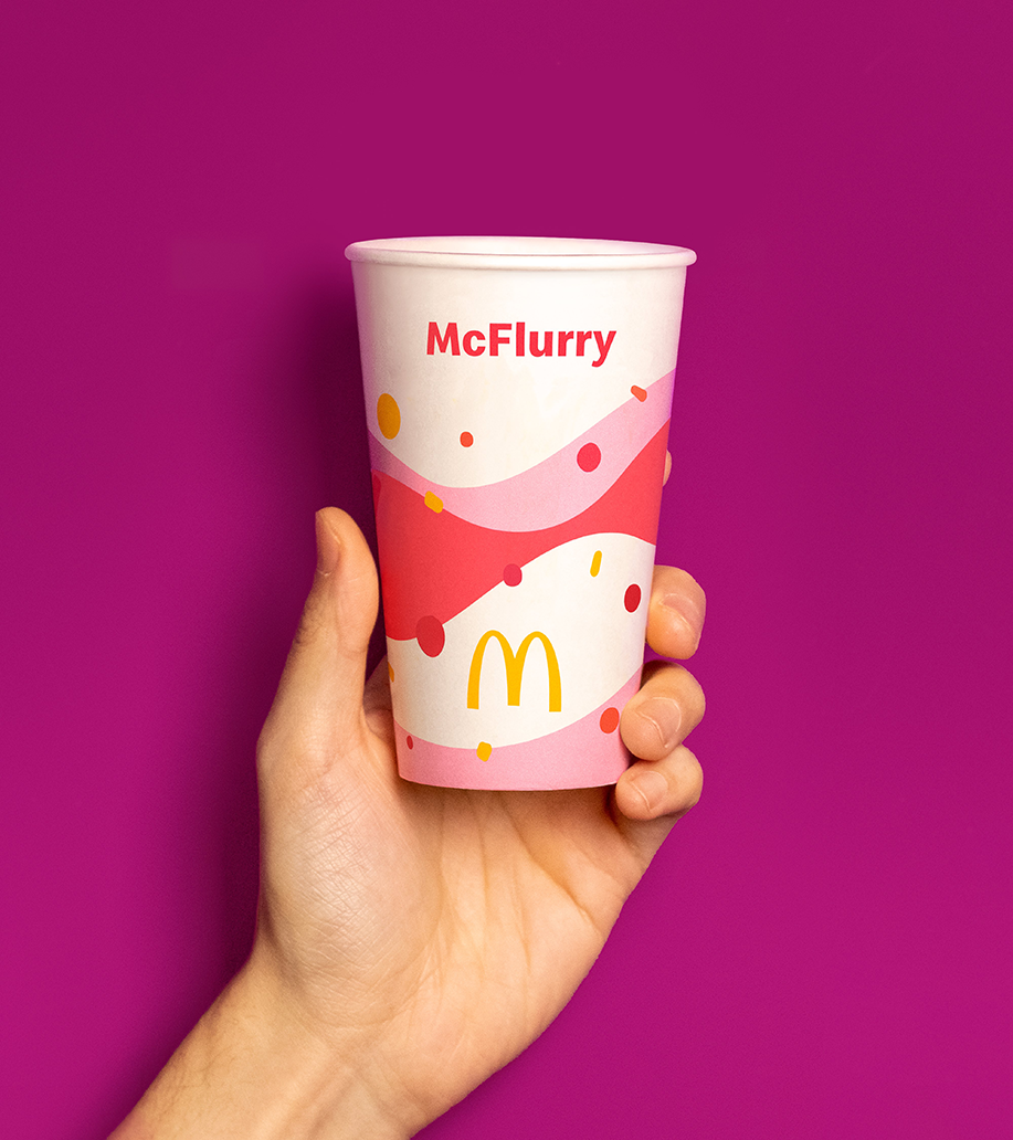
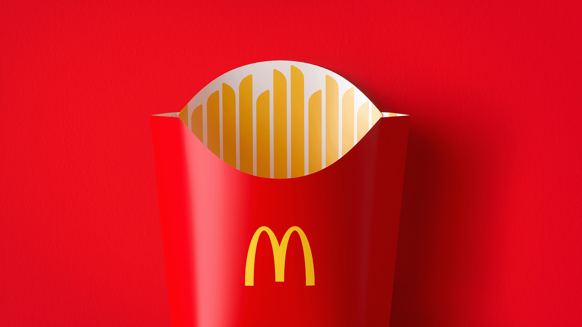
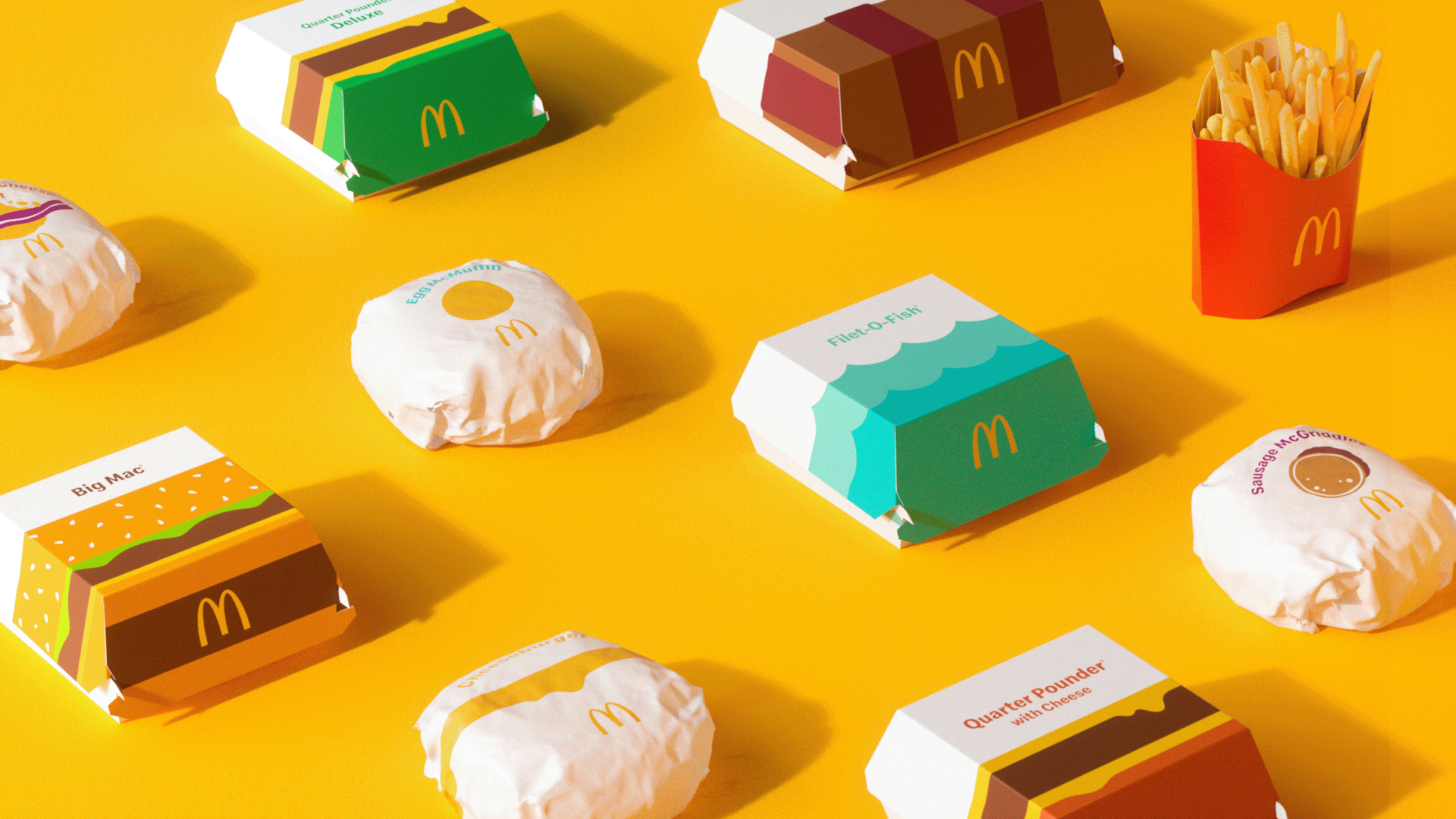
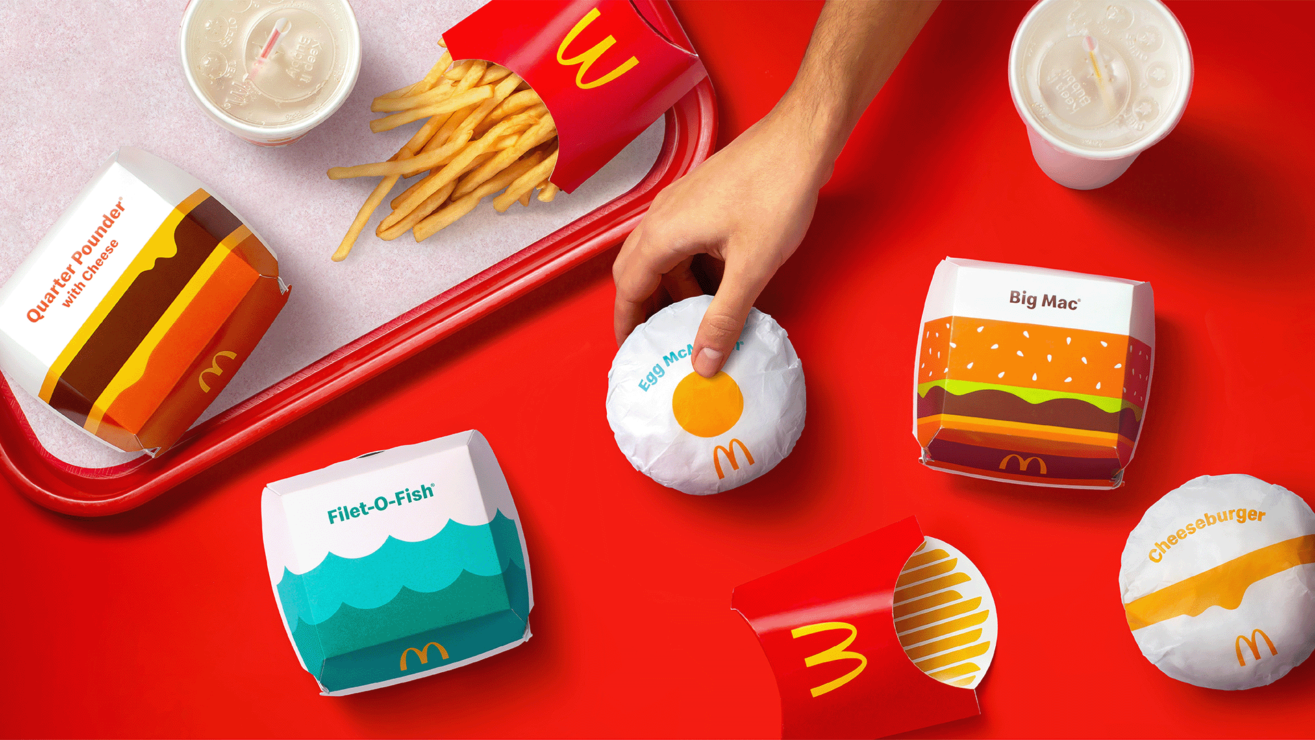
At the core of the McDonald’s redesign was the idea that packaging should become an integral part of what McDonald’s represents today – a modern, familiar, and joyous experience – expressed through a graphics system which serves as a single, visual framework for the brand’s portfolio of products.


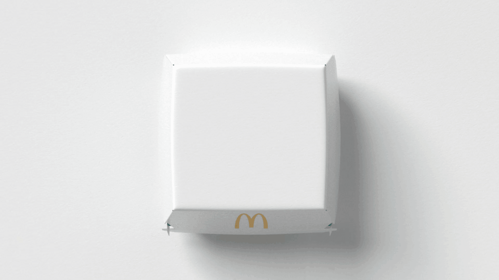
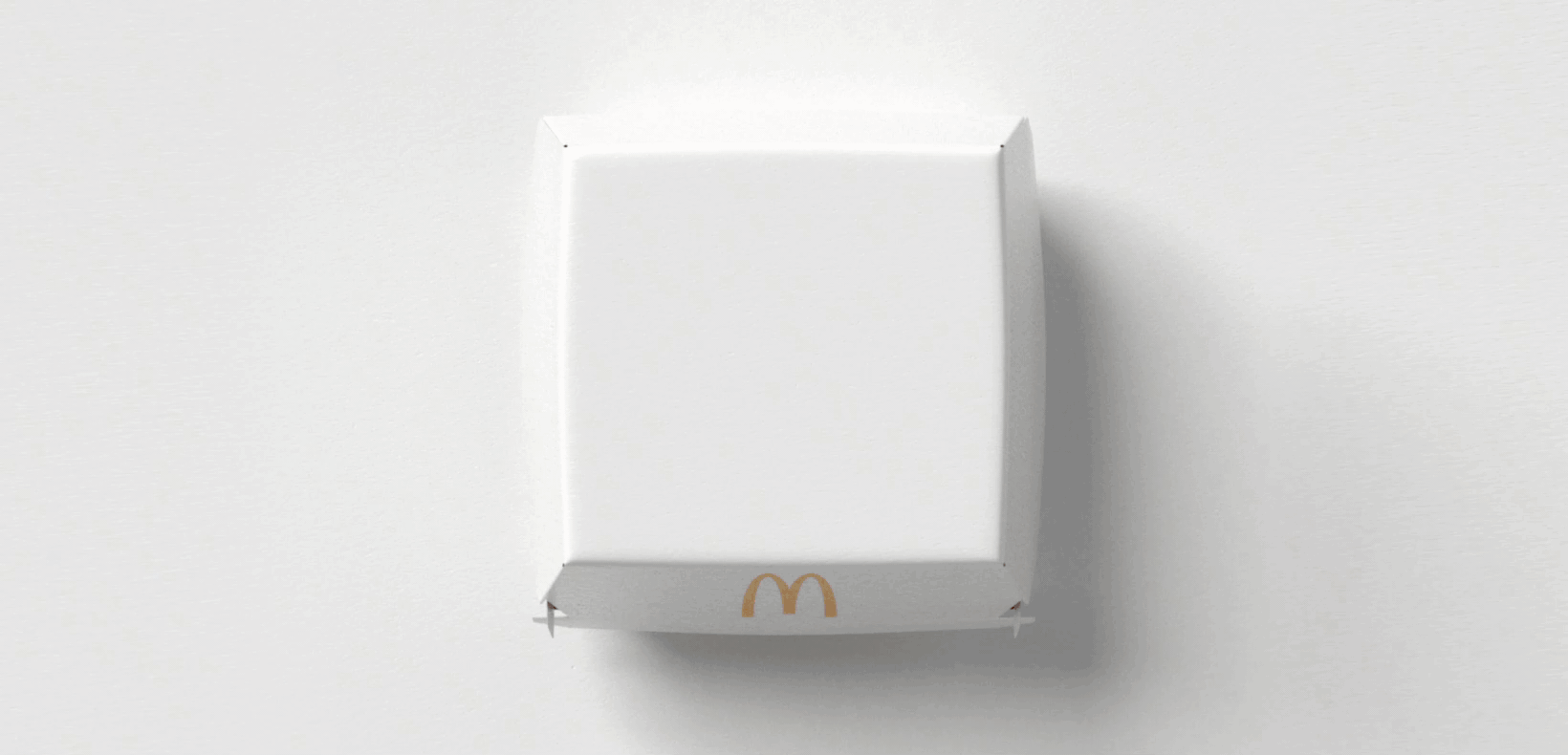
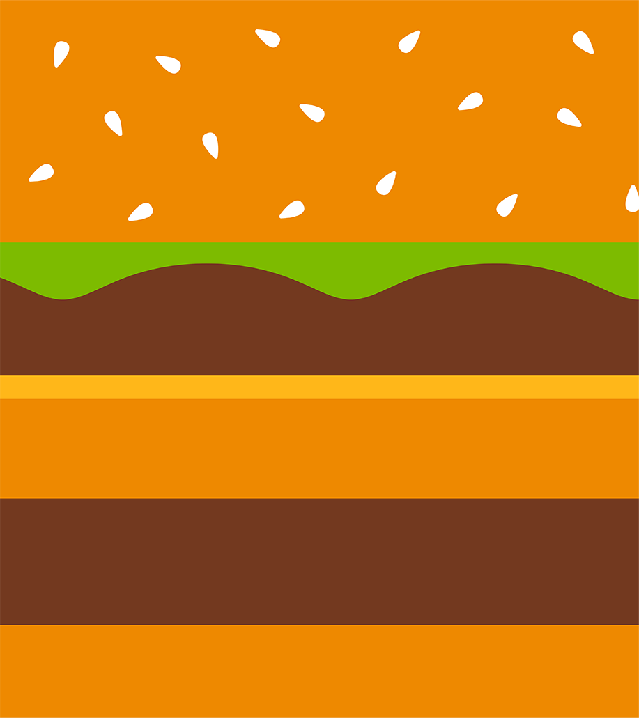
We leveraged the packaging as a creative canvas to celebrate the most recognizable and iconic expression of each menu item, bringing personality to life through a simple, aesthetically minimal brand design and uniquely functional – but joyful – design language. For instance, we crafted simple, cool teal waves to symbolize the Filet-O-Fish® and utilized a vibrant yellow egg yolk surrounded by pristine white space to represent the Egg McMuffin®. The result is a harmonious family of products designed to enhance countless individual moments for McDonald’s customers worldwide as orders are assembled, shared, and enjoyed.