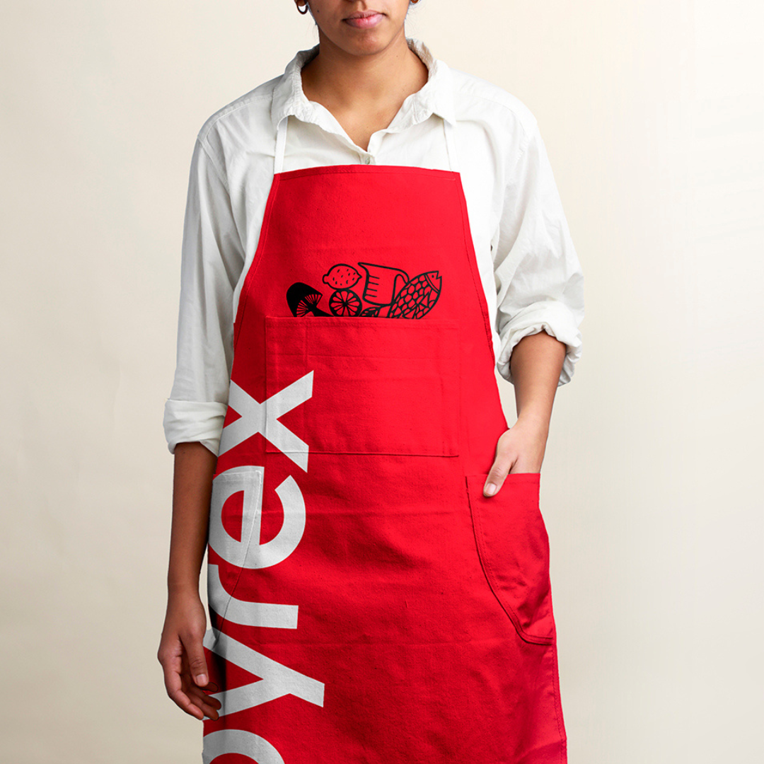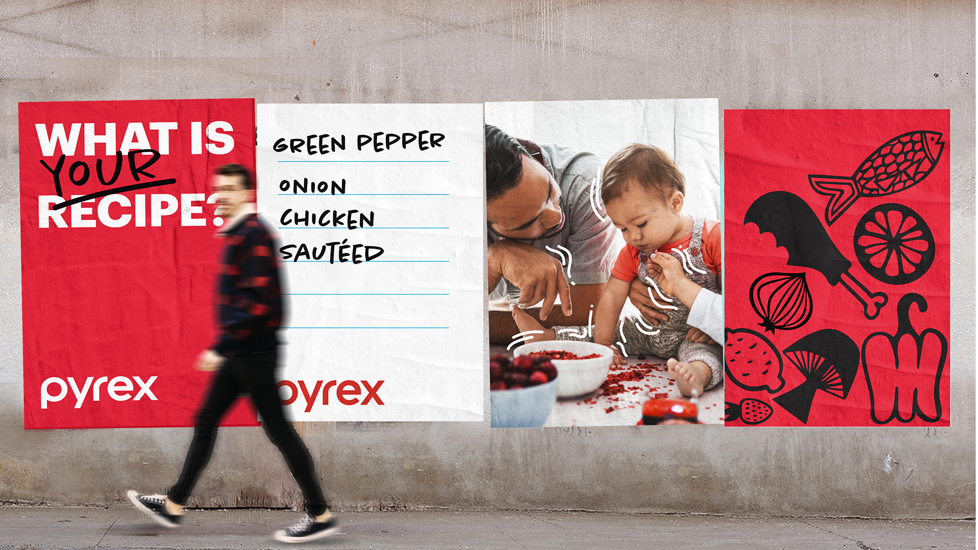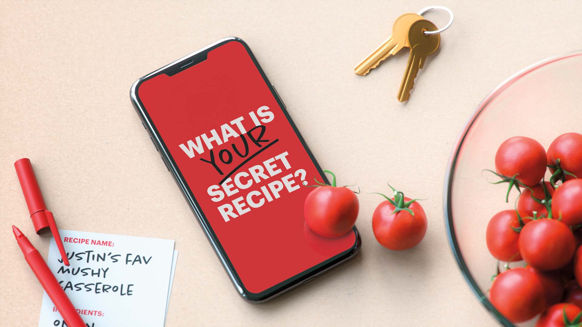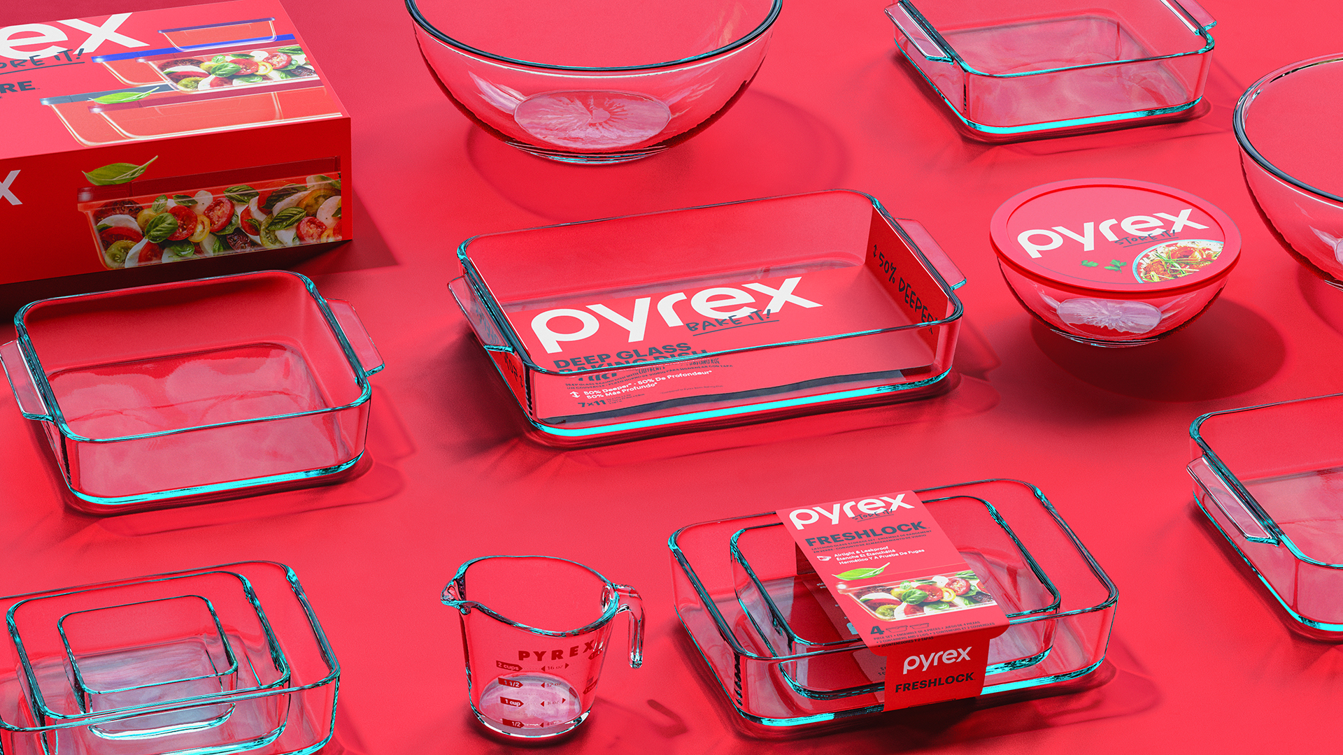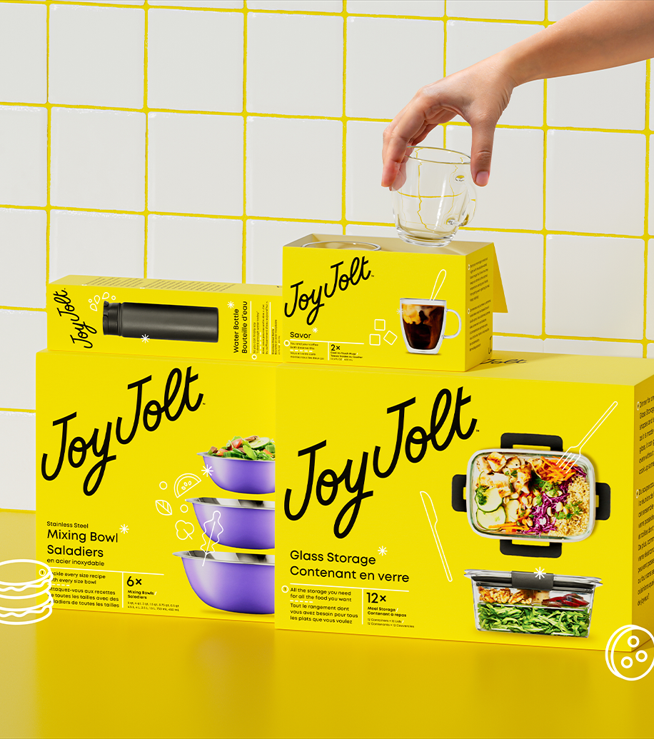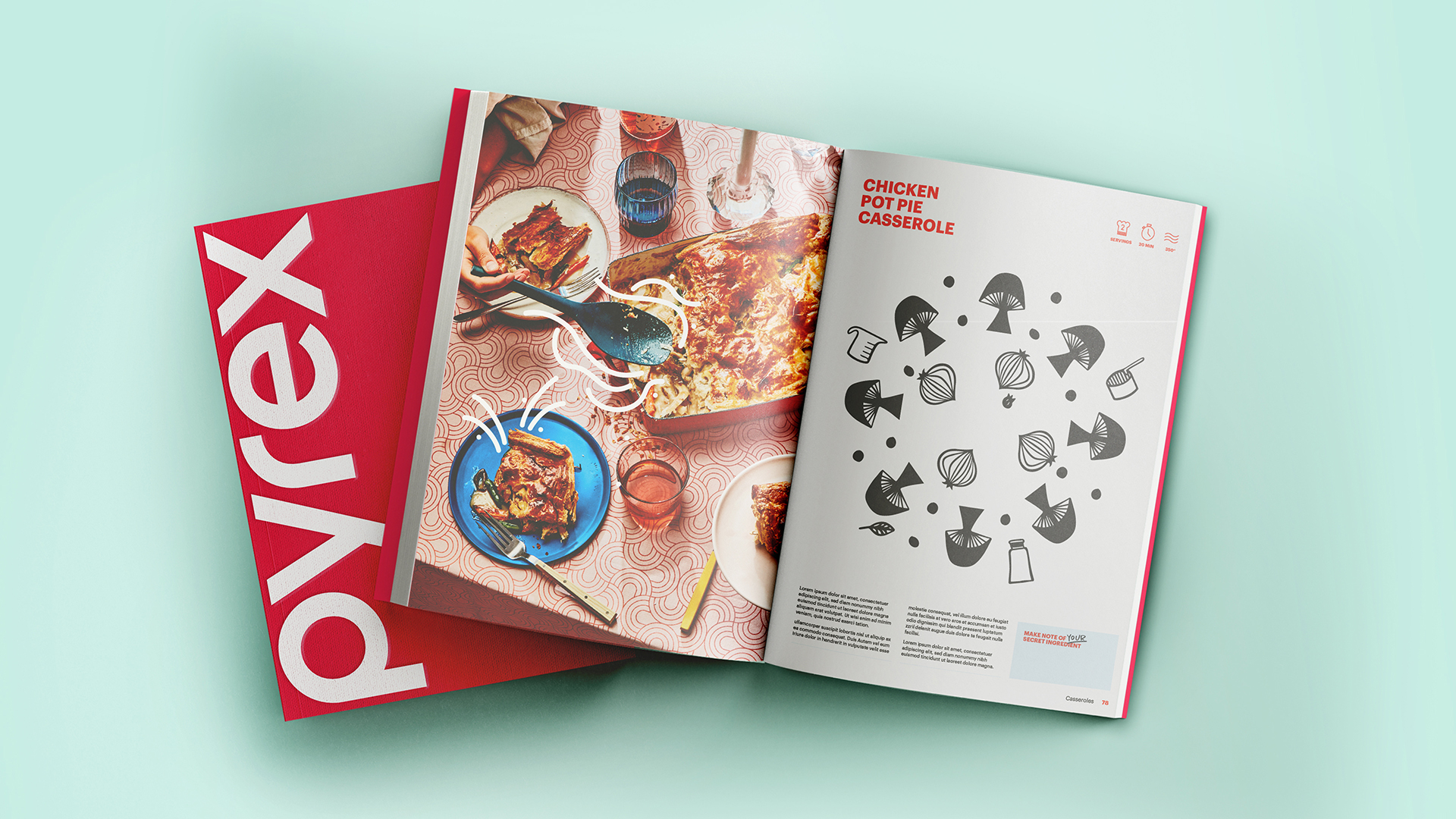

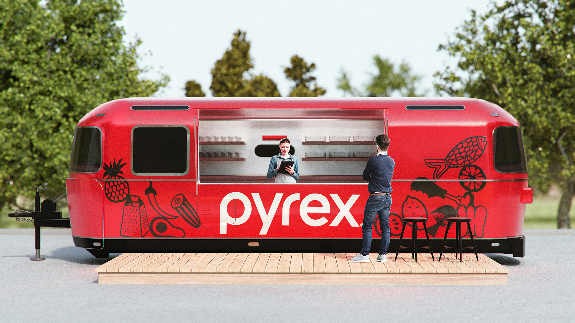
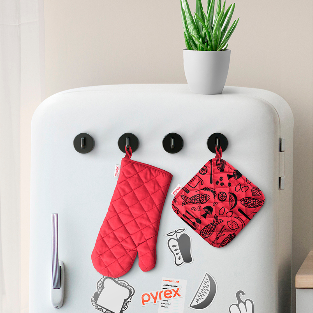
The new visual identity system elevates Pyrex’s quintessential red identity and crafts new expressions and illustrations to clarify products within the brand portfolio. Making the brand easier to navigate are the sub-brands—Bake It!, Store It!—showcased in a new Sharpie-style typography, which reinforces the handmade imperfections inherent to the cooking experience.
The redesigned packaging and lifestyle photography reflect an attitude that is boldly confident, yet refreshingly real, capturing the variety of ways in which people prep, serve, and enjoy cooking.
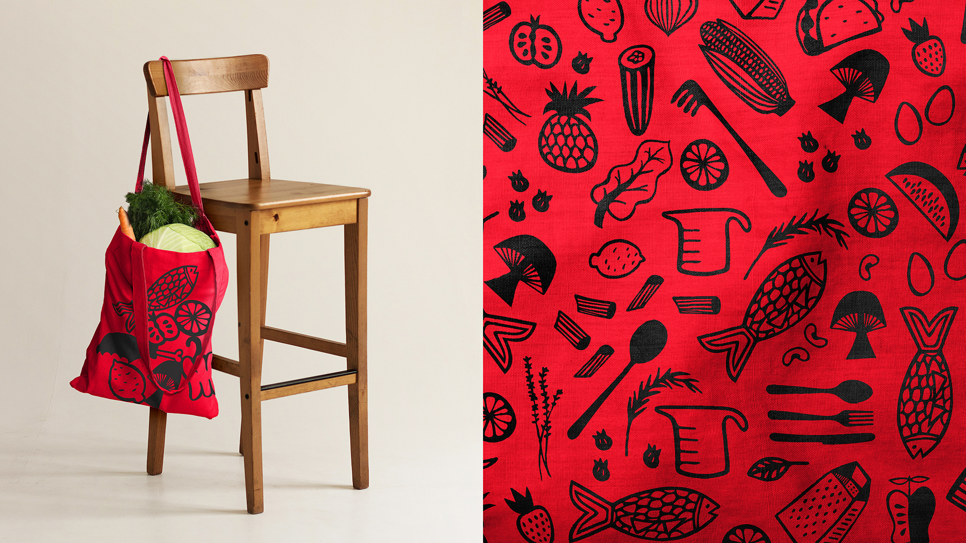
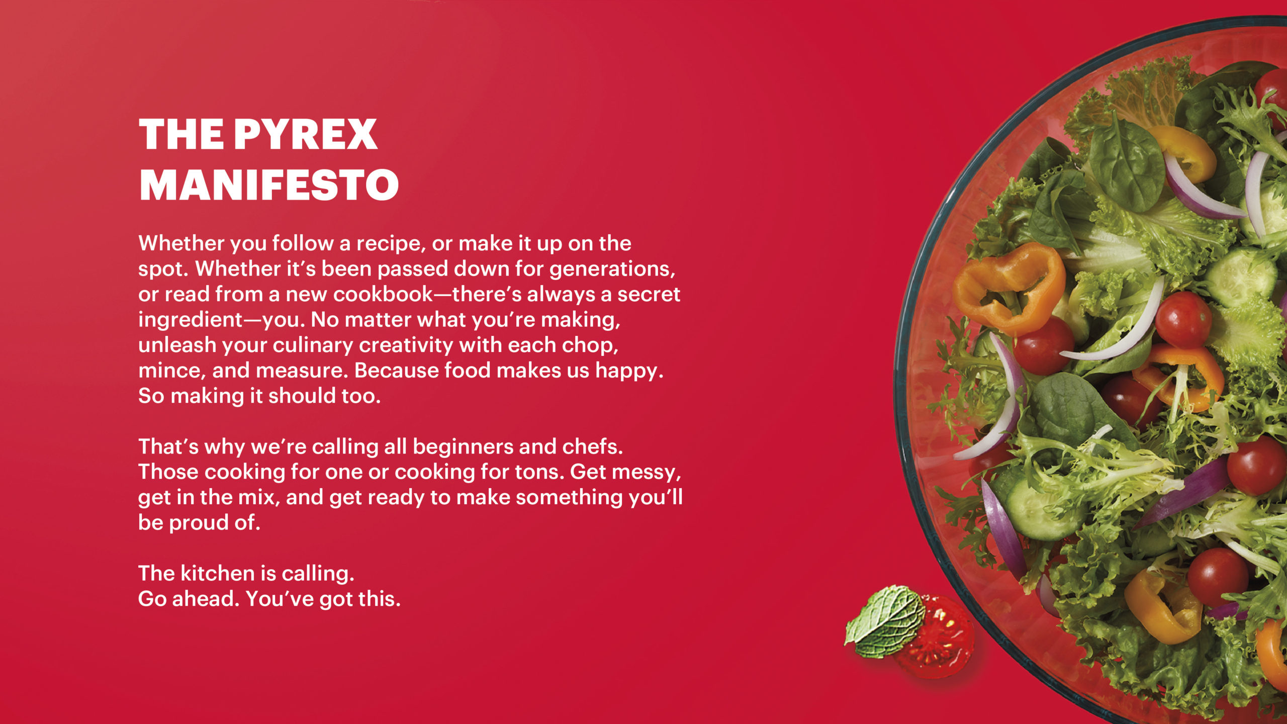
Pyrex is integral to getting dinner on the table in so many kitchens today, so the new design aims to modernize the brand for a new generation of cooks, families, and creators, making it more approachable and easier to bring people together around what connects us: food.
