Redefining Andrex for the Intimate Wellness Category
Leader in personal care, Andrex sought to evolve its brand identity to align with its new communications brand direction – Get Comfortable – and expand into the intimate wellness space. The goal was to create a bold, fresh visual identity that would resonate with modern families both in retail and at home while maintaining brand recognition.
Get in touch

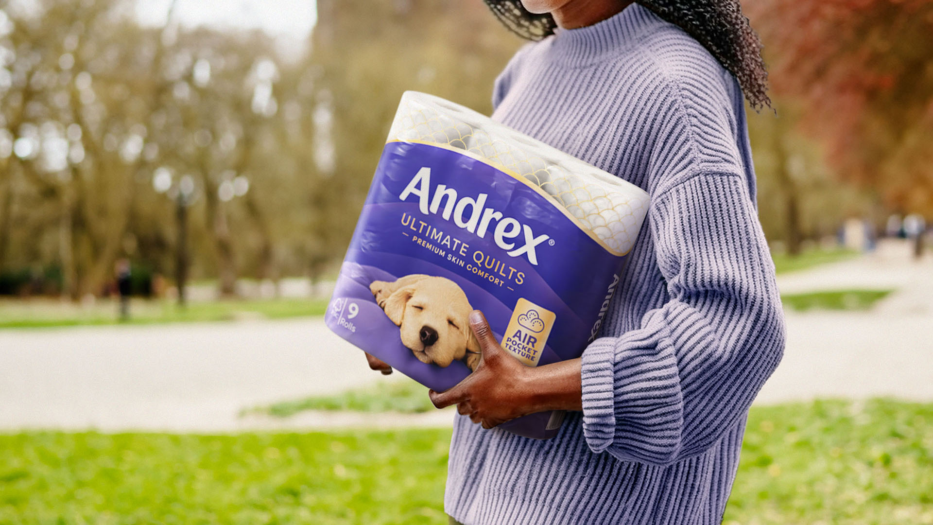
The core of Pearlfisher’s approach focused on elevating the iconic Andrex puppy to enhance brand visibility and emotional connection, refreshing the visual identity to reflect the shift from ‘clean to care’, and developing a cohesive brand language applicable across various touchpoints.
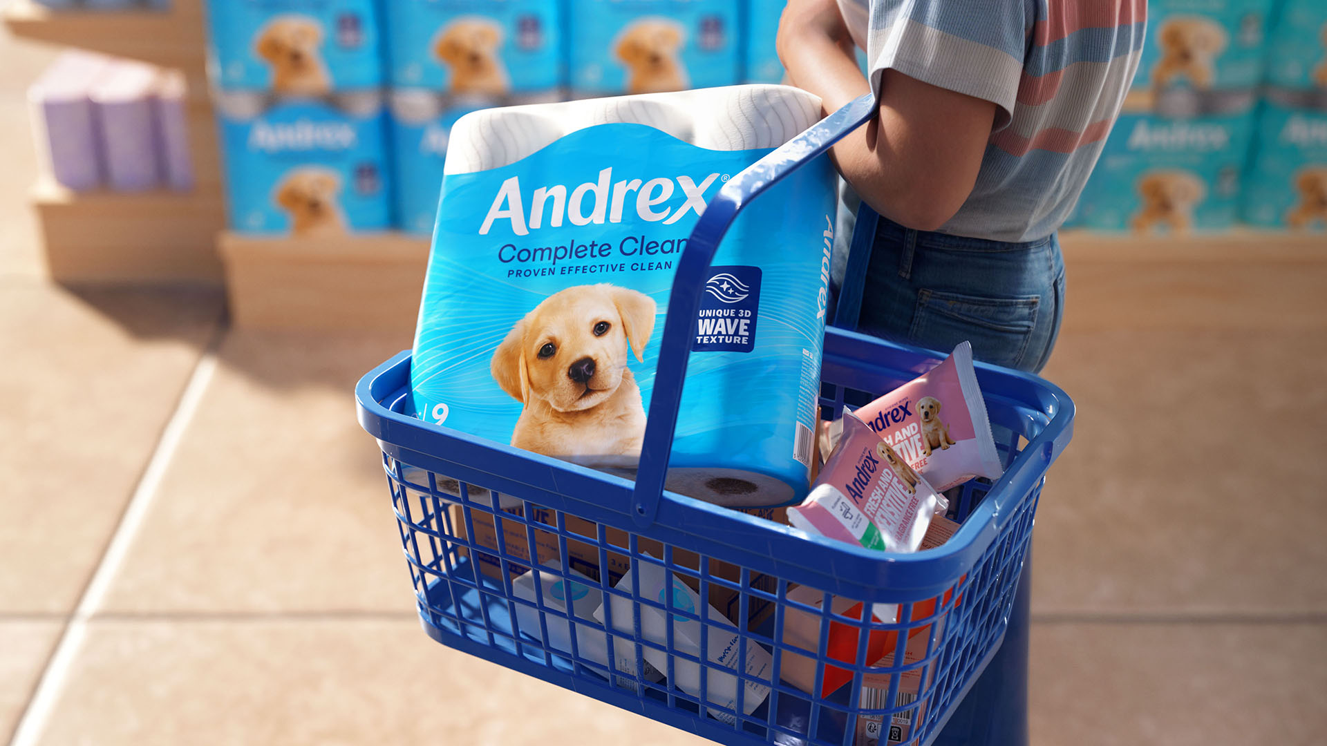
The redesign centred on reimagining the Andrex puppy imagery. Pearlfisher transformed the previously small mascot into a larger, boundary-free presence, making it more prominent across packaging and all brand touchpoints.
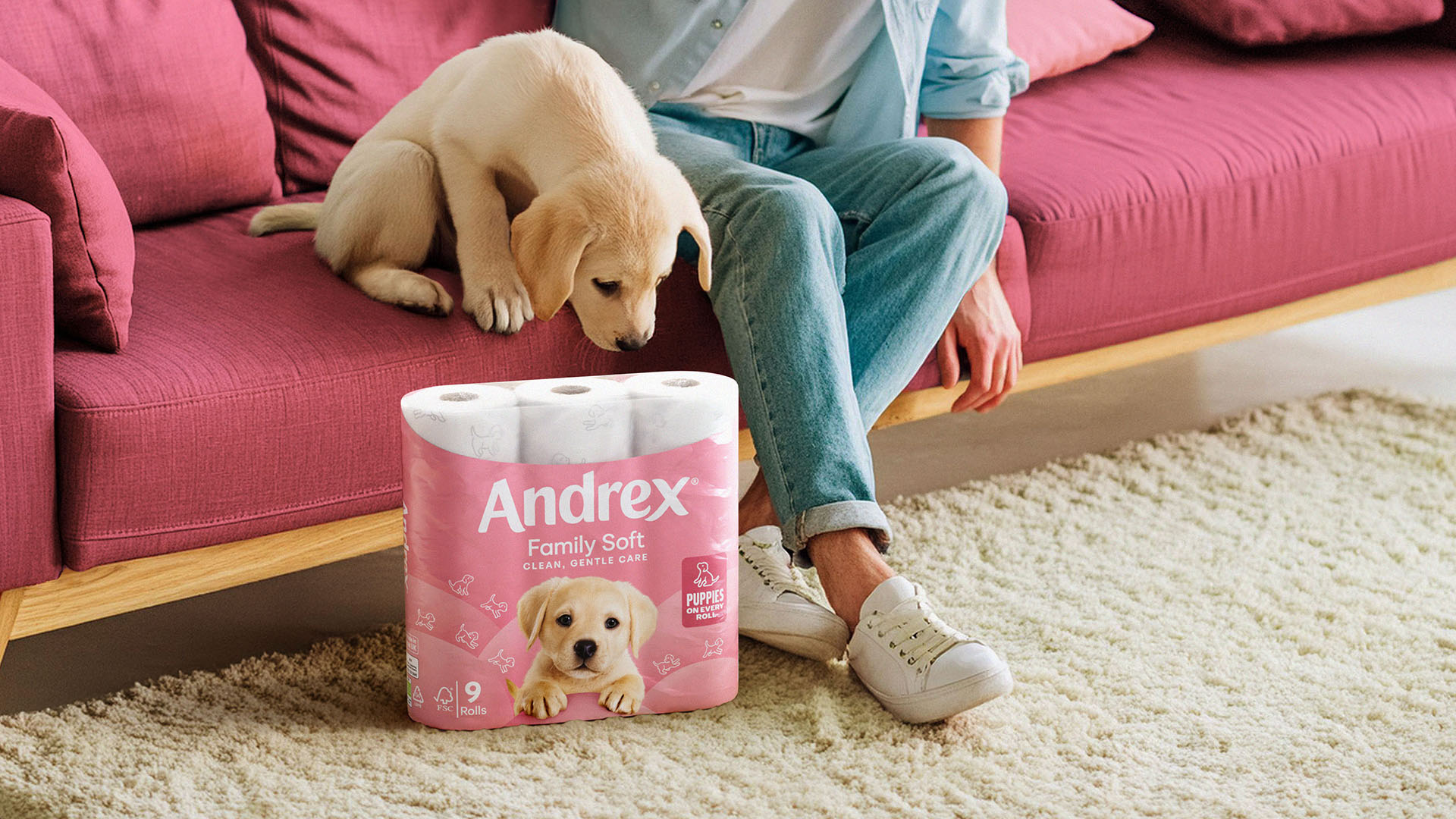
Colour played a crucial role in the redesign. While maintaining the established palette for brand recognition, Pearlfisher introduced modern tones to inject a contemporary feel. New graphic elements were developed to enhance navigation across different product ranges and clarify each proposition’s unique benefits.