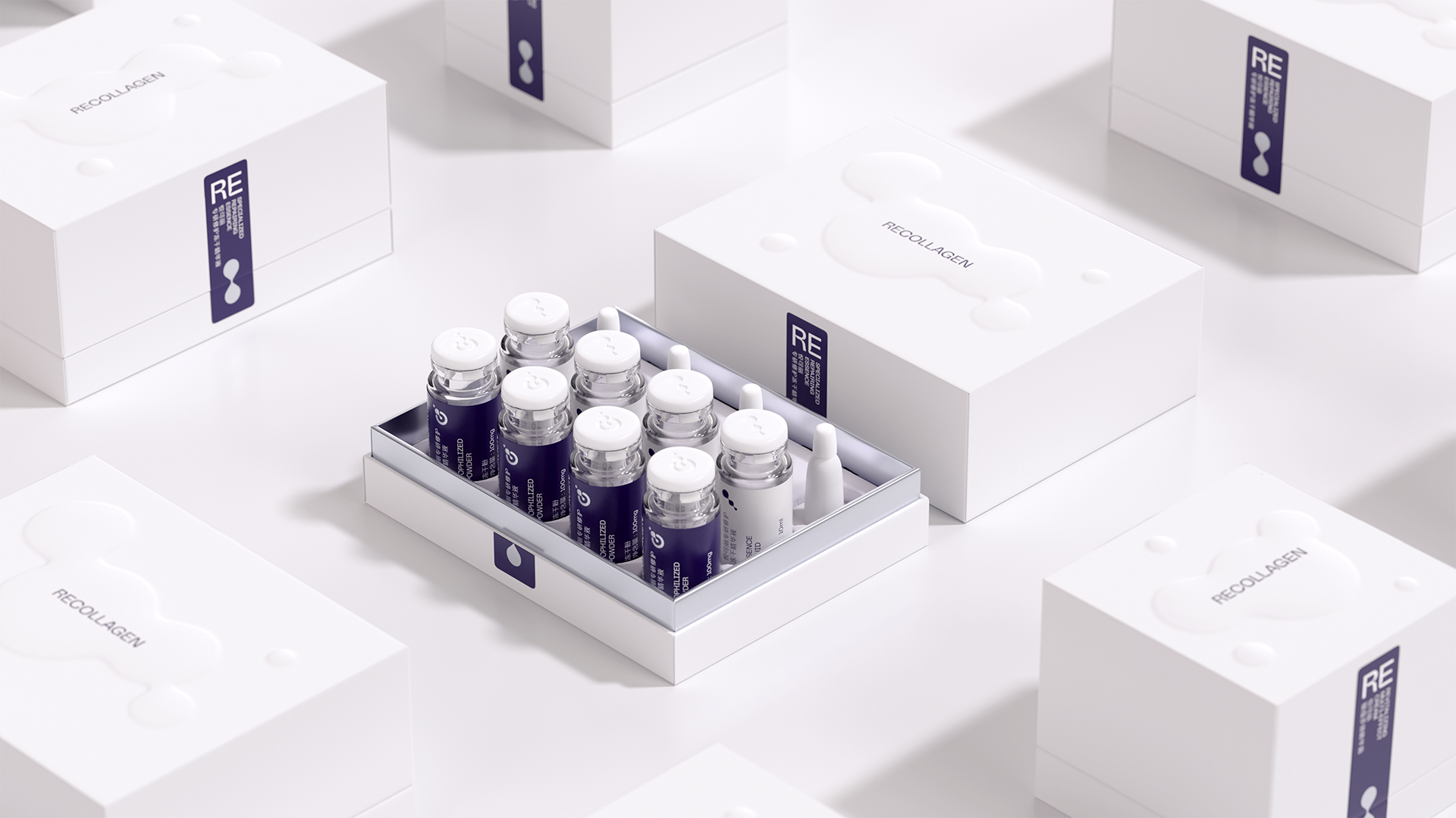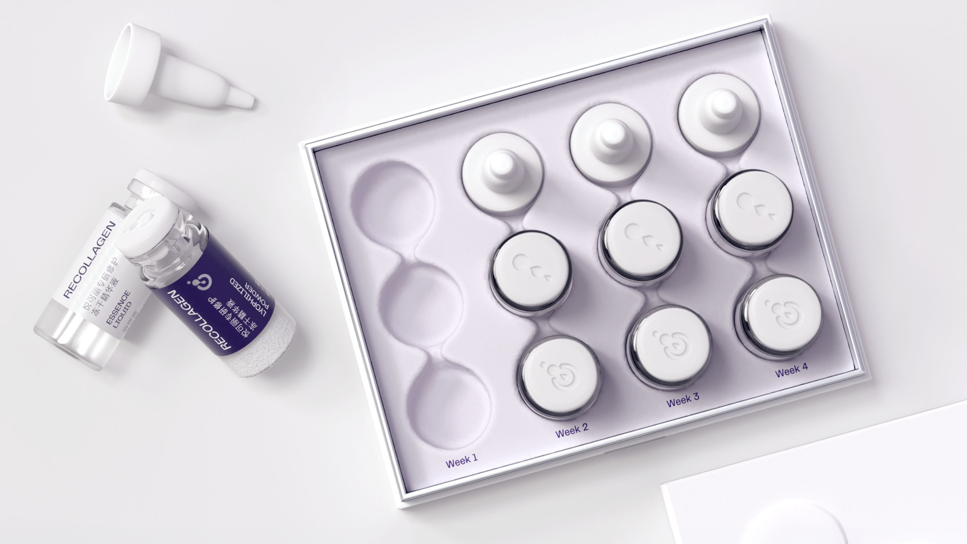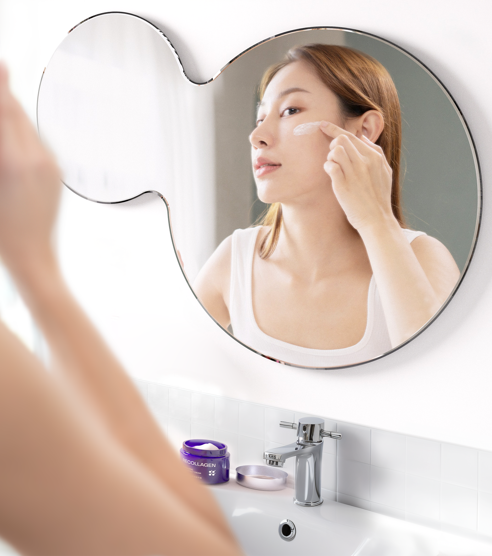
Our strategic vision for ReCollagen was to combine its medical-grade efficacy with the sensory delights and daily rituals of skincare routines, creating a collagen-specific offering reflective of its deep expertise and care. This transformation aimed to go beyond superficial rejuvenation, positioning ReCollagen as a leader in holistic collagen skincare, helping people replenish the look and feel of healthy, radiant skin while embracing the notion that youth is present in all of us, regardless of age. It just needs to be awakened and nurtured a bit more as we get older.

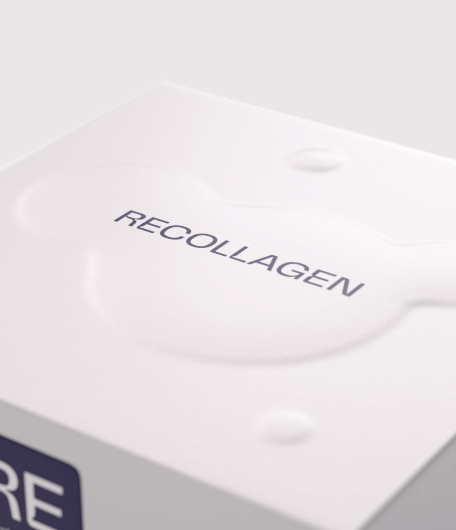
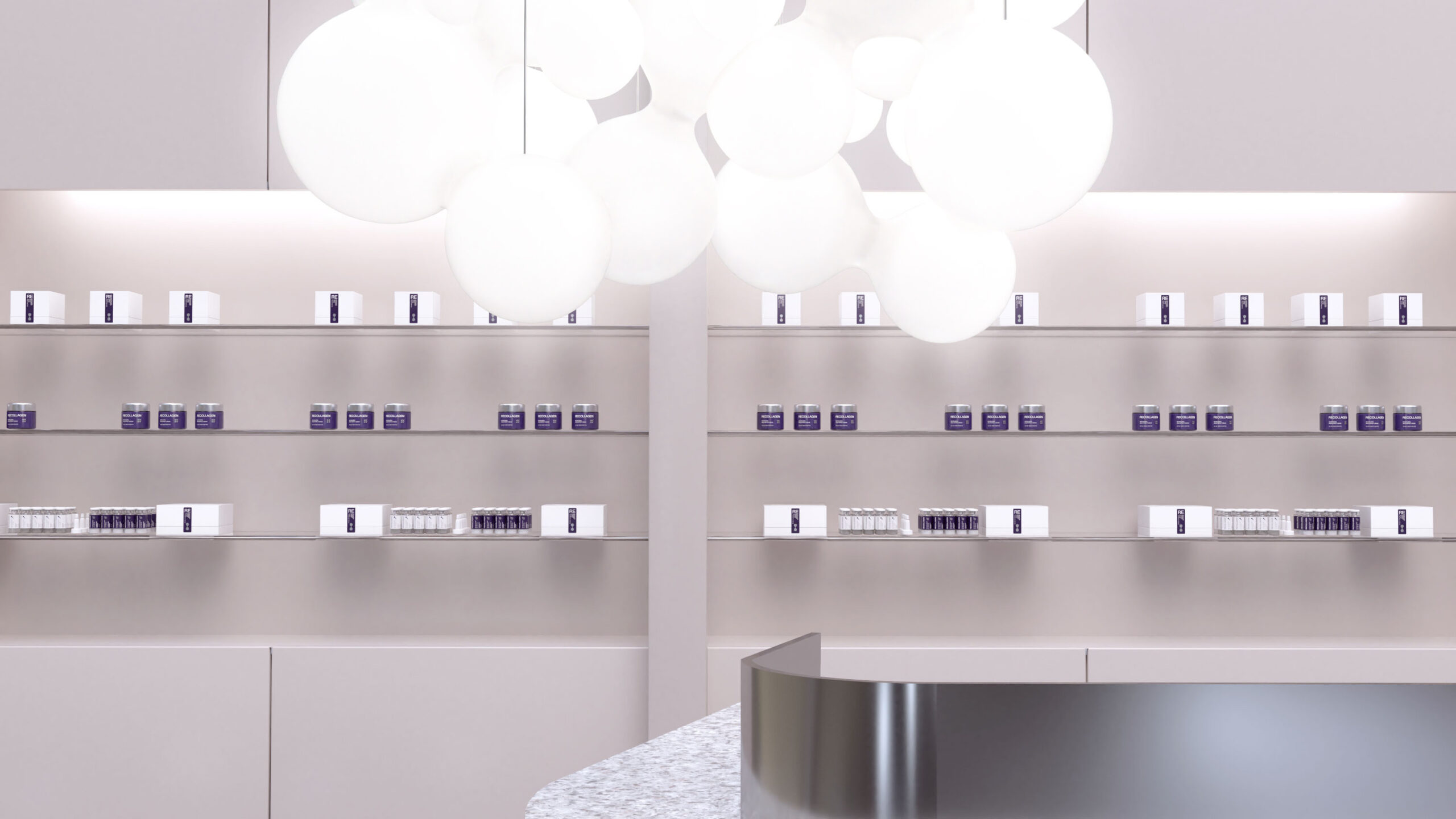
The brand’s design features geometric molecular shapes that mirror the intricate structure of collagen, reinforcing the product’s scientific credibility across packaging and retail touchpoints. The prefix “Re” in ReCollagen is ingeniously woven into brand messaging to evoke qualities such as “restorative” and “rejuvenating.” Its signature colour, a regal purple, marks ReCollagen’s entry into the market, symbolising beauty and luxury, this bold hue ensures ReCollagen stands out on shelves both at home and in retail.
