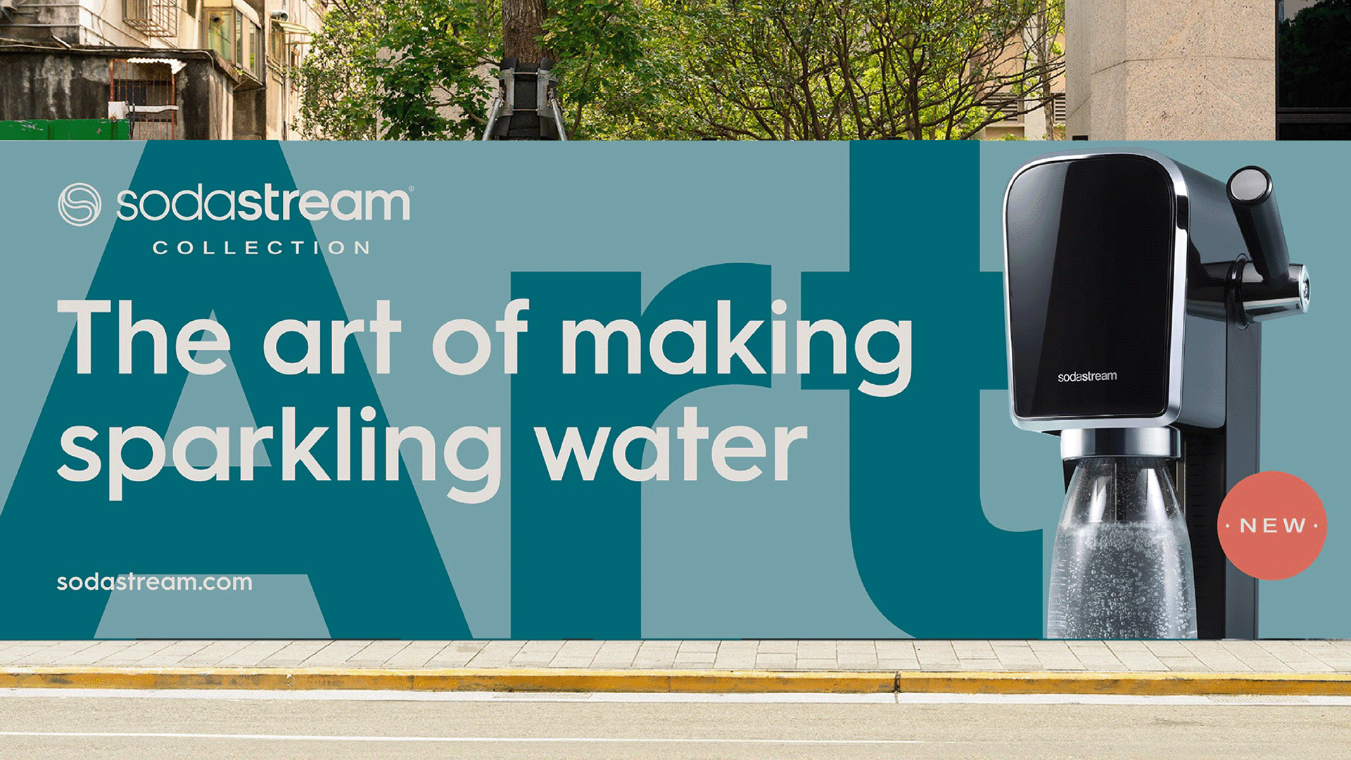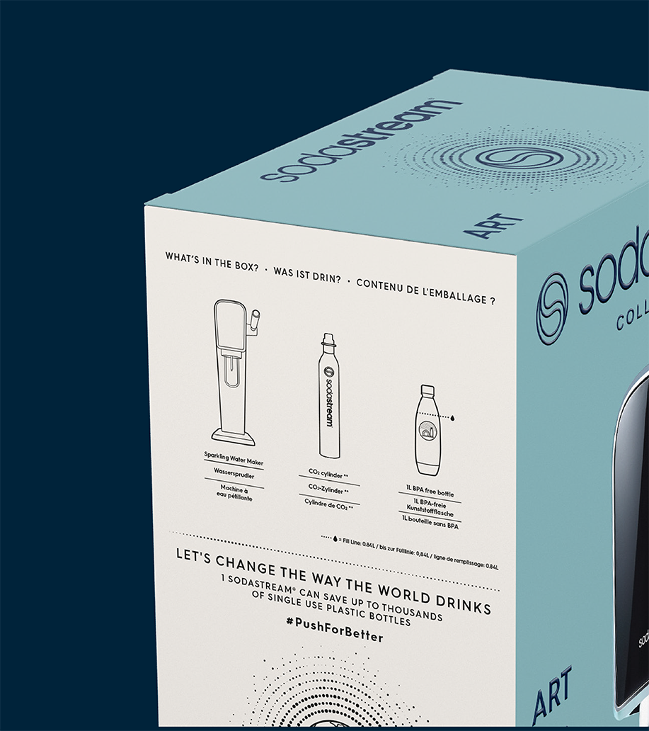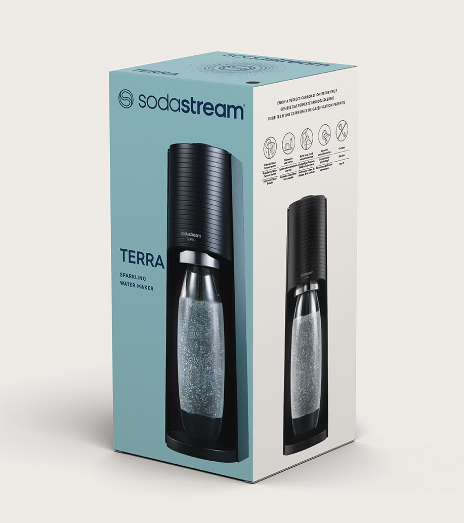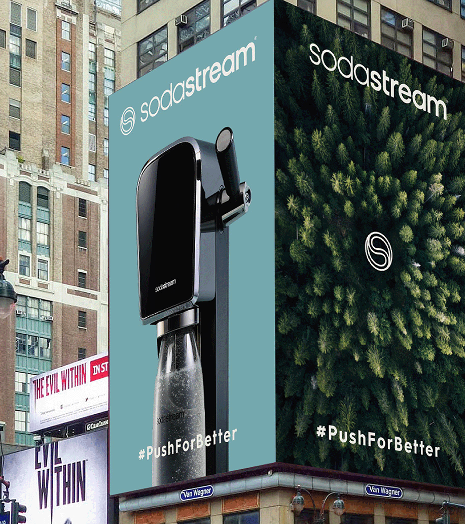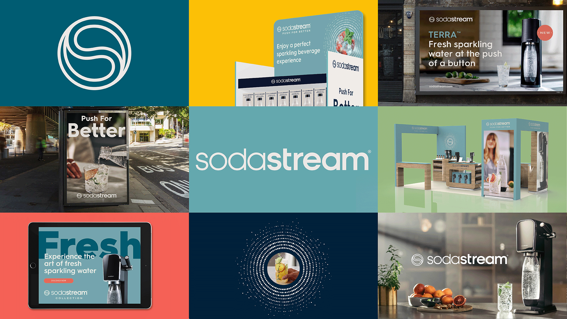

As the trend of making fresh sparkling water at home continues to grow, SodaStream was looking to reassert its expertise and leadership with a full 360° brand repositioning. To tap into its consumers’ growing interest in design, innovation, mixology, and user-experience fields, we partnered with SodaStream to redesign its new visual identity system, packaging and tone of voice – as it introduces a new tier of elevated products.

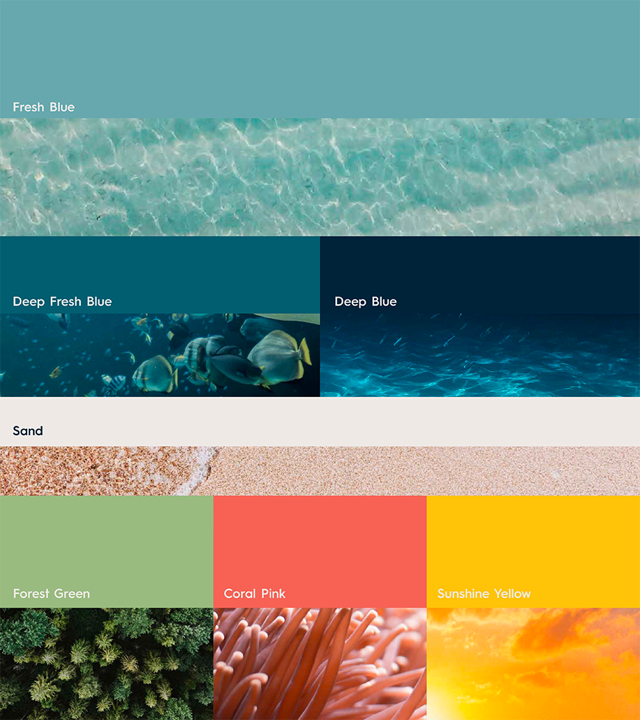
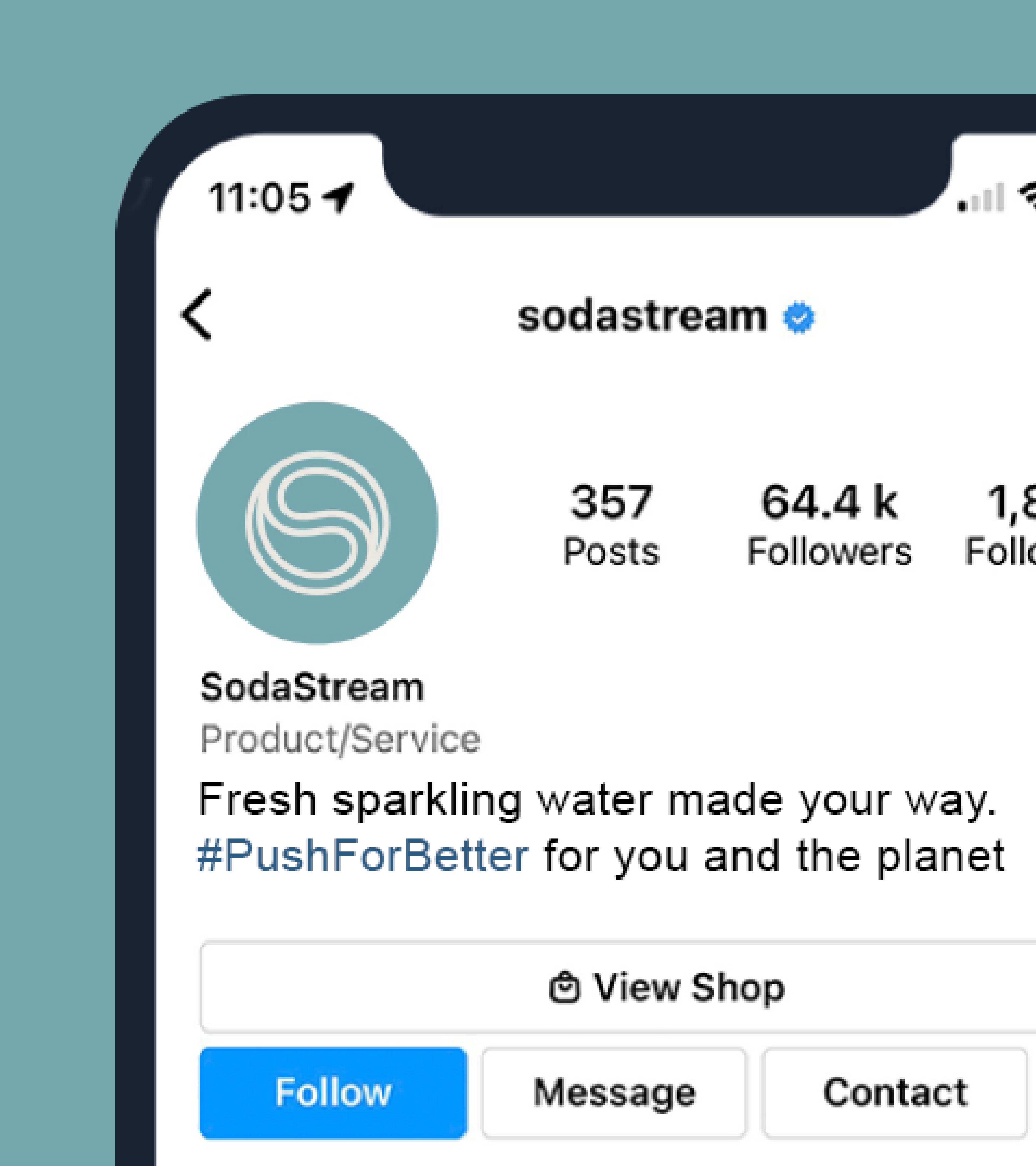
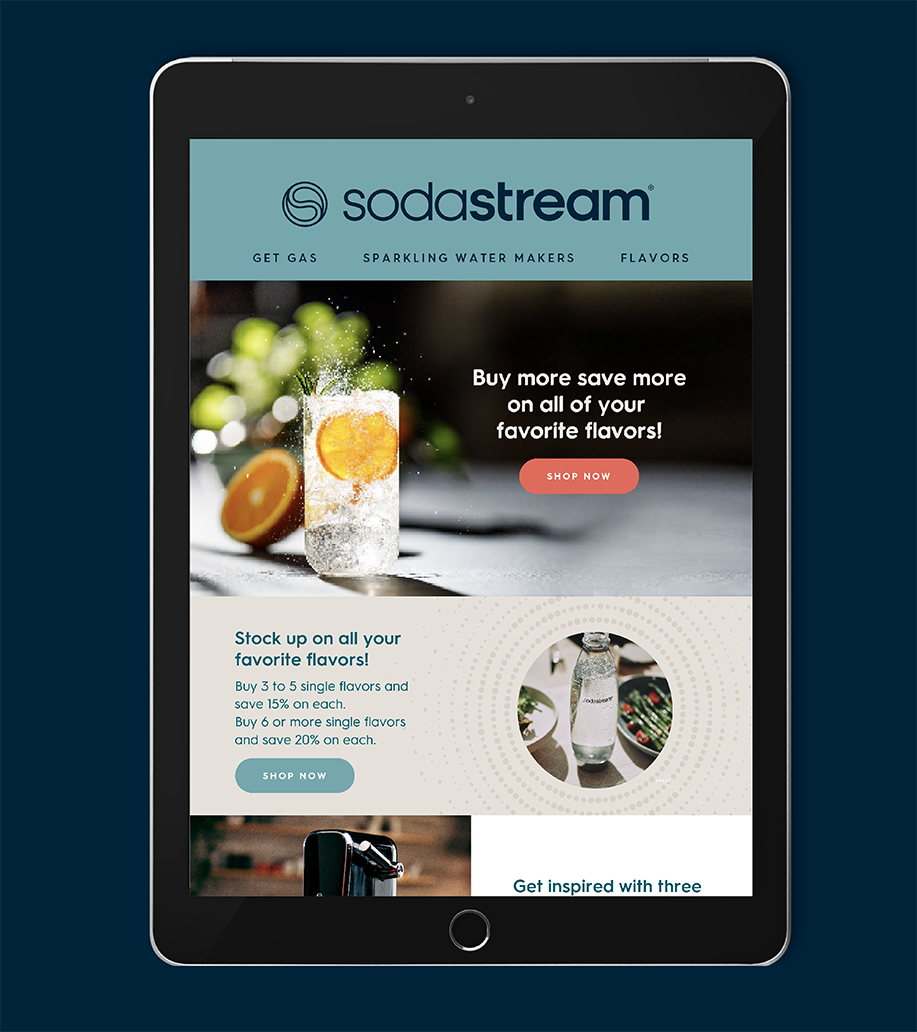
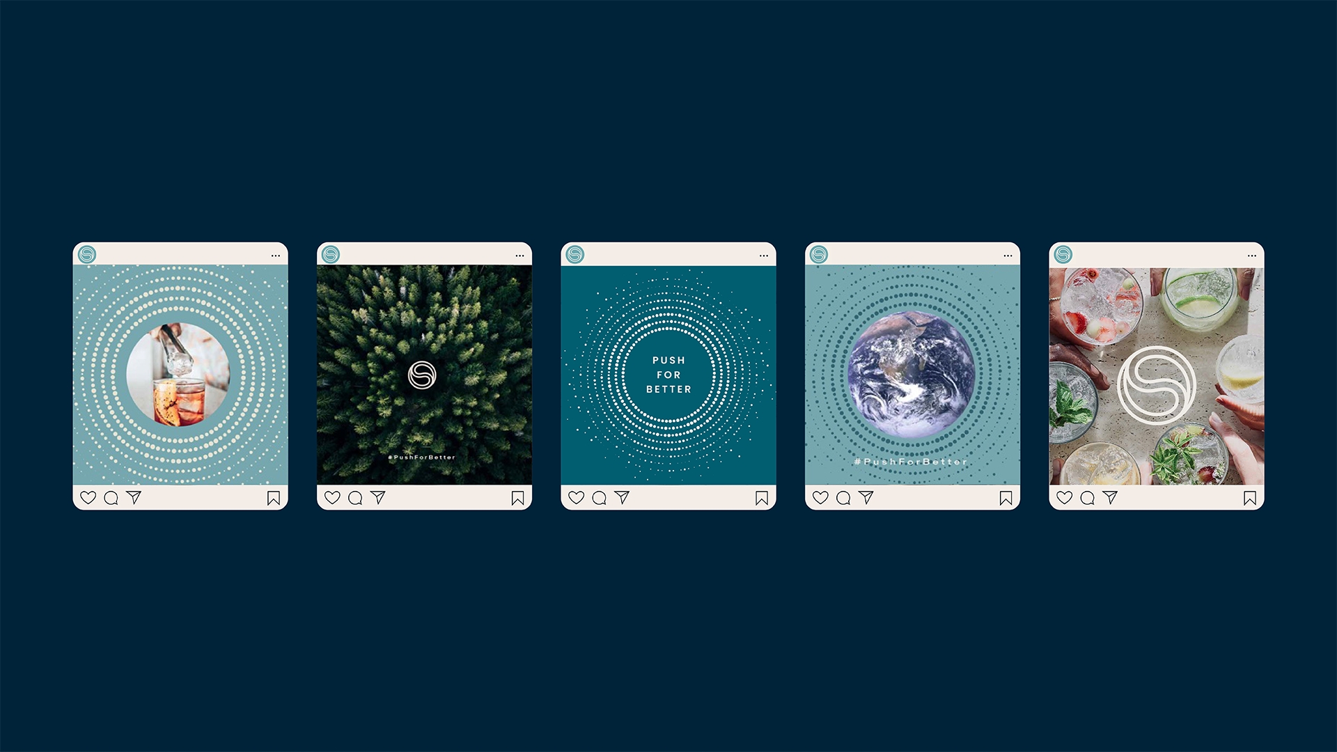
Every aspect of our new design vision and brand experience embodies SodaStream’s trailblazing attitude and stream-of-change mentality as it drives forward its sustainability mission and ‘Push for Better’ call to action. The S symbol acts as the key graphic asset for the brand. Two interlocking water droplets arranged in a Yin and Yang formation to create a signature ‘S’ – depicting balance and harmony, as well as resembling the planet. The contemporary new ‘SodaStream’ wordmark and bubble-shaped typography are a nod to its fizzy core product, while a more natural colour palette of blues and sand adds sophistication across branding, advertising and digital touchpoints.
