Cinnamon Toast Crunch
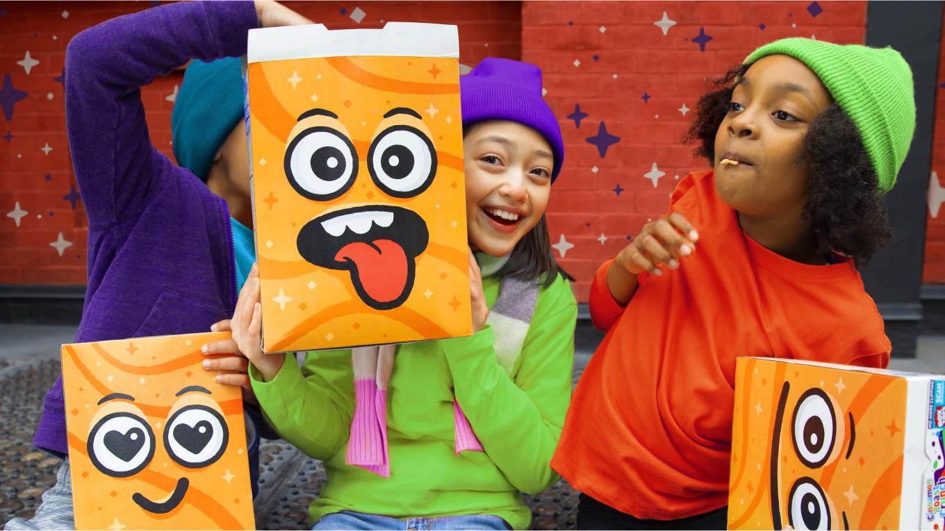
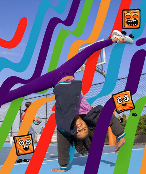
The Cinnamon Toast Crunch brand is known for being one of the most epic combinations of cinnamon and sugar. For this iconic super-brand, we knew we needed a big purpose. We immersed ourselves with tweens, and their world, and found that they are increasingly living as digital natives first, which can have negative effects on their social development and wellbeing. We focused on this challenge head-on, to infuse all brand activities with I.R.L. (in real life) moments to create an effective brand communication strategy, with a focus on encouraging interaction and spontaneous, messy experiences in and out of the home.
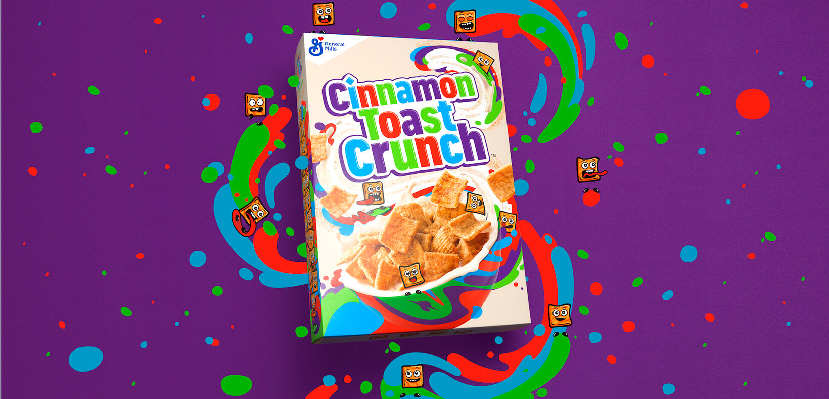
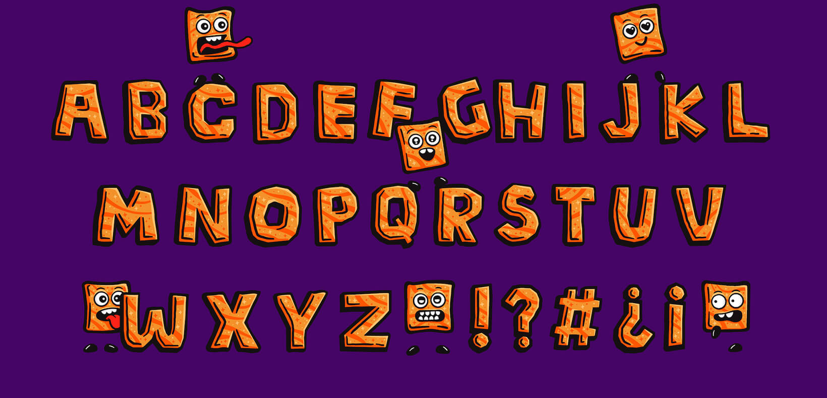
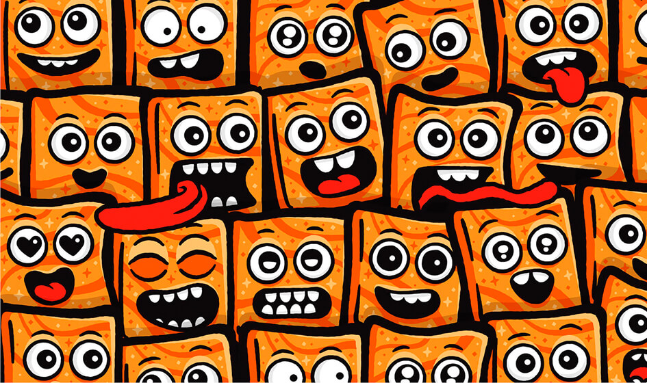
The foundation we created for the brand enables multi-sensory experiences through a set of key brand colors, including cinnamon-like hues, that swirl and mix (but never muddy) to make a vibrant impact. The interactive and multi-sensory elements continue with the 16, new ‘Cinnamojis’. These hand-illustrated characters are reminiscent of a cartoon-like world. Whether they’re animated or still, each of the Cinnamojis communicate unique expressions through lively sets of eyes or an often stuck-out tongue.
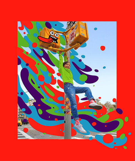
To elevate the brand communication and extend the iconic equities of the cinnamon breakfast cereal and milk, we created two bespoke letter illustrations. The first is a fully formed alphabet modeled after the cinnamon cereal shape, while the other typeface is a milk text illustration, resembling the liquid-like cinnamon speckles that form in each bowl.
Each element of the Cinnamon Toast Crunch rebrand combines to immerse our senses in ever-changing moments, making way for endless possibilities with new sights, sounds, smells and sensations.
