Bringing delight to an American icon’s visual identity
Driscoll's faced a unique branding challenge: in a largely unbranded category, they sought to forge a more emotional connection with their audience as they planned for greater global expansion.
Get in touch.
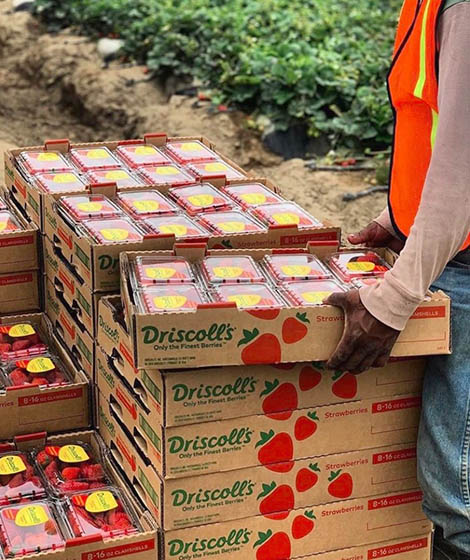
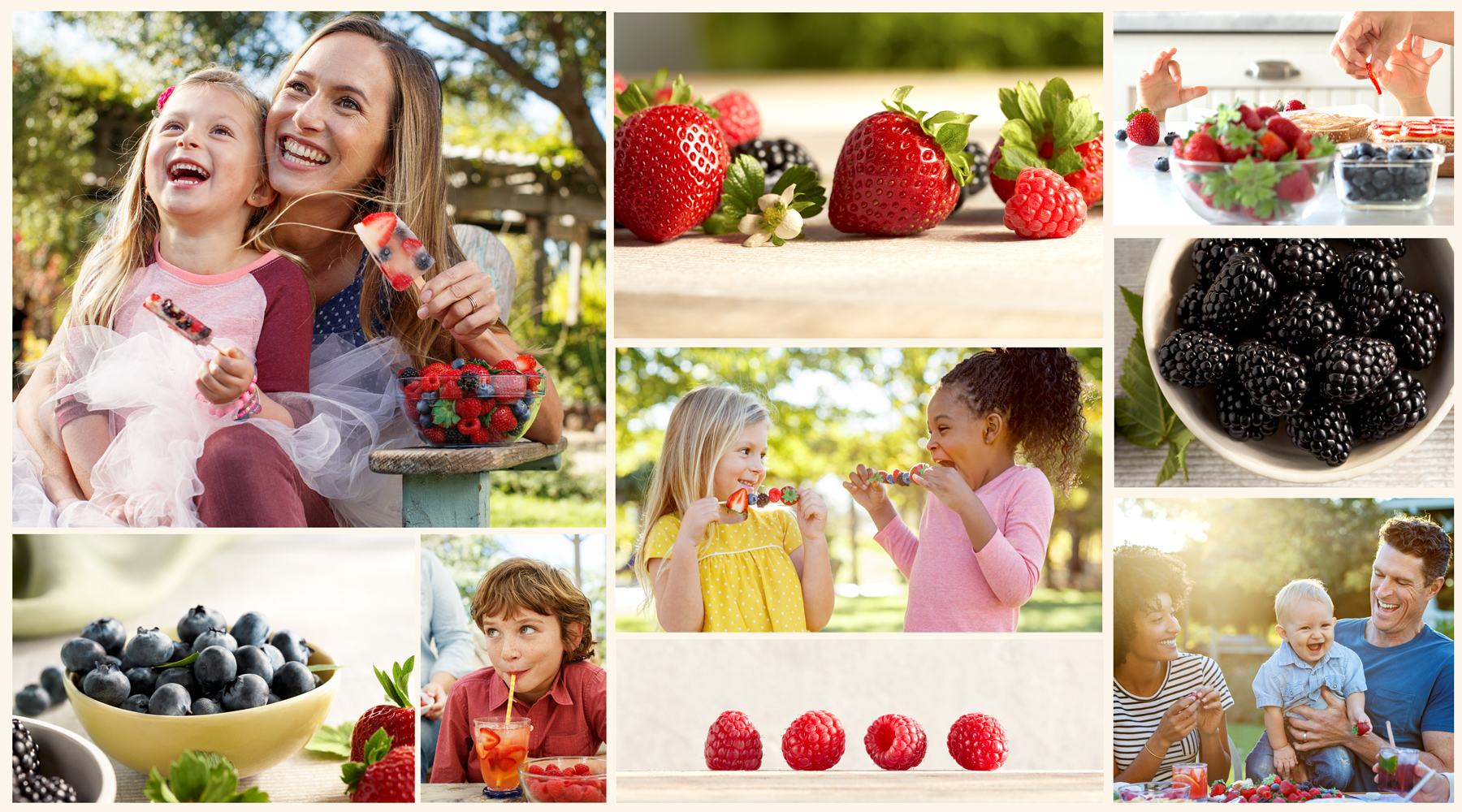
In a field of local growers and unbranded peers, Driscoll’s is always poised to share moments of berry joy on their way to global expansion. When Driscoll’s berries are added to the mix, they make ordinary moments more special. Thus, the opportunity was ripe for Driscoll’s to elevate their brand by forging deeper emotional connections and building stronger bonds with consumers.
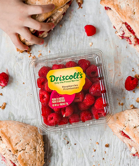
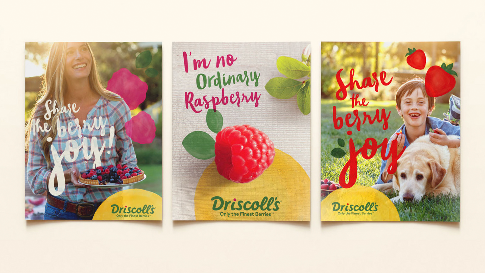
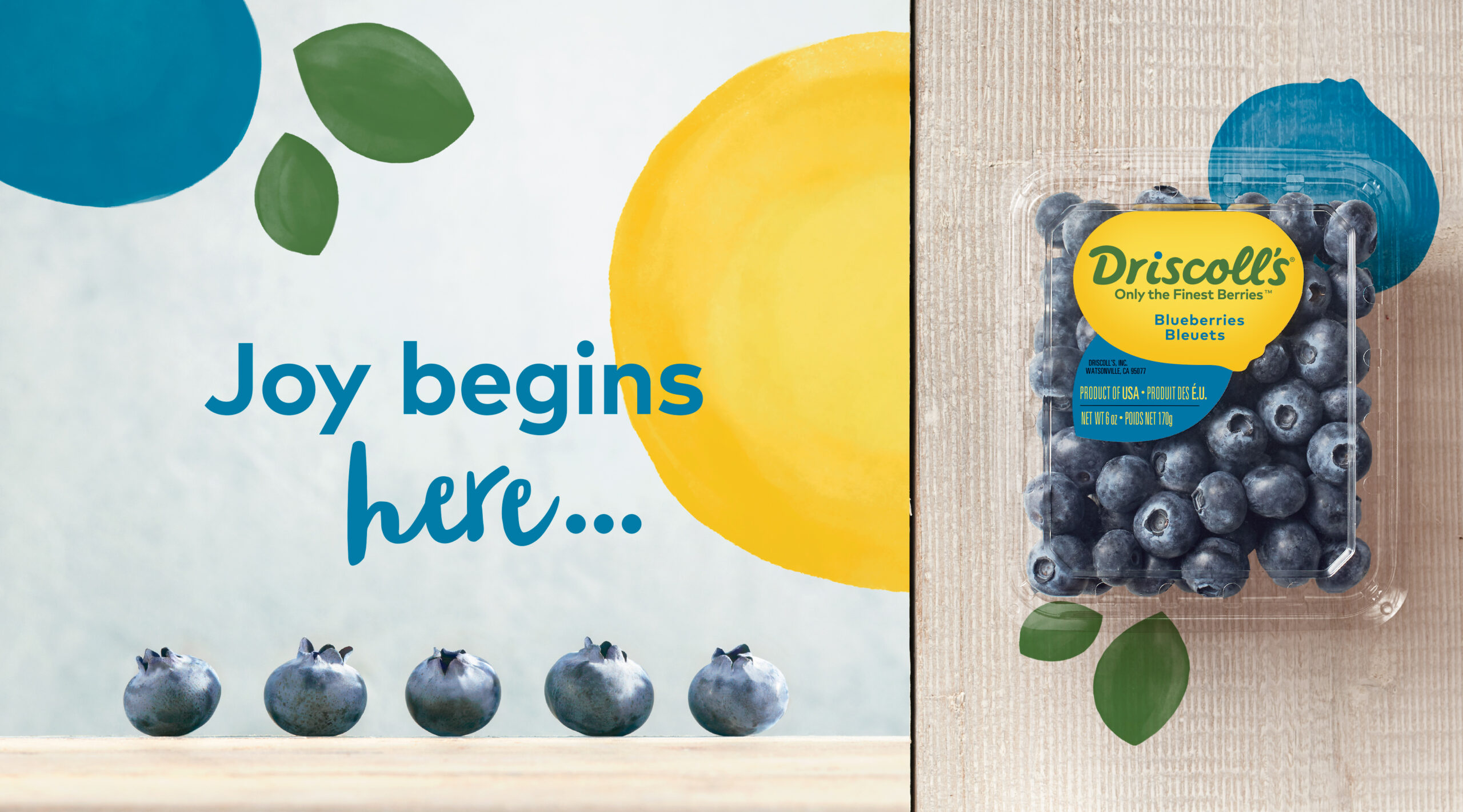
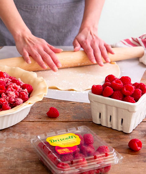
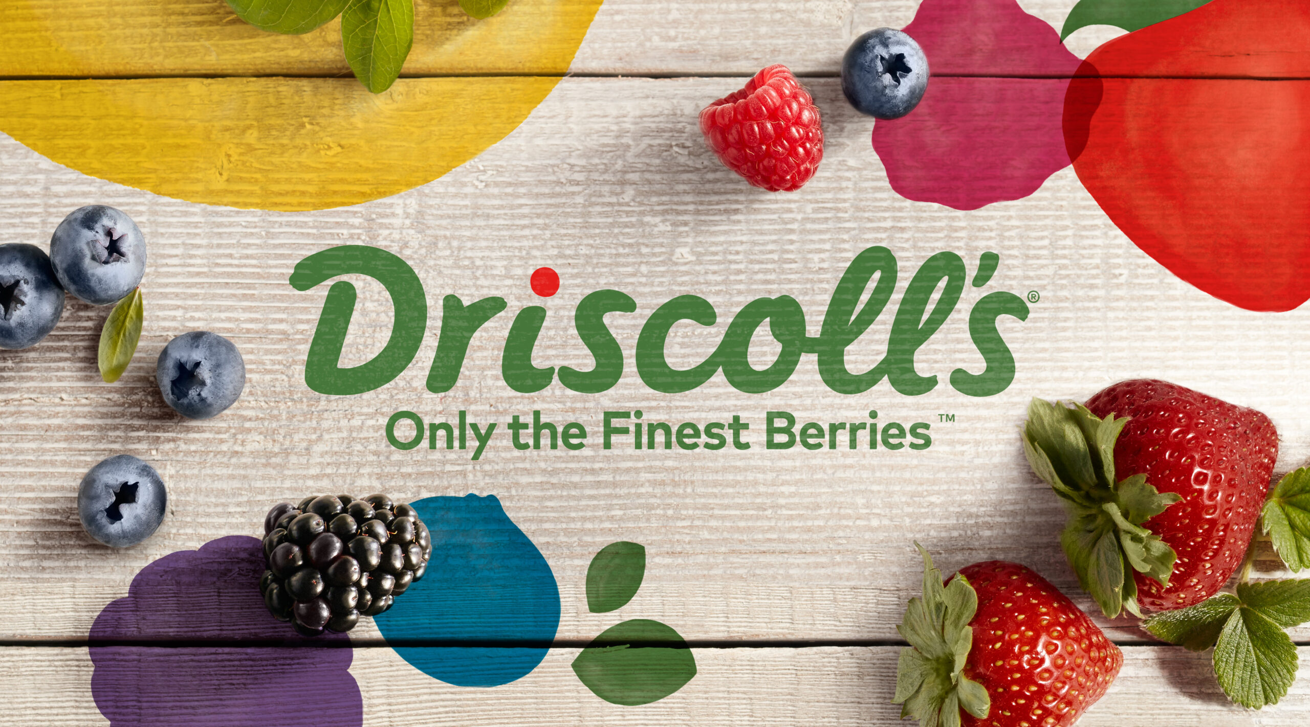
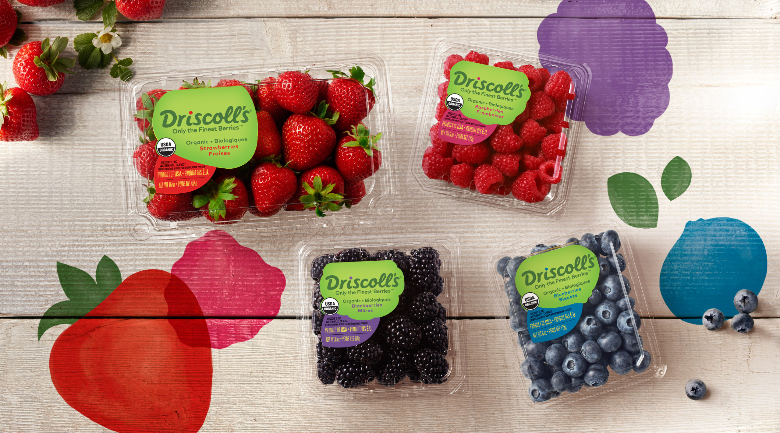
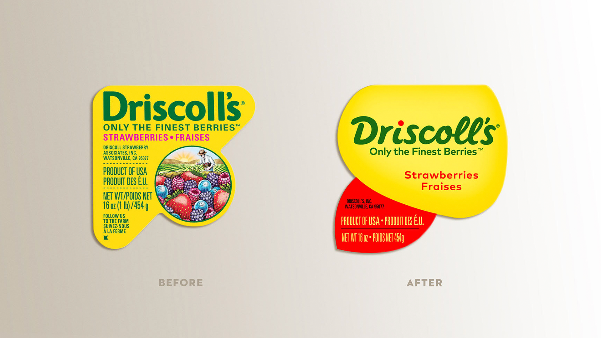
To make this powerful brand idea universal, we created a suite of strategic tools and an expressive, new identity. The handcrafted design reflects the care that goes into growing their berries with a palette that varies to match the color of the produce and the natural green of the plants themselves.
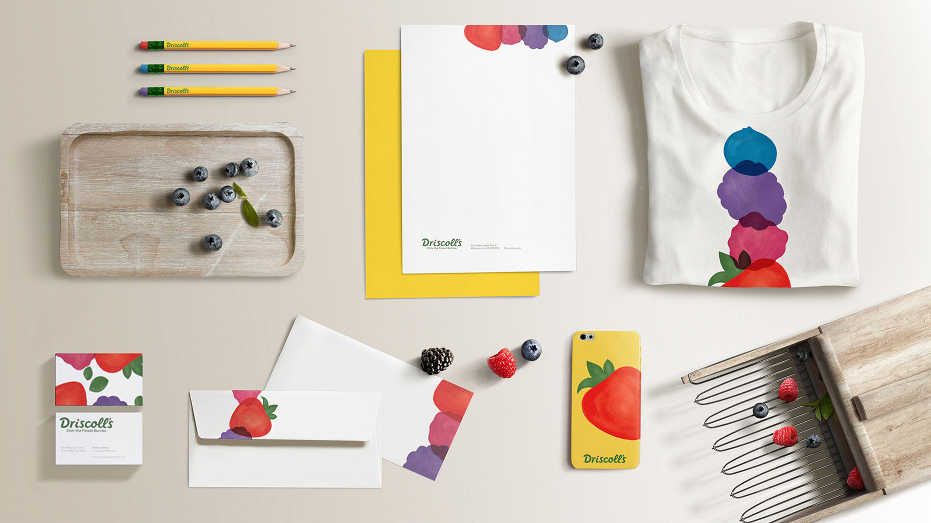
To celebrate Driscoll’s limited-edition batch of berries, we also collaborated on the premium label designs for the pink Rosé Berries and Sweetest Batch collection. The result is a vibrant, dynamic and flexible brand that is as delightful as the berries themselves.