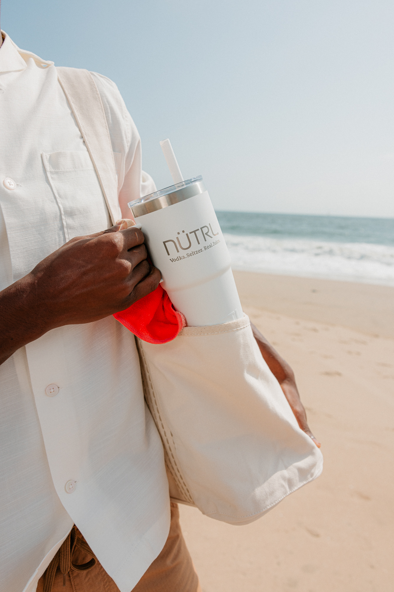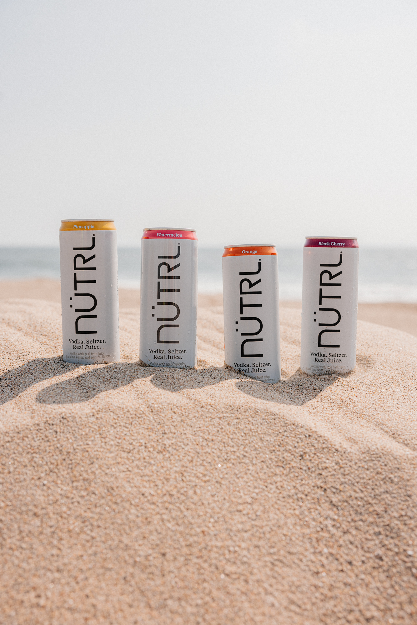
Working closely with the ABI teams, Pearlfisher’s strategists and designers audited the existing brand assets to understand how they were delivering in the category and created a design strategy that focused on a refreshed evolution. Our design team developed a cohesive system by applying subtle shifts to make the biggest impact. We nurtured visual equities designed with flexibility and approachability in mind, crafting a visual identity that’s not only unmissable, but also actively speaks to the consumer through revitalized, refreshed packaging identity.
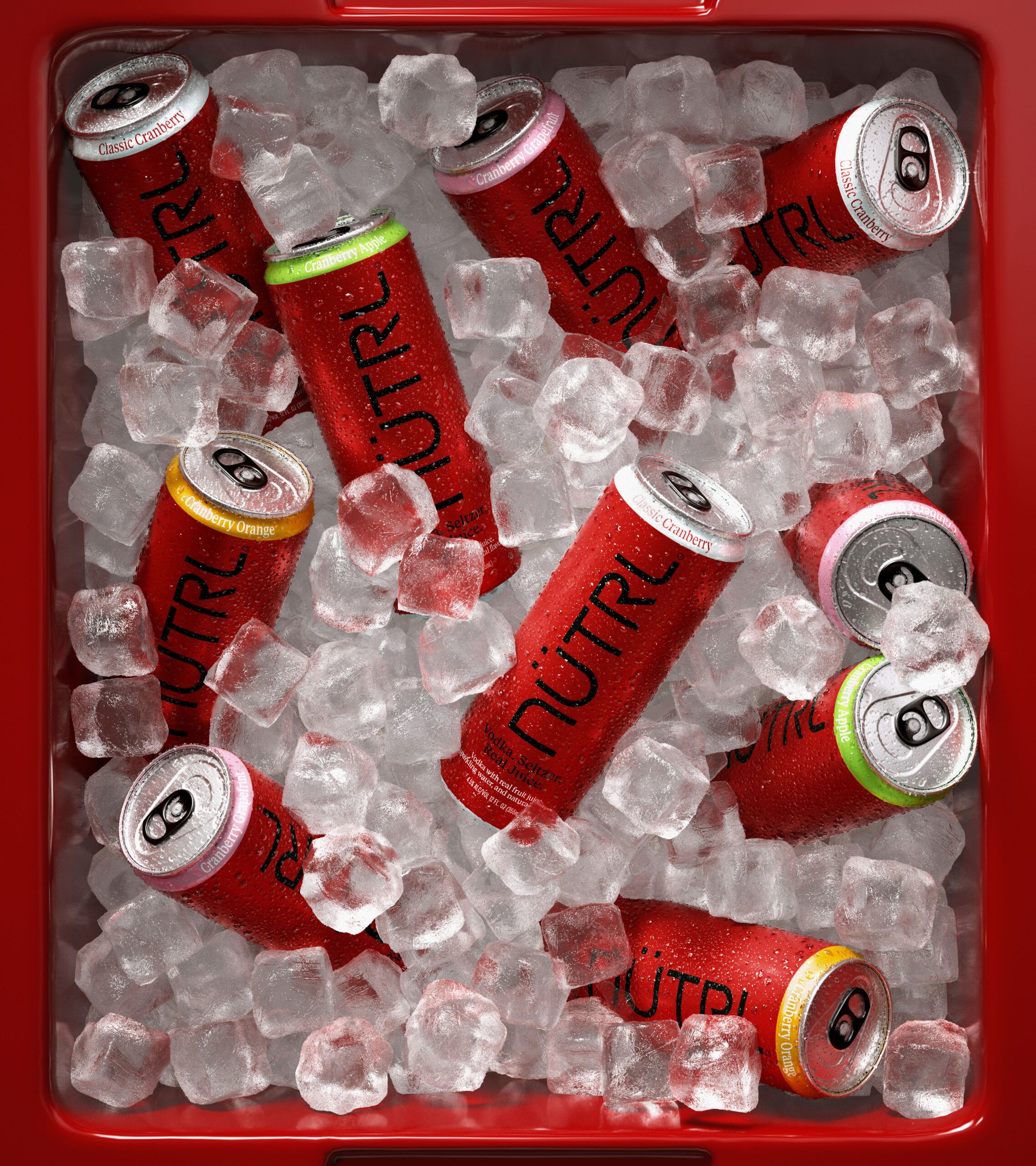
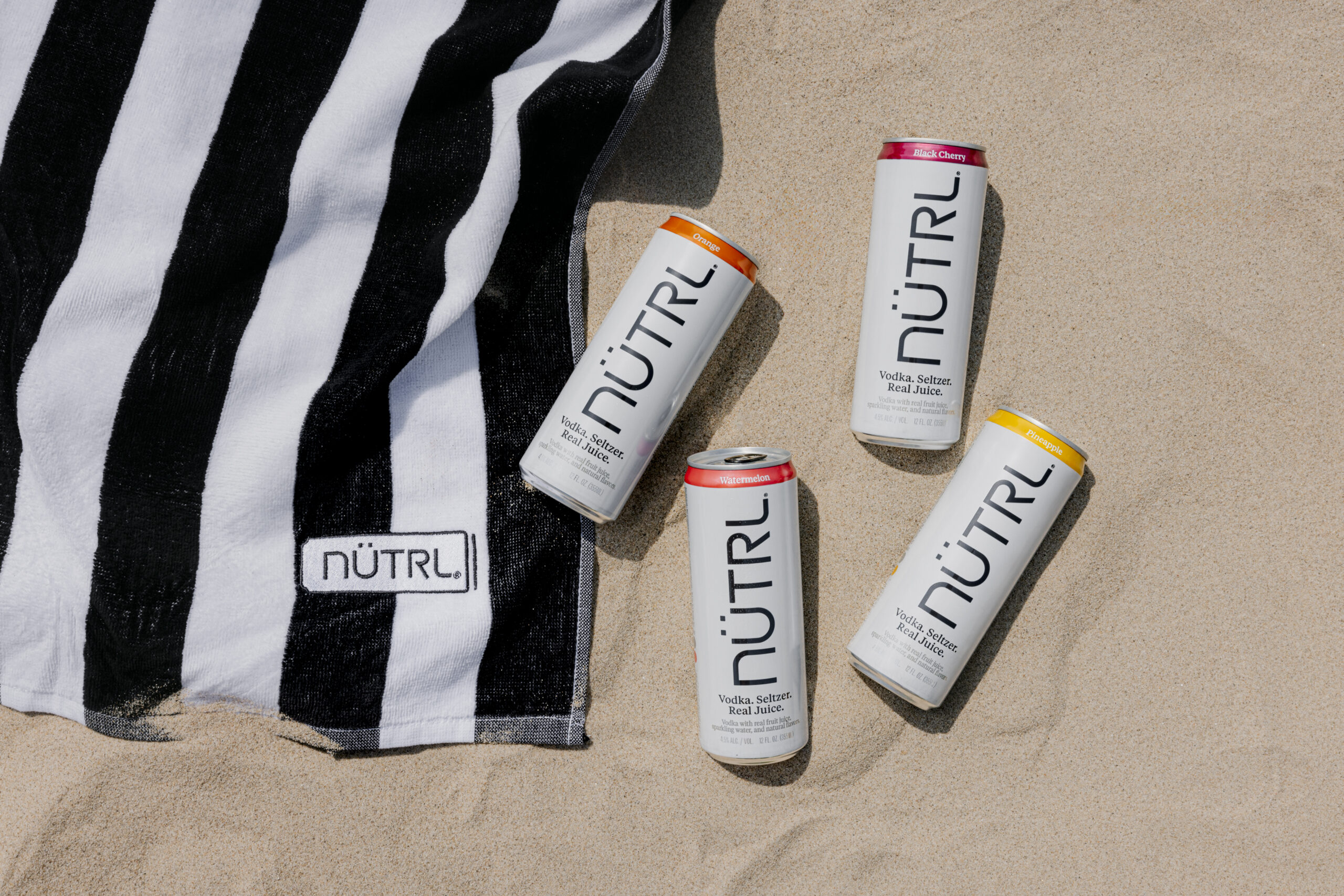
With an eye toward simplicity, our design team also sought to refine and elevate the brand’s equities to better communicate its value proposition to the consumer. From tightening and cleaning the logo, to clarifying the typography, to freshening the color palette, we optimized each element—big and small—in meaningful and impactful ways.
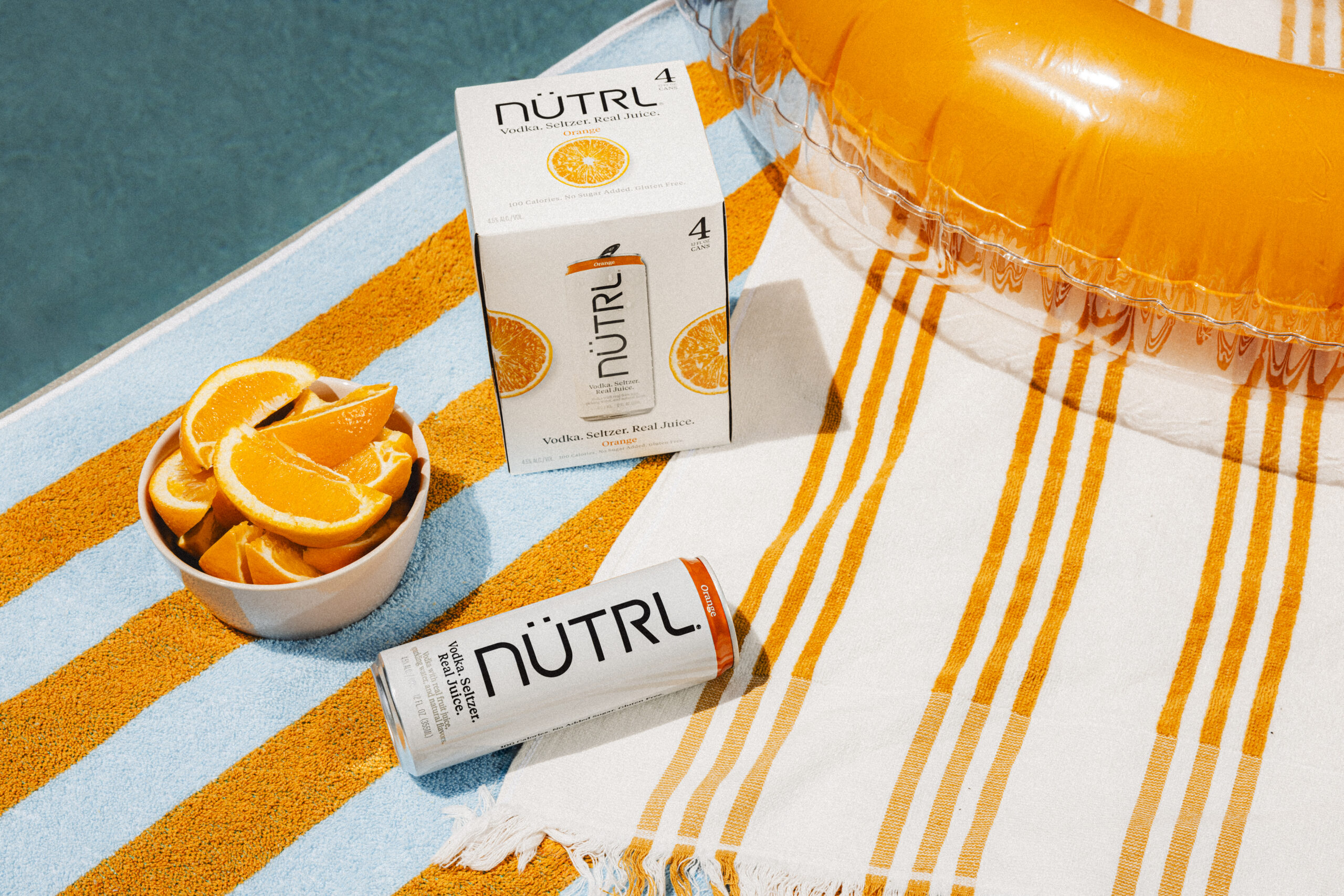
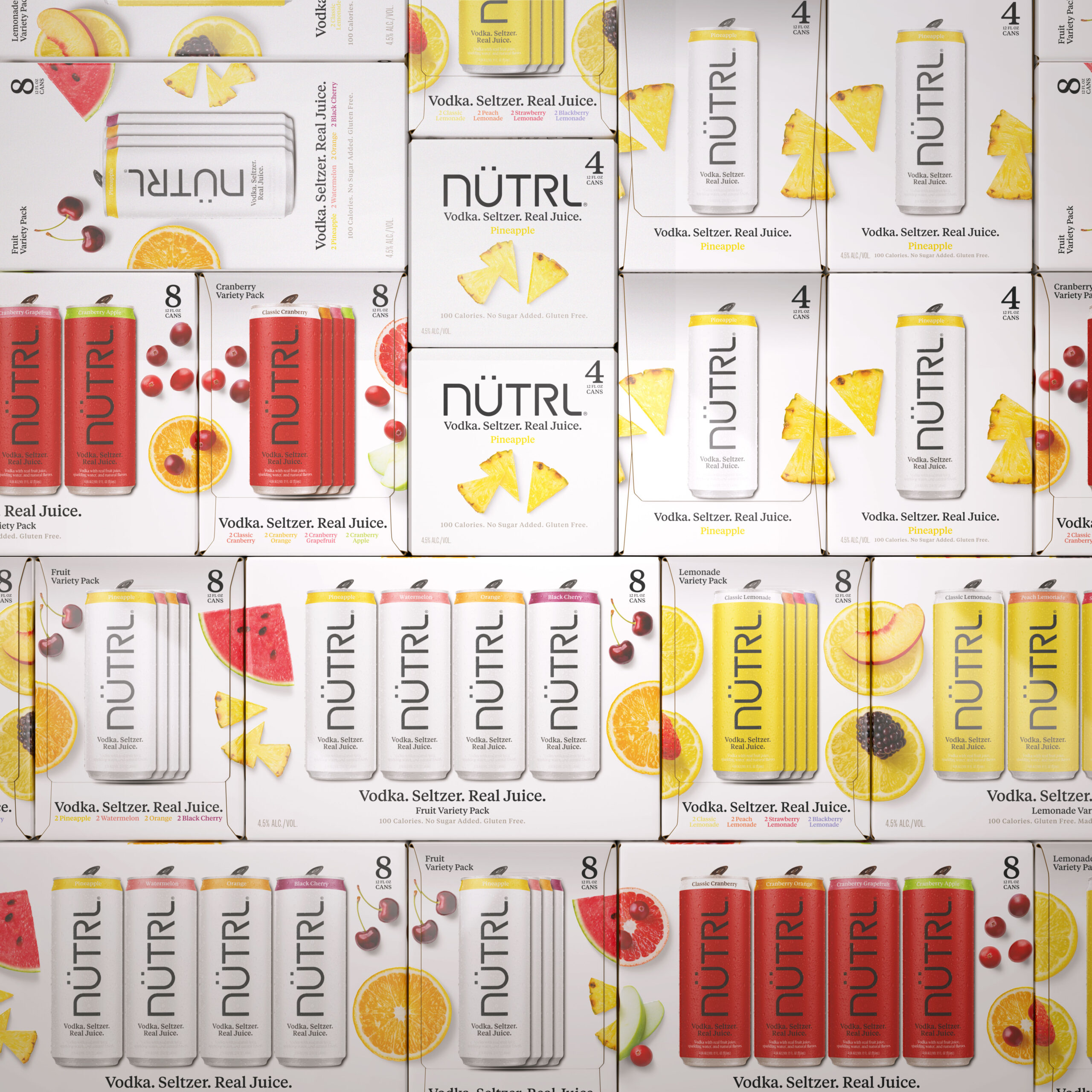
We also applied consistent and intentional touches across the portfolio to create a clearer relationship and more interaction between the single flavor packs and secondary variety packs, as well as performance across multiple in-store environments.
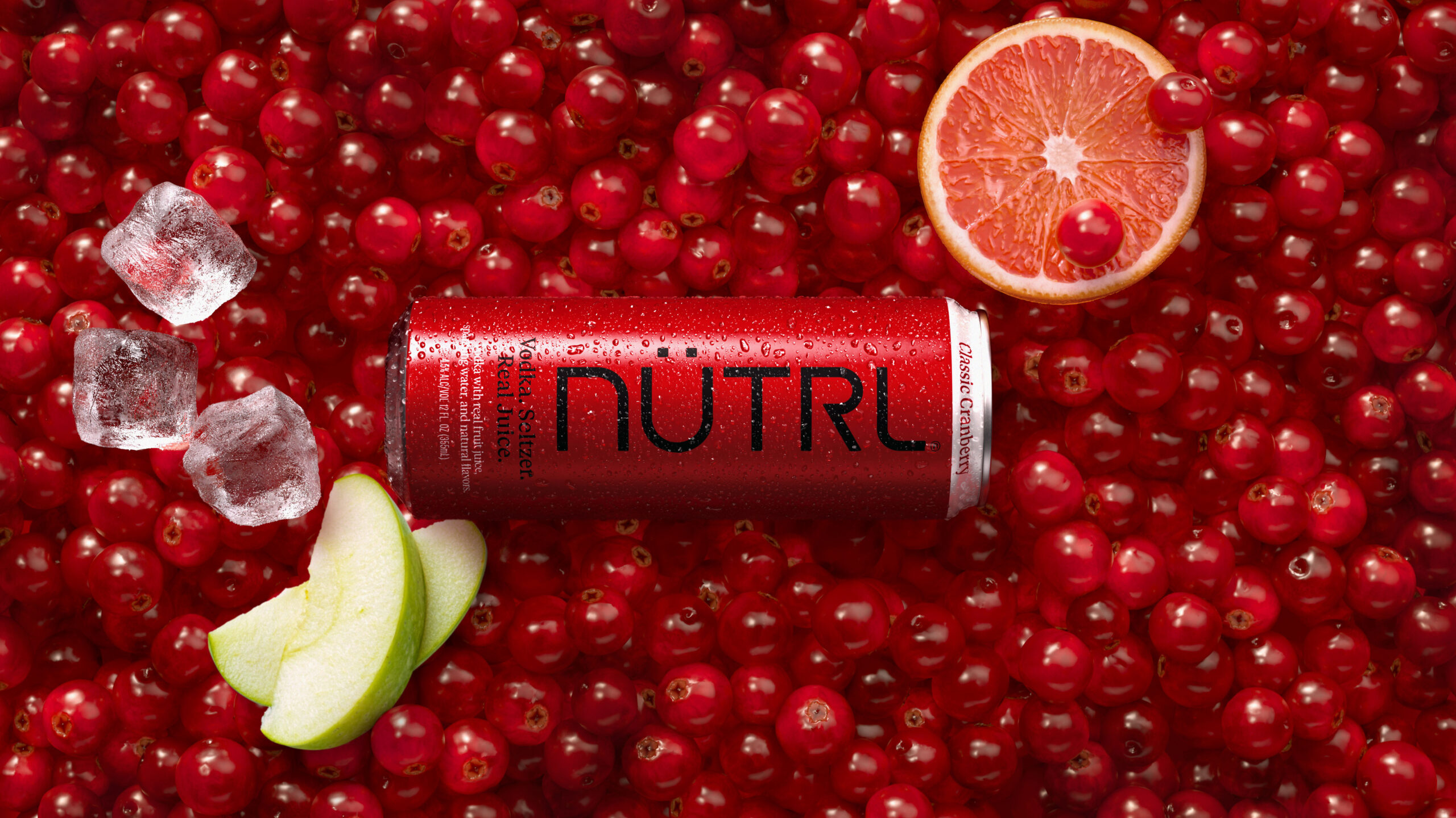

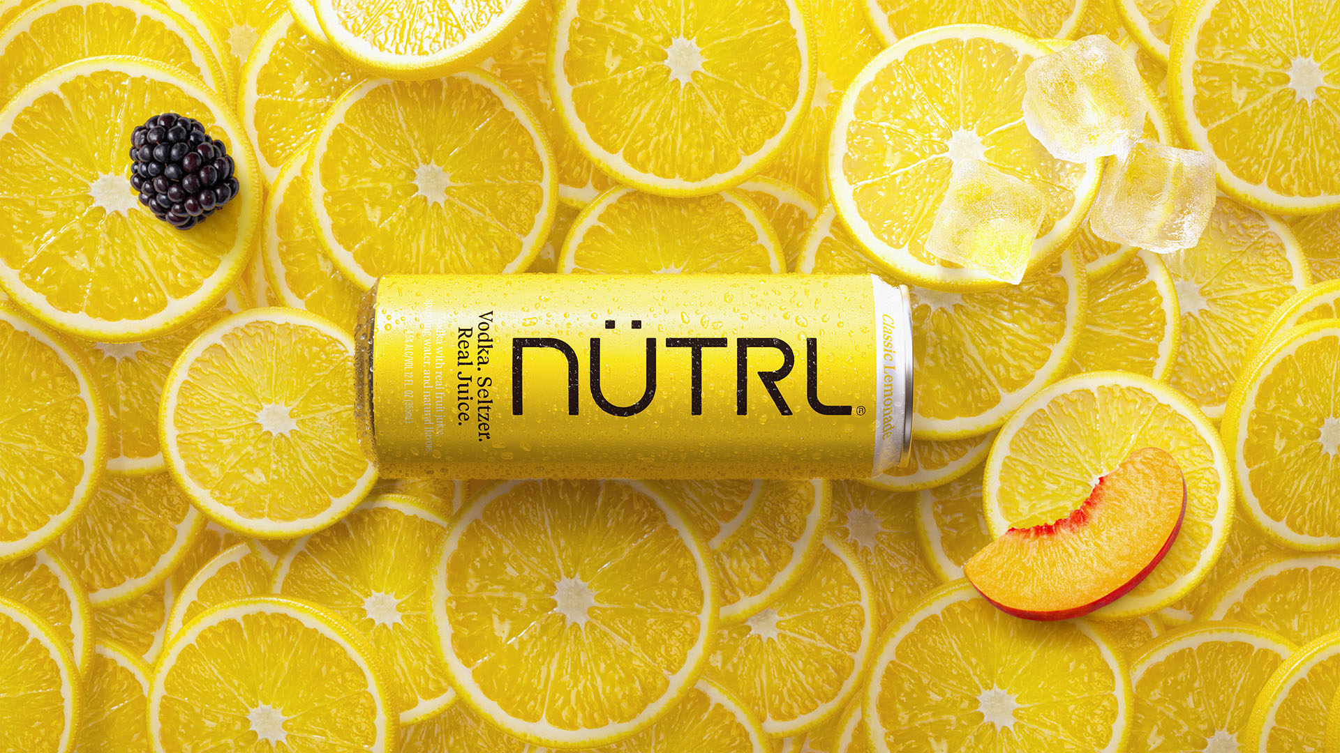
To ensure that the freshness and realness of the fruit imagery worked in full support of NÜTRL’s commitment to using real juice, our visualization team conducted a bespoke in-house photography session. From direction and lighting, to food selection, styling, and retouching, every detail was crafted to amplify natural flavor.
