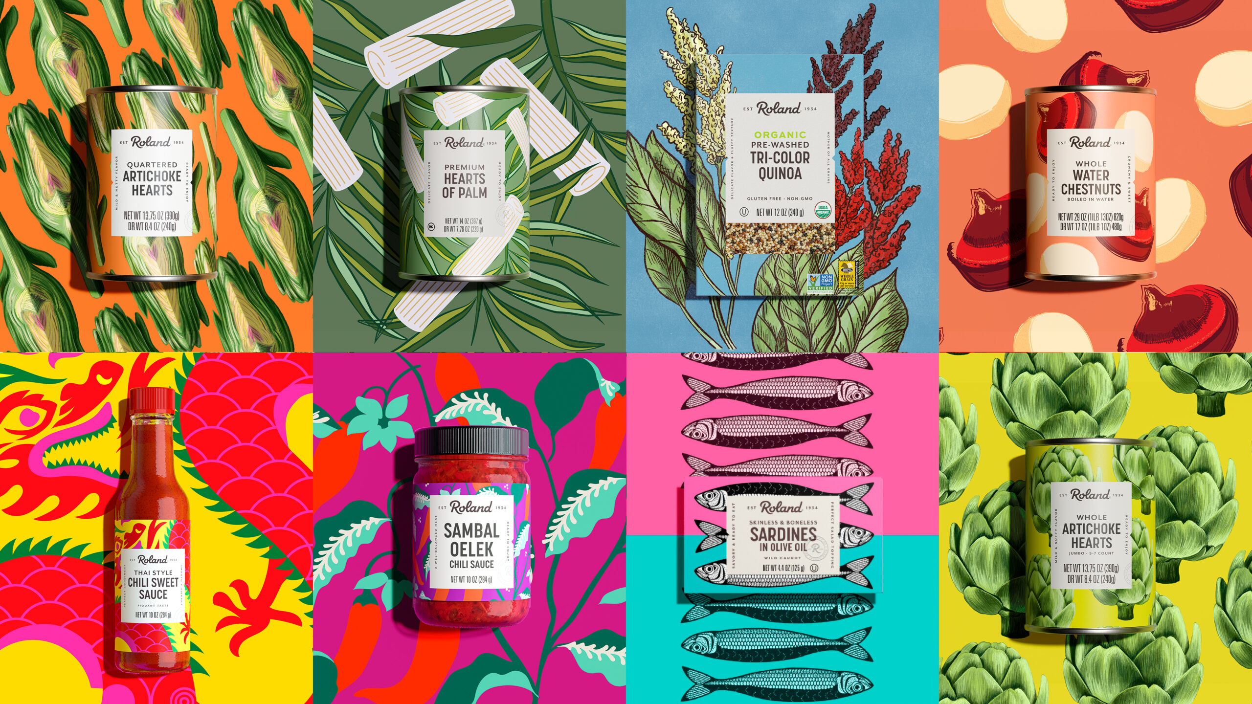
Despite decades of cultivating an impressive and diverse portfolio, Roland Foods lacked visual consistency across their products. We needed to leverage the overlap between what makes Roland special and what people want today as they use food to explore, discover and come together.
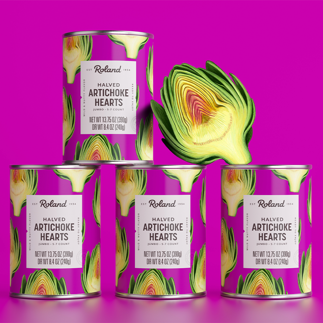
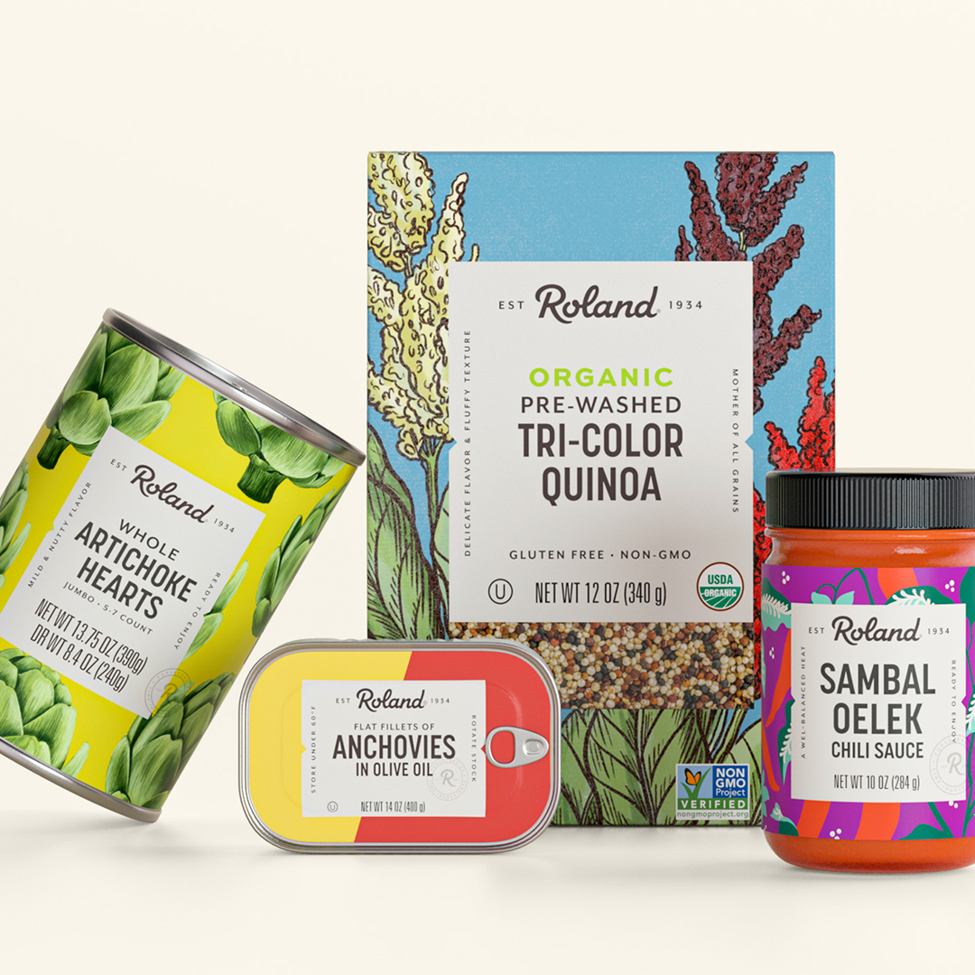
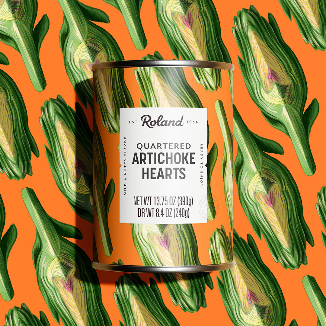
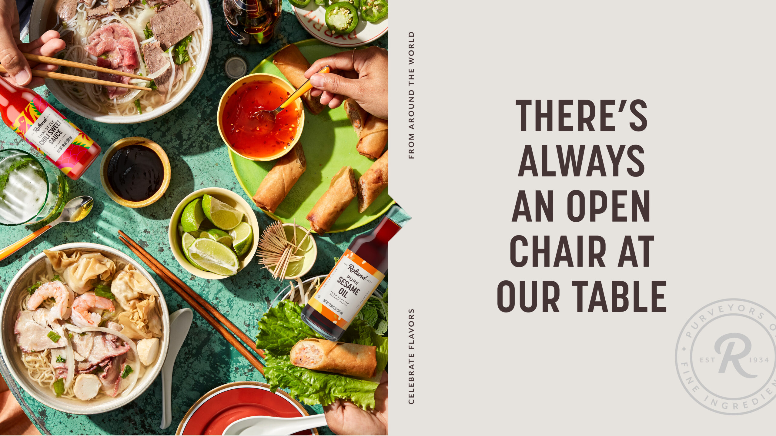
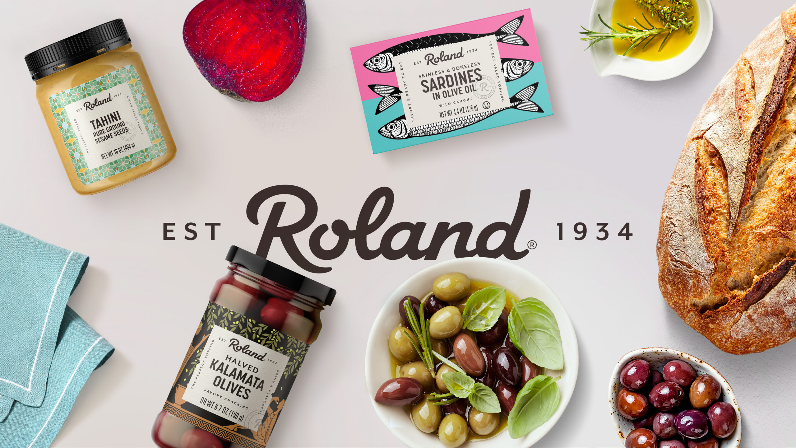
Under the new identity system, the brand embraces variety and allows each product to have its own unique impact while remaining cohesive, united in its celebration of cuisine, ingredients, origins, flavors and food types through vibrant colors and design.
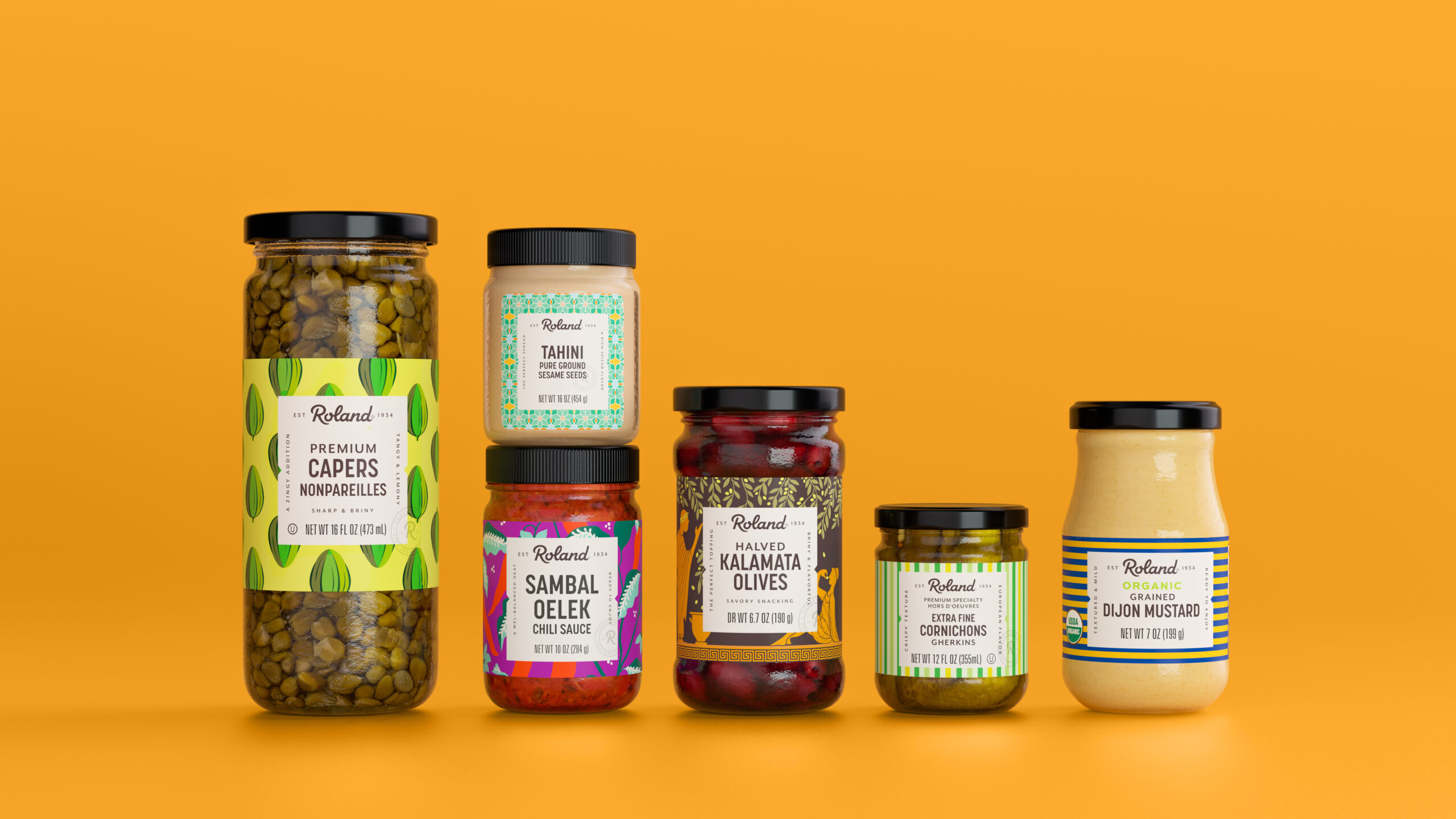
The table element at the center of every pack is designed to symbolize a gathering place where people can come together, share meals and enjoy conversation. The notches resemble that of a ticket or a passport to discovery and innovation. The illustrations flow from emotive to literal environments, invoking flavor profiles that showcase the cultural styles of the regions from which the ingredients are sourced. Roland Foods is now as visually unified, diverse and connected as the people enjoying their foods.
