Sow Good’s cutting-edge freeze dried technology creates lightweight snacks with incredibly rich flavor but much less waste, reducing unused produce waste (for farmers, retailers, and consumers), and lowering shipping emissions. With this goal of eliminating food waste as our guide, Pearlfisher was tasked with bringing this inspiring mission to life through the brand’s strategy, naming, tone of voice, messaging, visual identity, packaging design, and digital design.
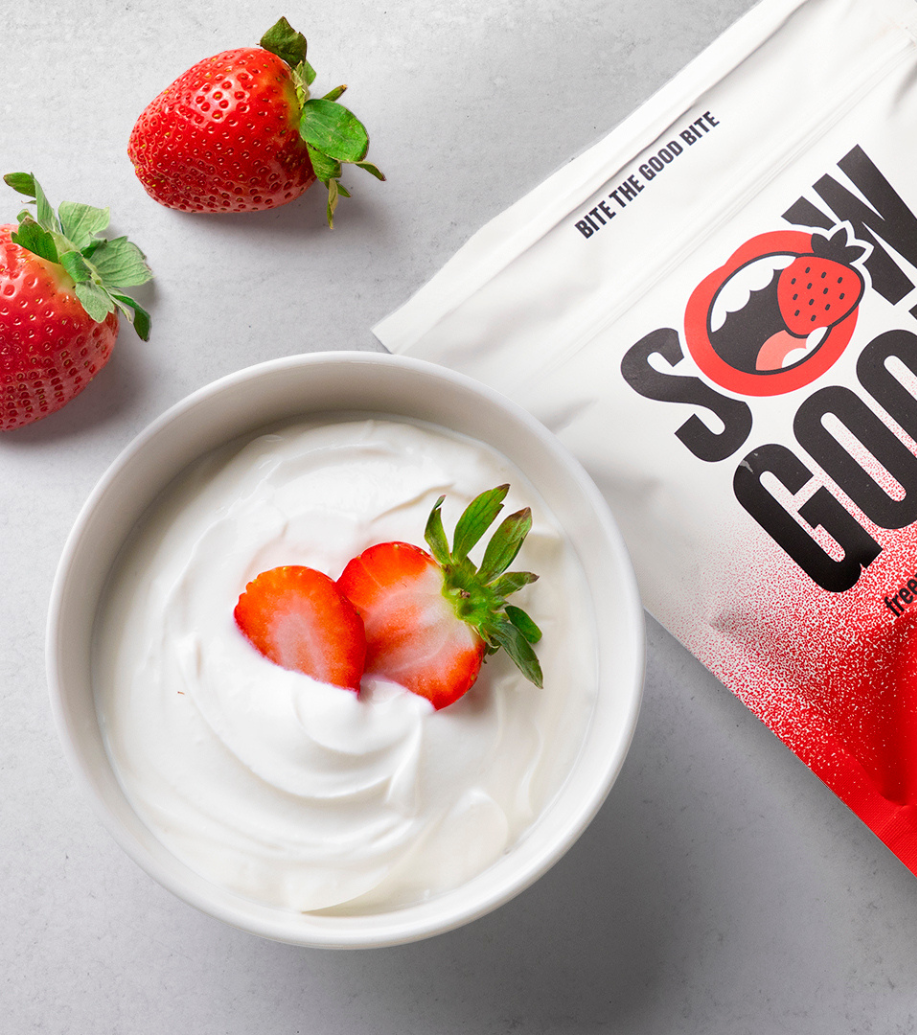
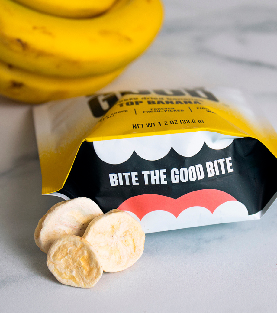
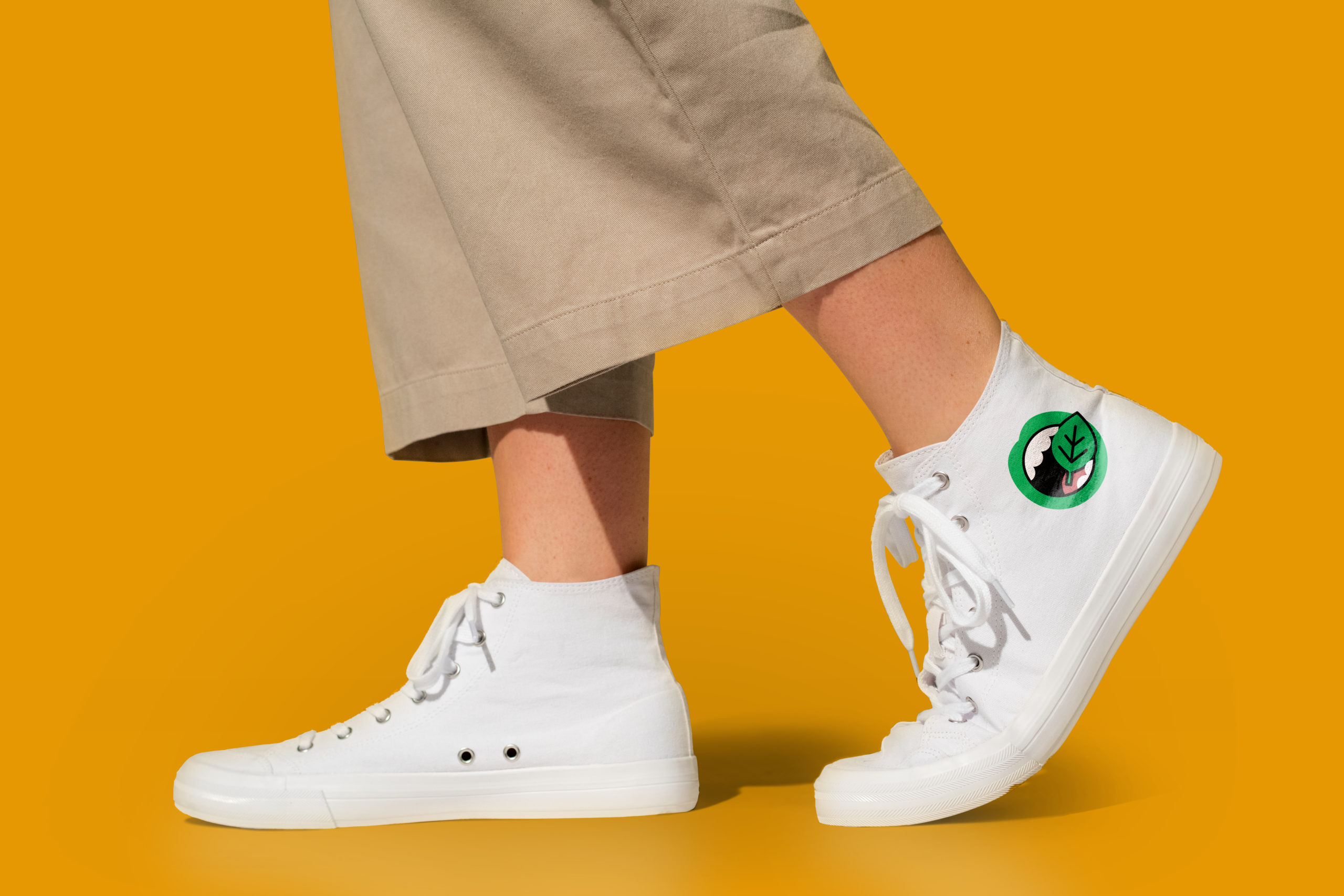
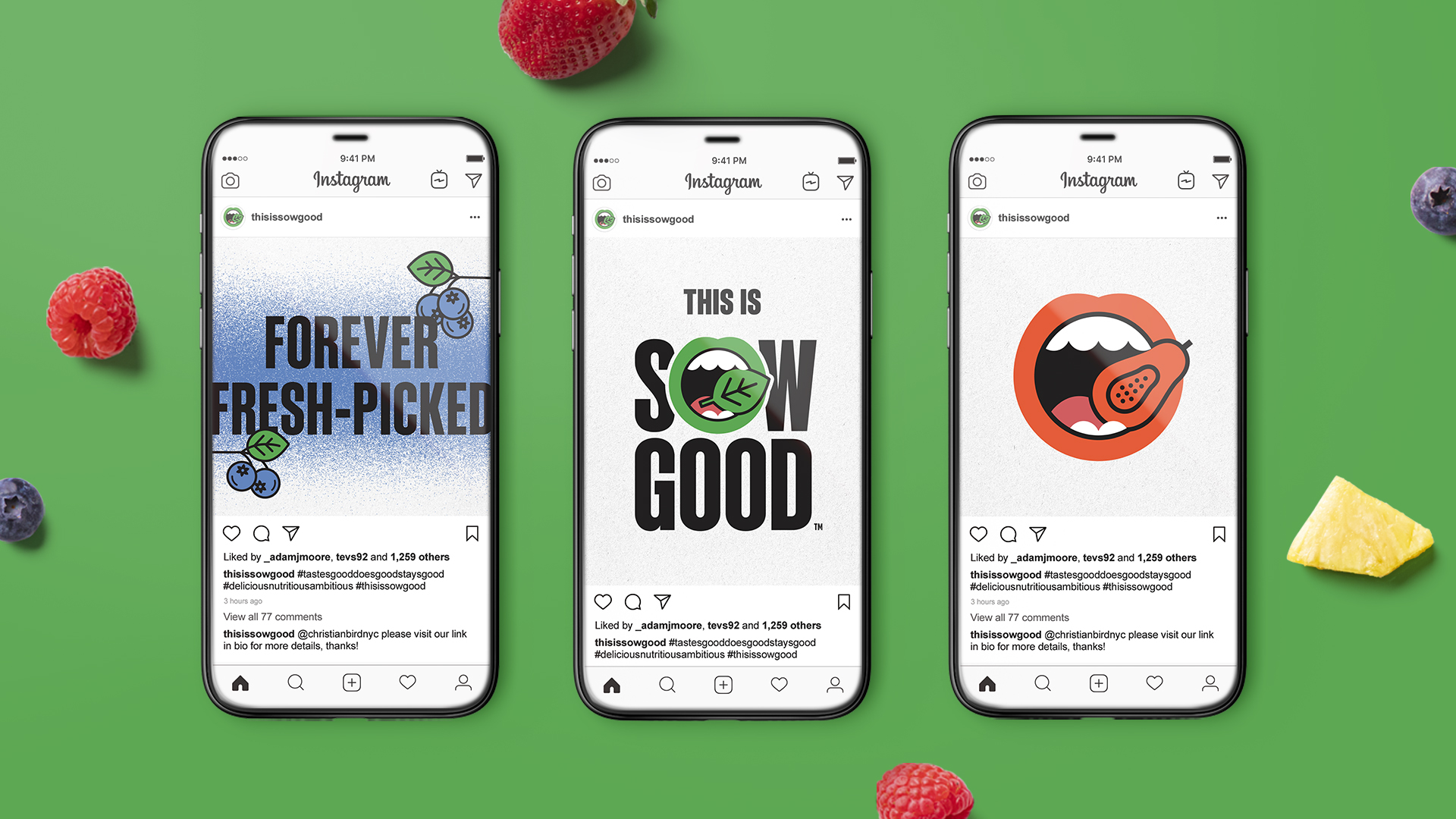
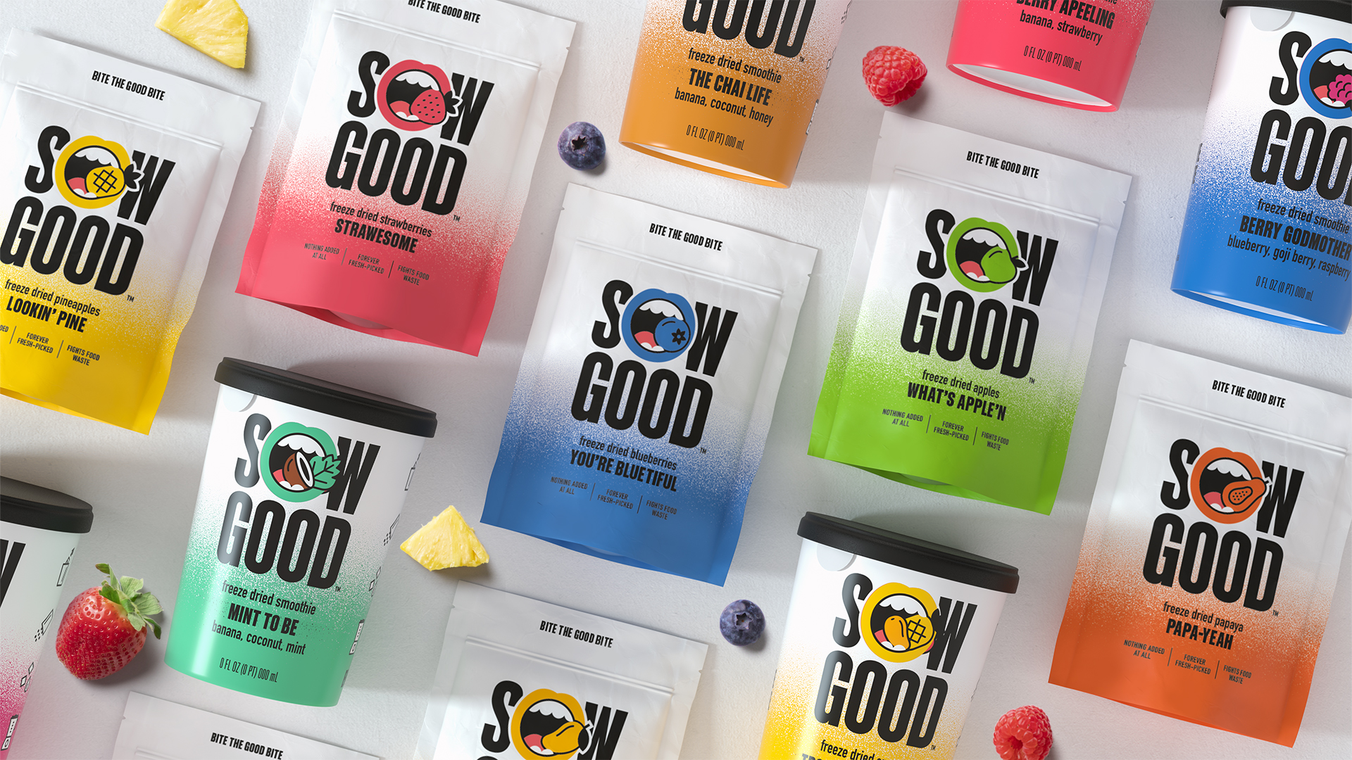
Sow Good is an innovative, open and playful brand. One that wants to immediately engage with and inform its audience about providing a better, more nourishing and sustainable choice. Pearlfisher’s creative solution enabled the brand to “Bite the Good Bite.” The masterbrand identity depicts an open mouth biting down on an illustrated, green leaf icon to speak to the total sustainability of the offer with Sow Good being part of a positive food revolution.

The illustrative fruit and vegetable icons live within the mouth identity with the color of the lips always representing the main flavor of the product. Almost becoming their own emoji, they come to life across all touch points, from depicting the process of making a smoothie on back-of-pack, through to merchandise and digital where they animate with a bite being taken from them on scroll over.
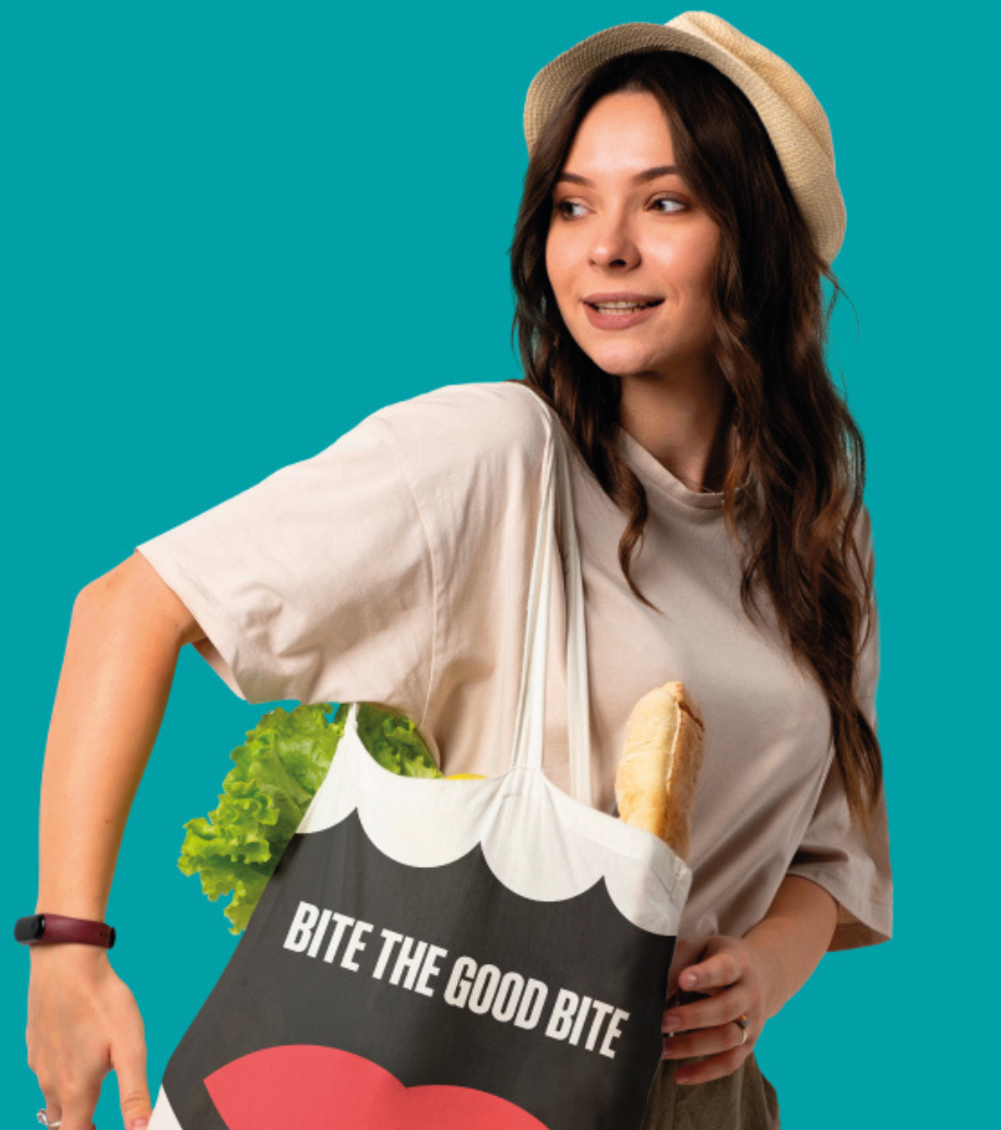
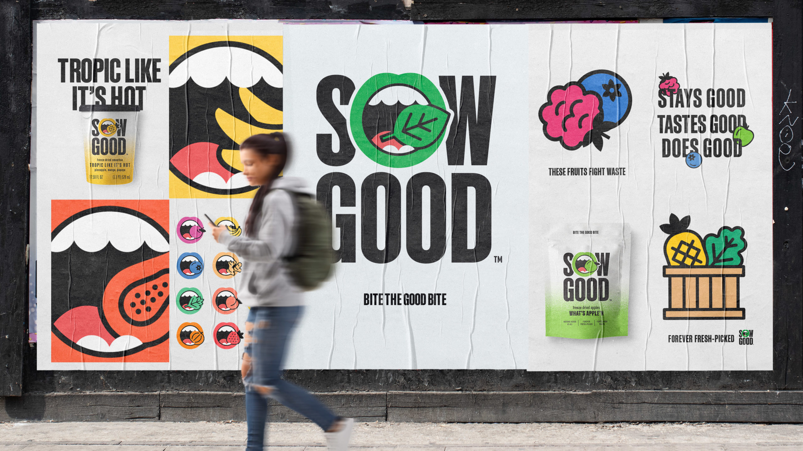

Pearlfisher’s strategy team undertook all copywriting and tone of voice, from play-on-word product naming – such as “What’s Apple’N” and “You’re Bluetiful” – to key messaging and taglines that bring to life the daring and clever nature of Sow Good just as it is written into the brand DNA: D (Delicious). N (Nutritious). A (Ambitious). With the digital design of thisissowgood.com, Pearlfisher wanted to create a playful yet straightforward direct to consumer e-commerce experience to match the brands’ premium offering, enriching user experience and strengthening connections with its customers.
