UNFI
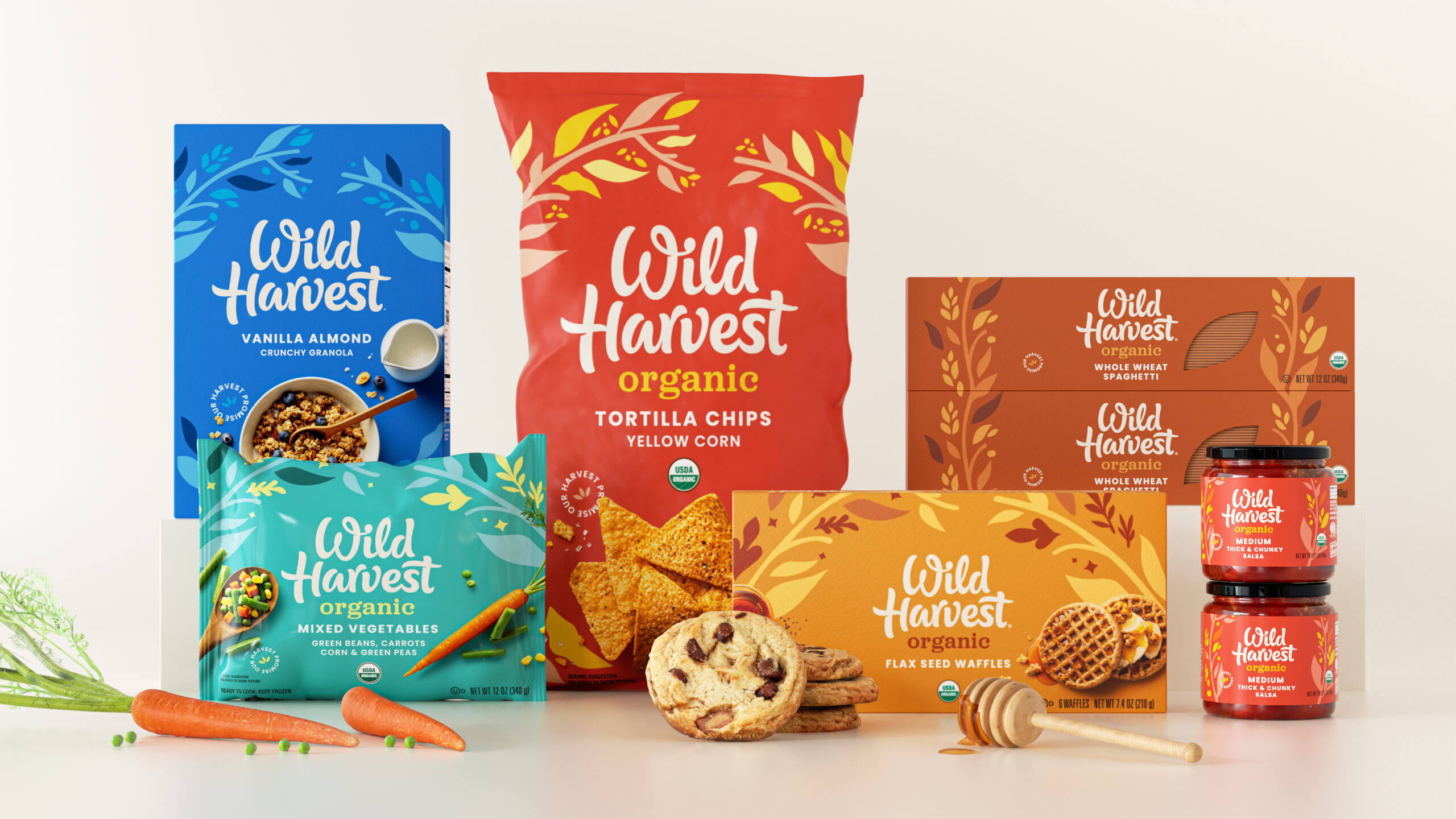
United Natural Foods' brand Wild Harvest encompasses a range of categories and products – from food and pets to household cleaning – appealed to conscientious consumers. But the brand had become visually stagnant and needed to better connect with modern audiences. Pearlfisher helped Wild Harvest create an exciting, modern and ownable brand expression that brings simplicity and joyfulness to the full brand system, with an emphasis on transparency of the brand’s commitment to organic farming in its ingredients.
Get in touch.
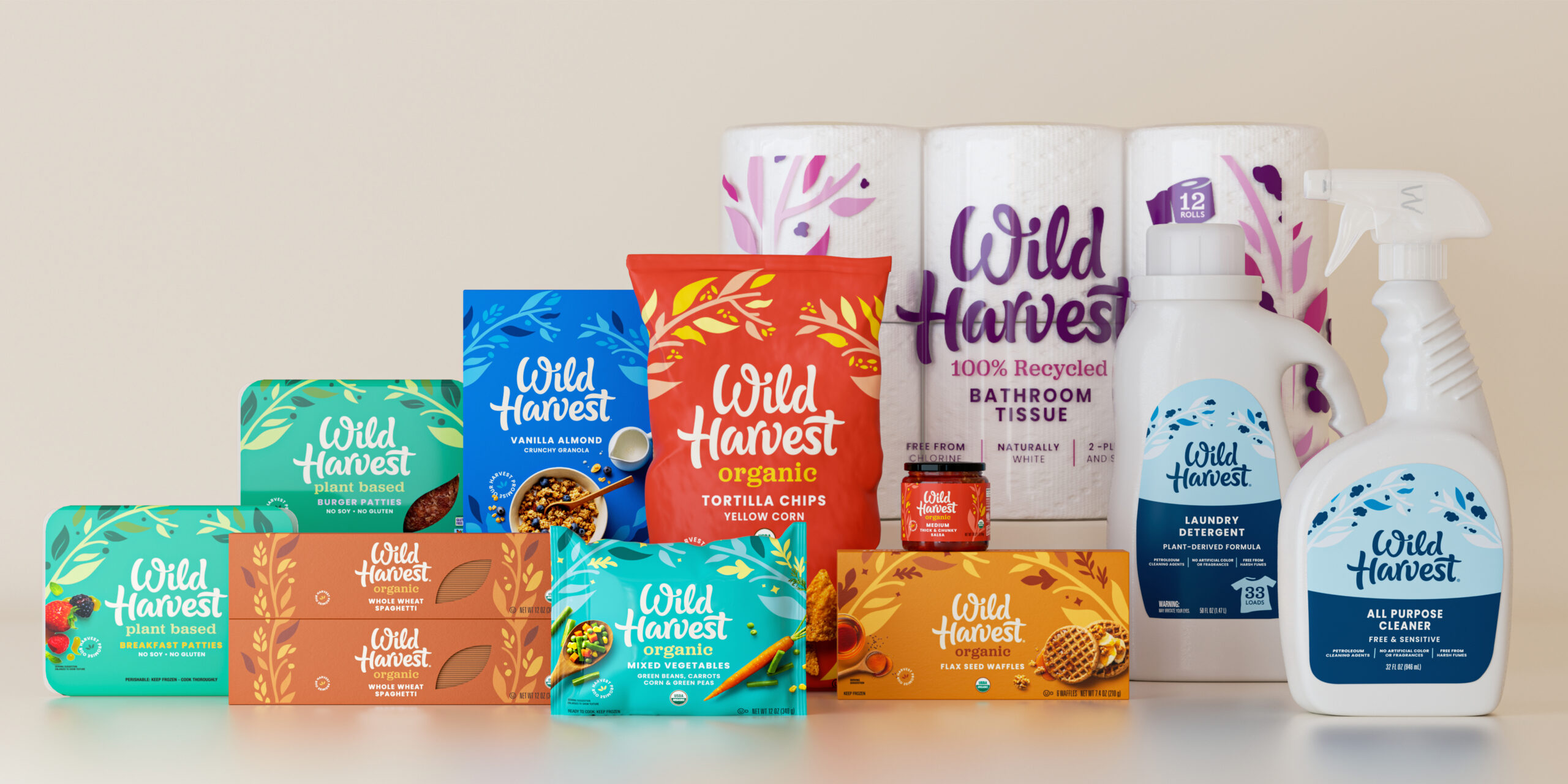
With its mission of harvesting the best and highest quality products to enrich our lifestyles, Wild Harvest needed to better showcase the ways in which its products support consumers’ health and wellness goals. By refreshing the brand and packaging design to highlight these attributes, our designers and strategists sought to give people a compelling reason to love and invite the brand into their homes.
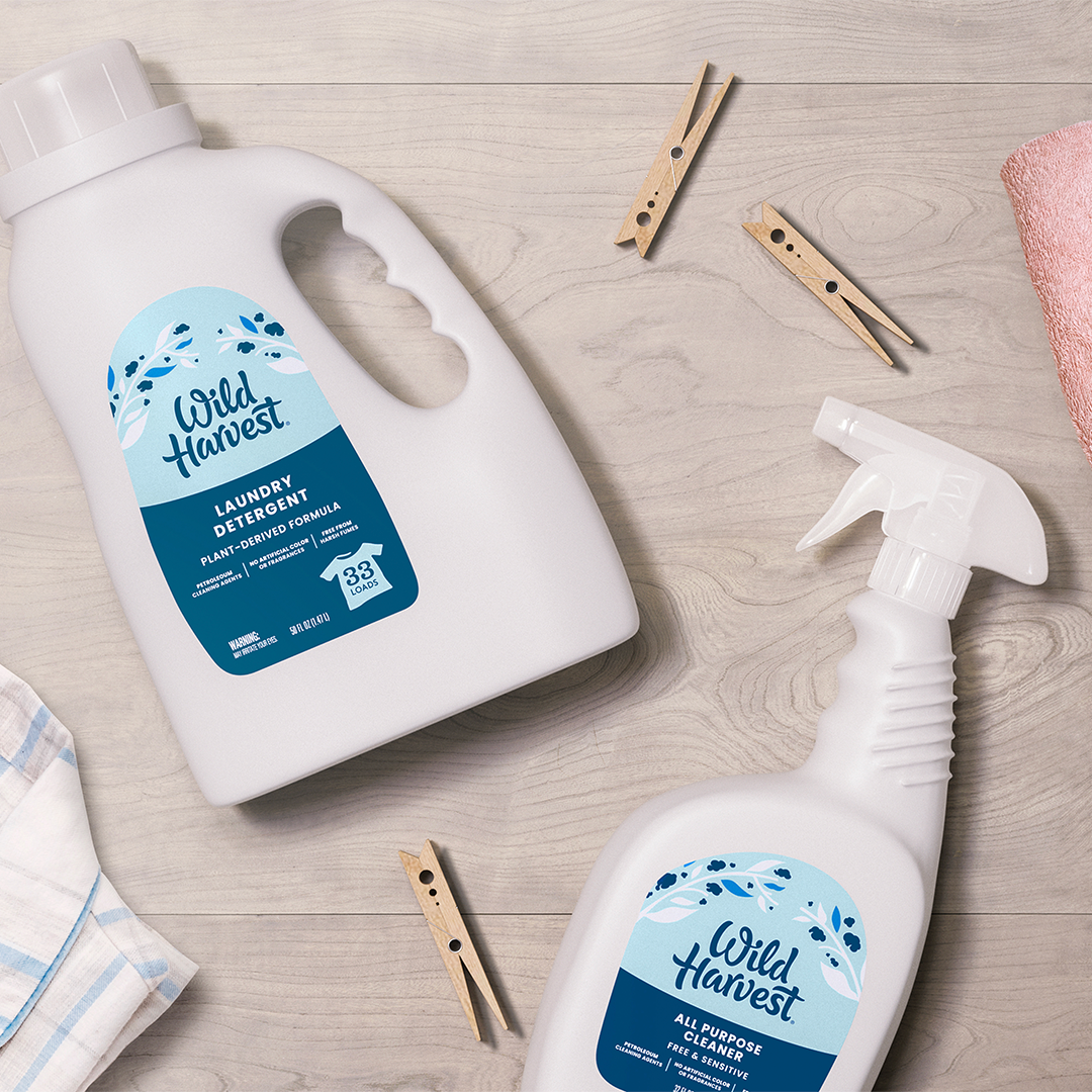
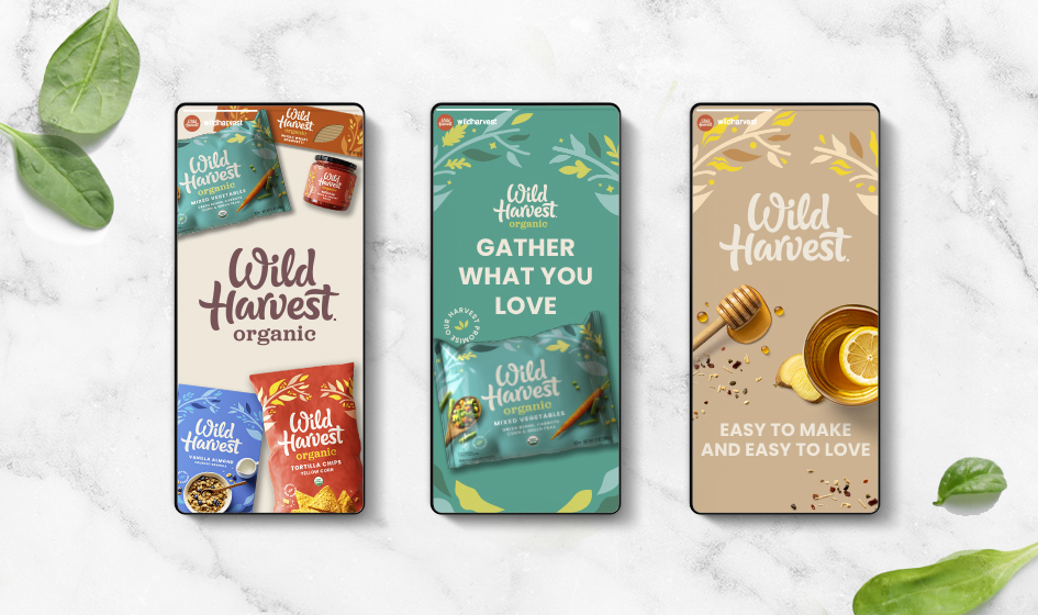
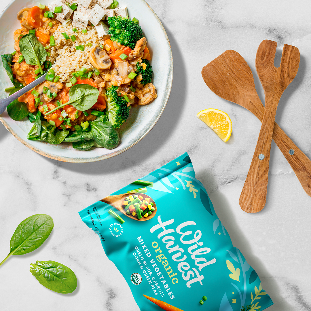
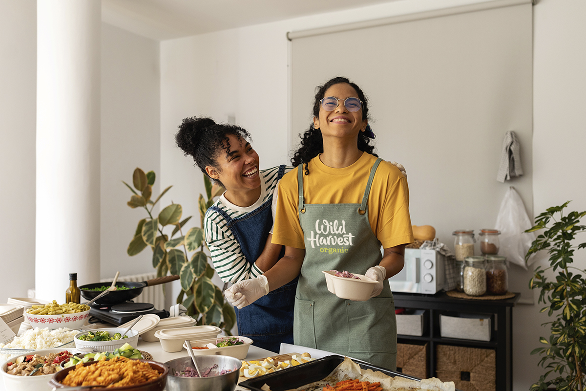
The organic design system speaks to the loving act and idea of “gathering together.” The letterforms of the logo enfold each other with a reverse heart playfully suggested between the “e” and “s” of harvest – putting the love at the center of the brand. Leafy, harvest inspired illustrations embrace the mark as a graphic representation of this core idea; consistently holding everything together across all the ranges with subtle changes and bright, natural colors segmenting the different ranges. Beautifully shot and in-the-moment lifestyle photography adds the human touch to show how Wild Harvest naturally fulfills all aspects of our daily lives and needs.