The Hidden 20%
How do we depart from the norm, to make people stand up, take notice and take action?
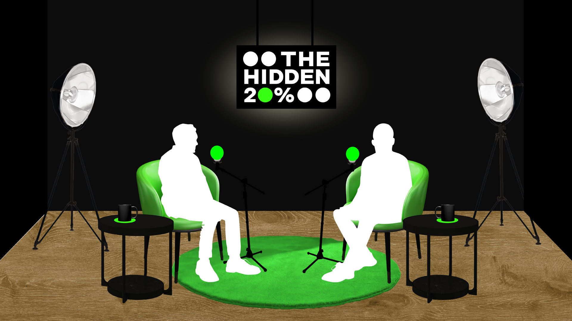
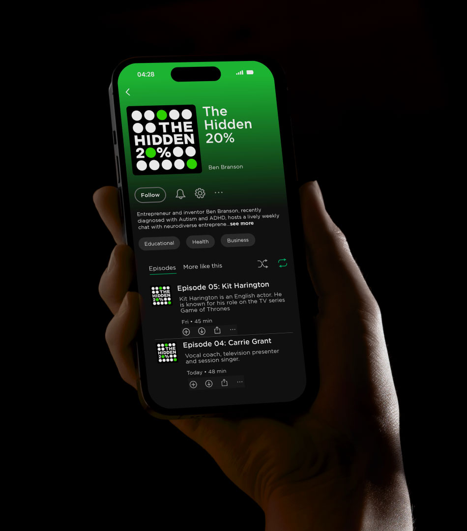
After entrepreneur Ben Branson was diagnosed with autism and ADHD, he became aware of the significant challenges that neurodivergent individuals face. Inspired by his journey, Ben launched the media-led charity PRISM ND to offer support and raise awareness. Having previously collaborated with Pearlfisher on the creation of the non-alcoholic drinks brands Seedlip and Seasn, we once again partnered with Ben for his latest venture, establishing a fresh and compelling visual identity for the charity's first social impact campaign, THE HIDDEN 20%.
Get in touch
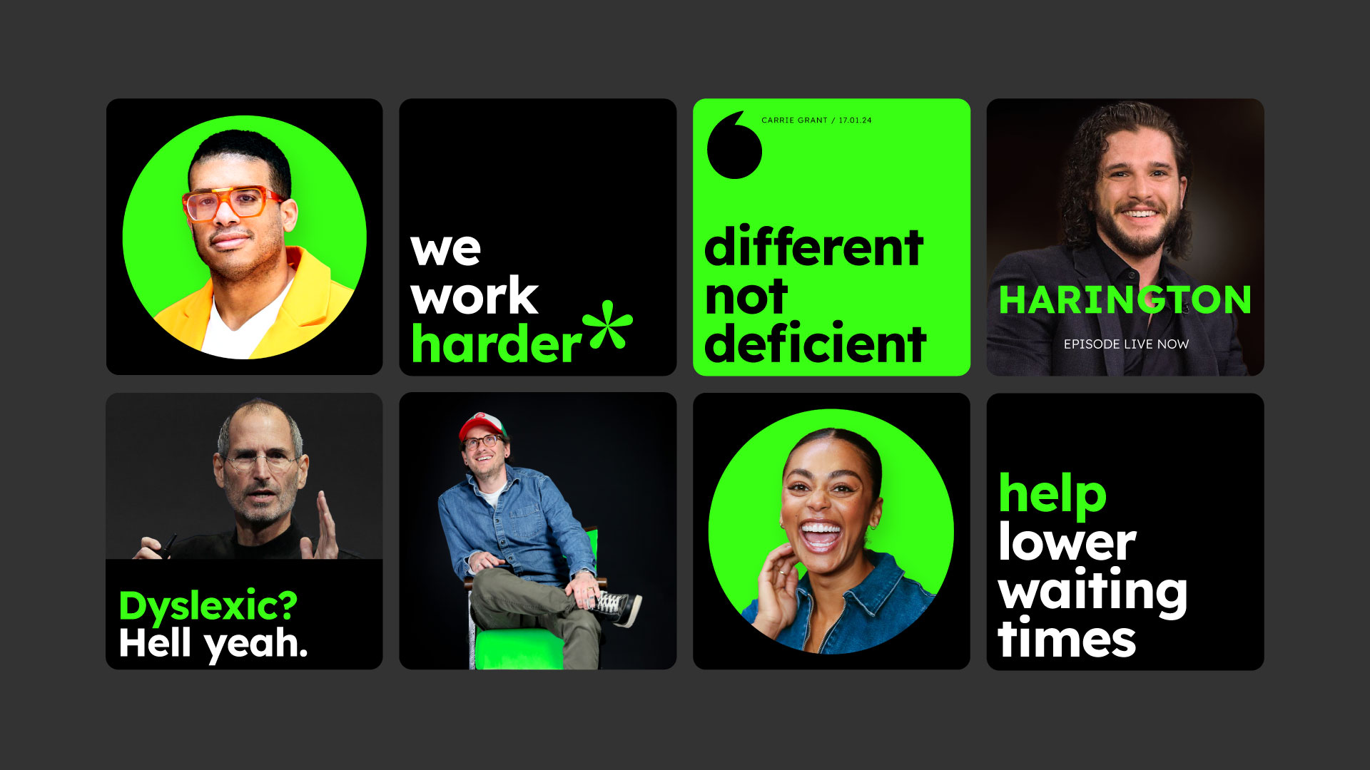
Departing from the naive, rainbow-heavy, and often patronising language and visual aesthetic prevalent in its sector, the striking identity for THE HIDDEN 20% mirrors the campaign’s mission as a frontier for effecting change, starting with conversations on a podcast inviting neurodivergent entrepreneurs, celebrities, influencers, and experts. The identity offers a branded framework to enhance neurodivergence individuals’ education and support infrastructure.
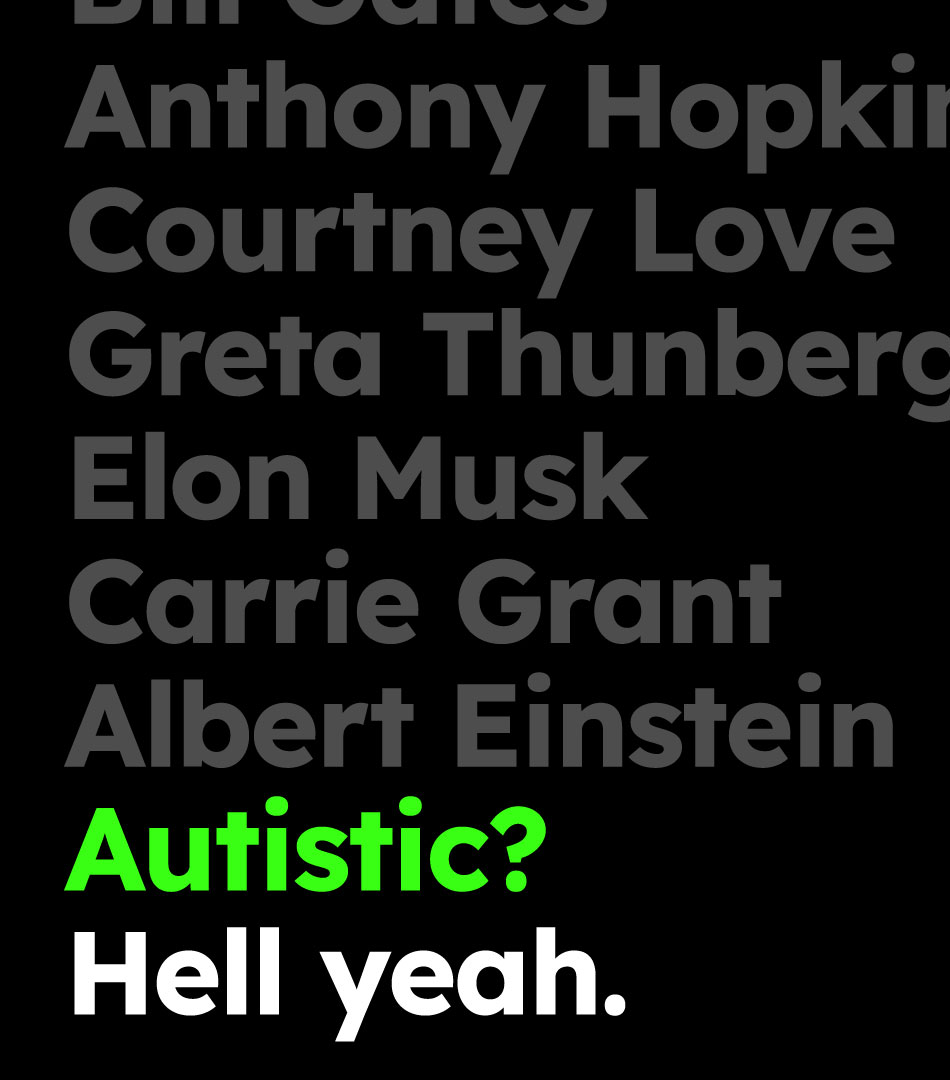
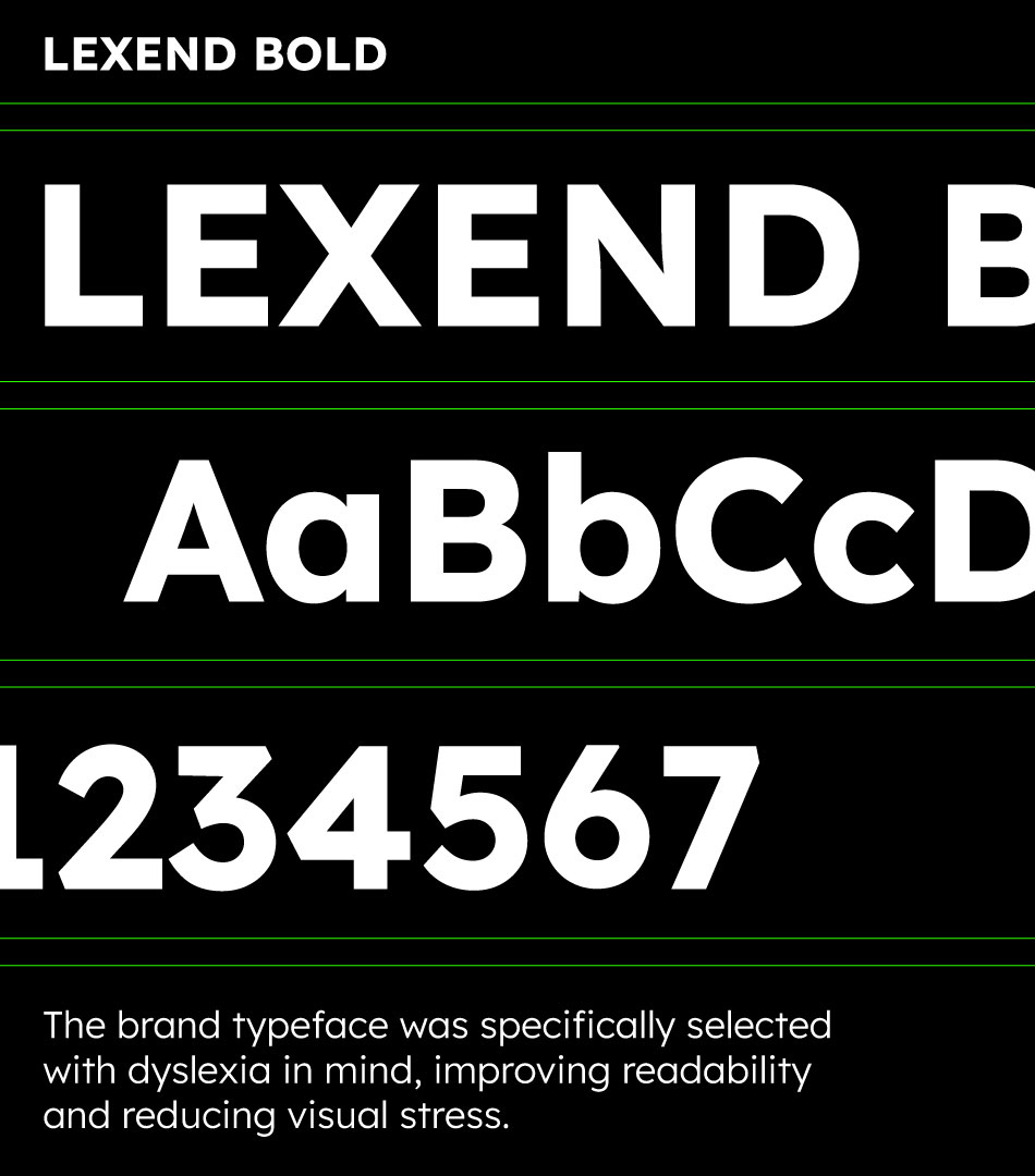
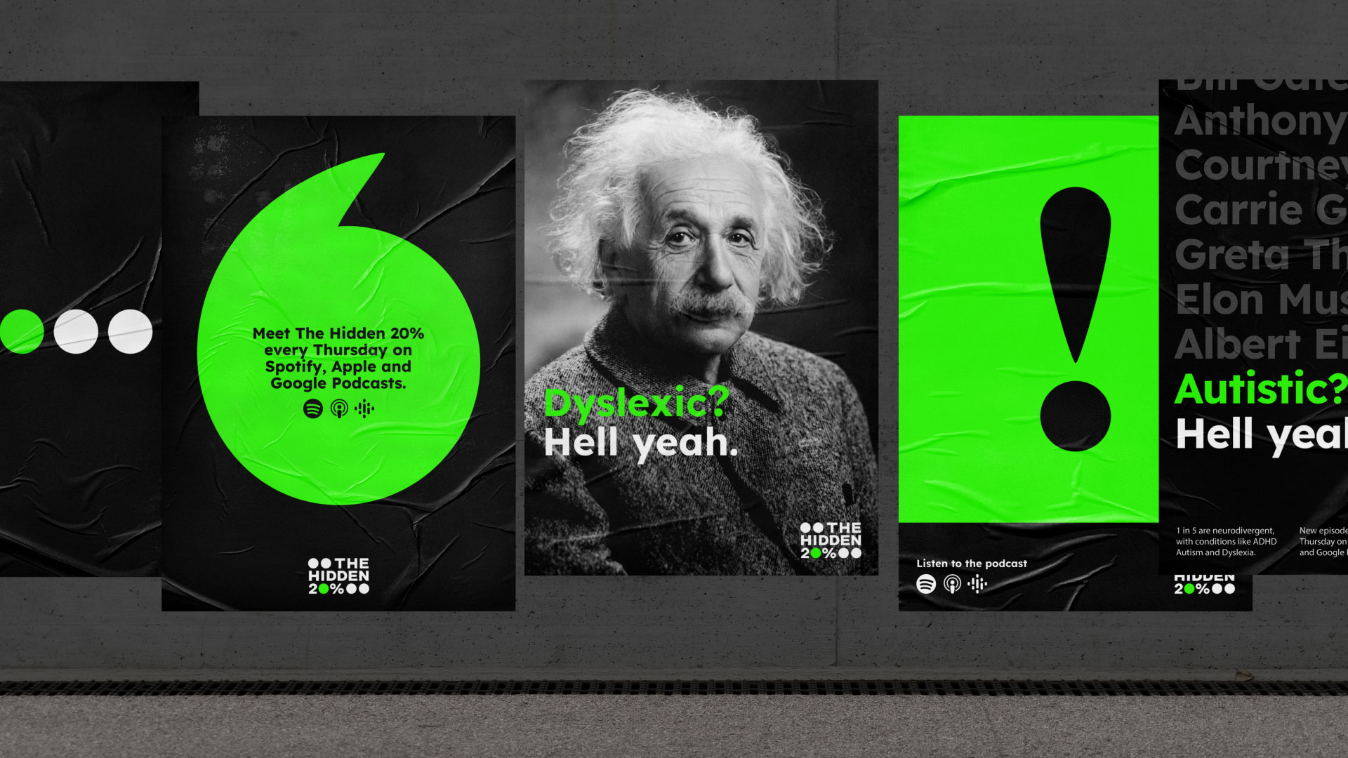
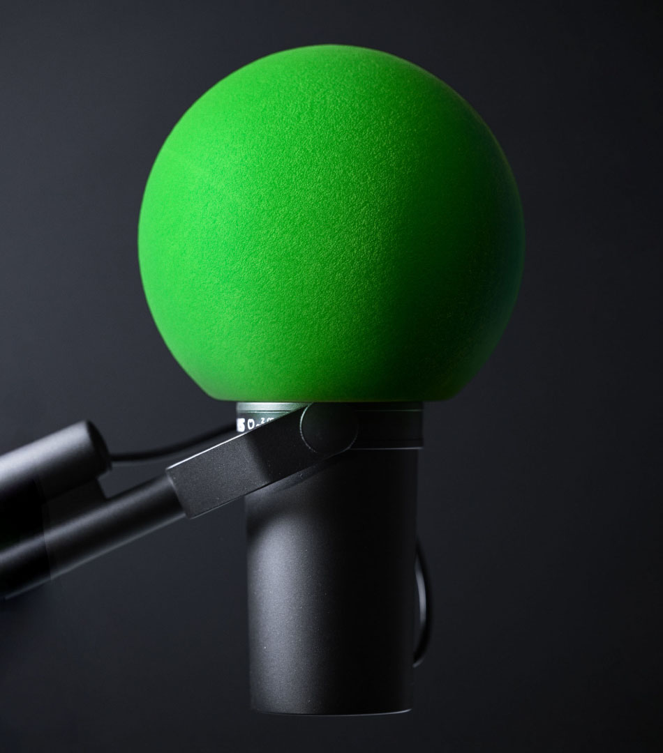
Large, stylised punctuation marks appear in the charity’s ad campaigns and marketing materials, emphasising The Hidden 20%’s platform for its community and extending into accentuating facts or prompting questions. The punchy colour palette, complemented by the dyslexia-friendly font Lexend, which comes alive in the defined tone of voice guidelines, evokes positivity and approachability.