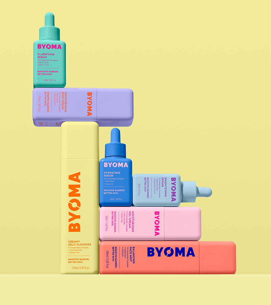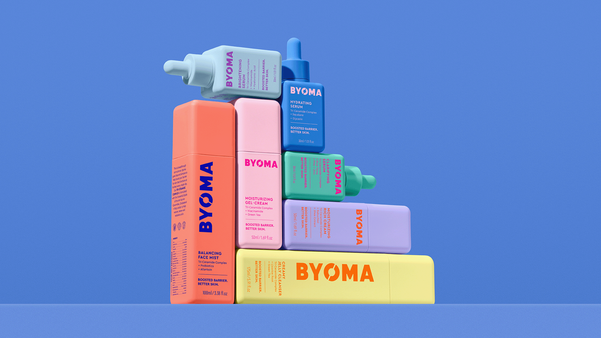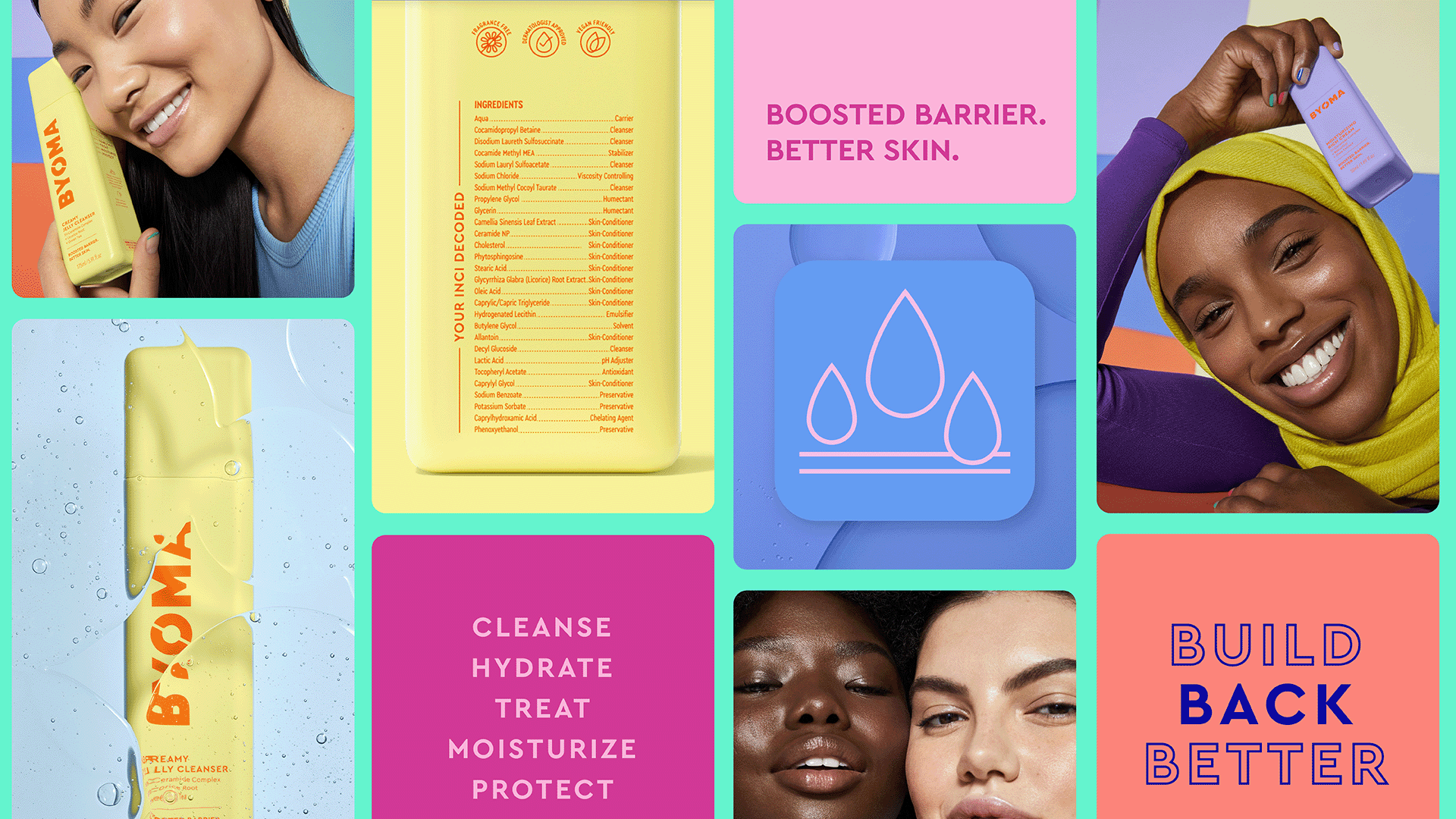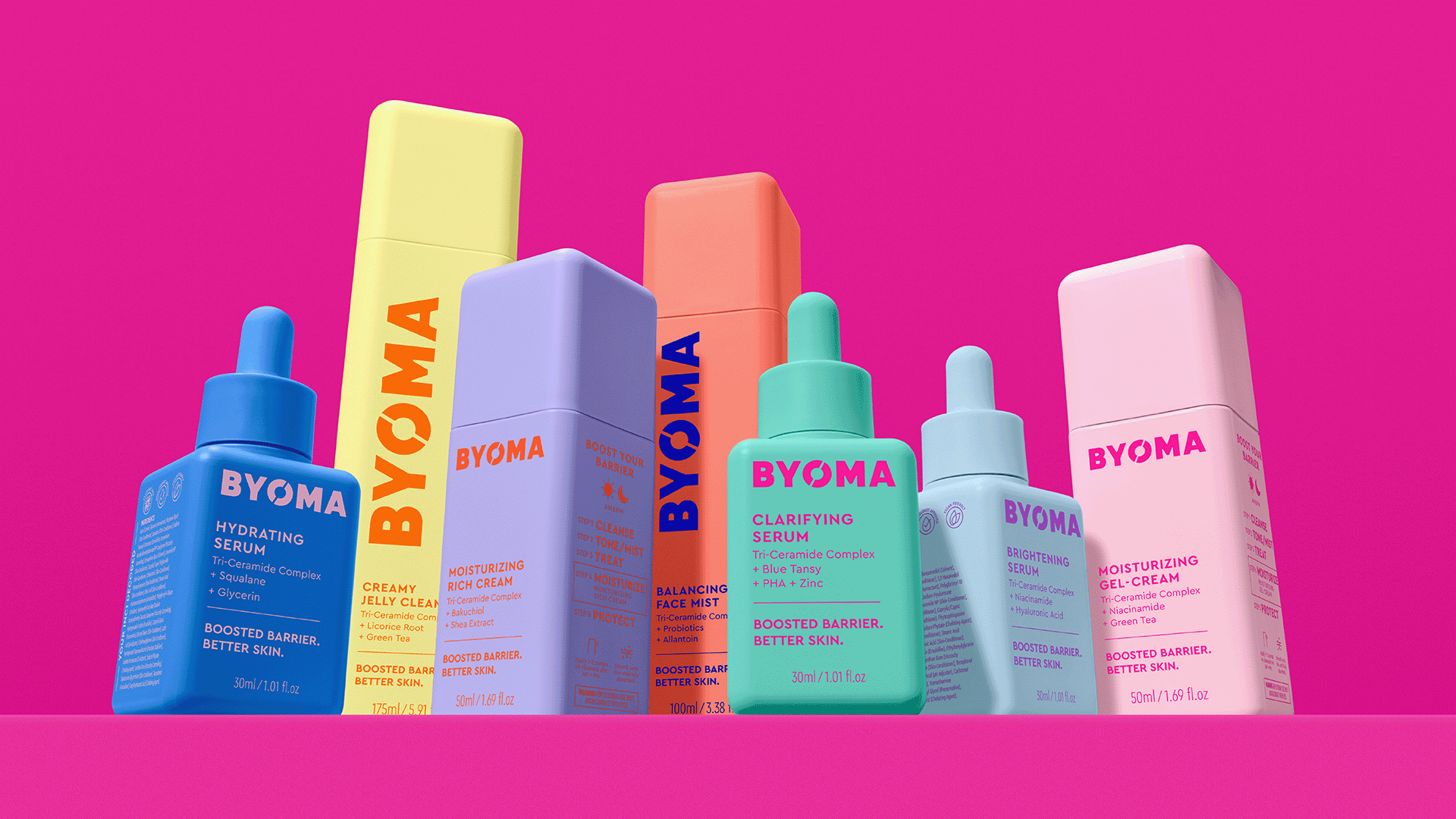
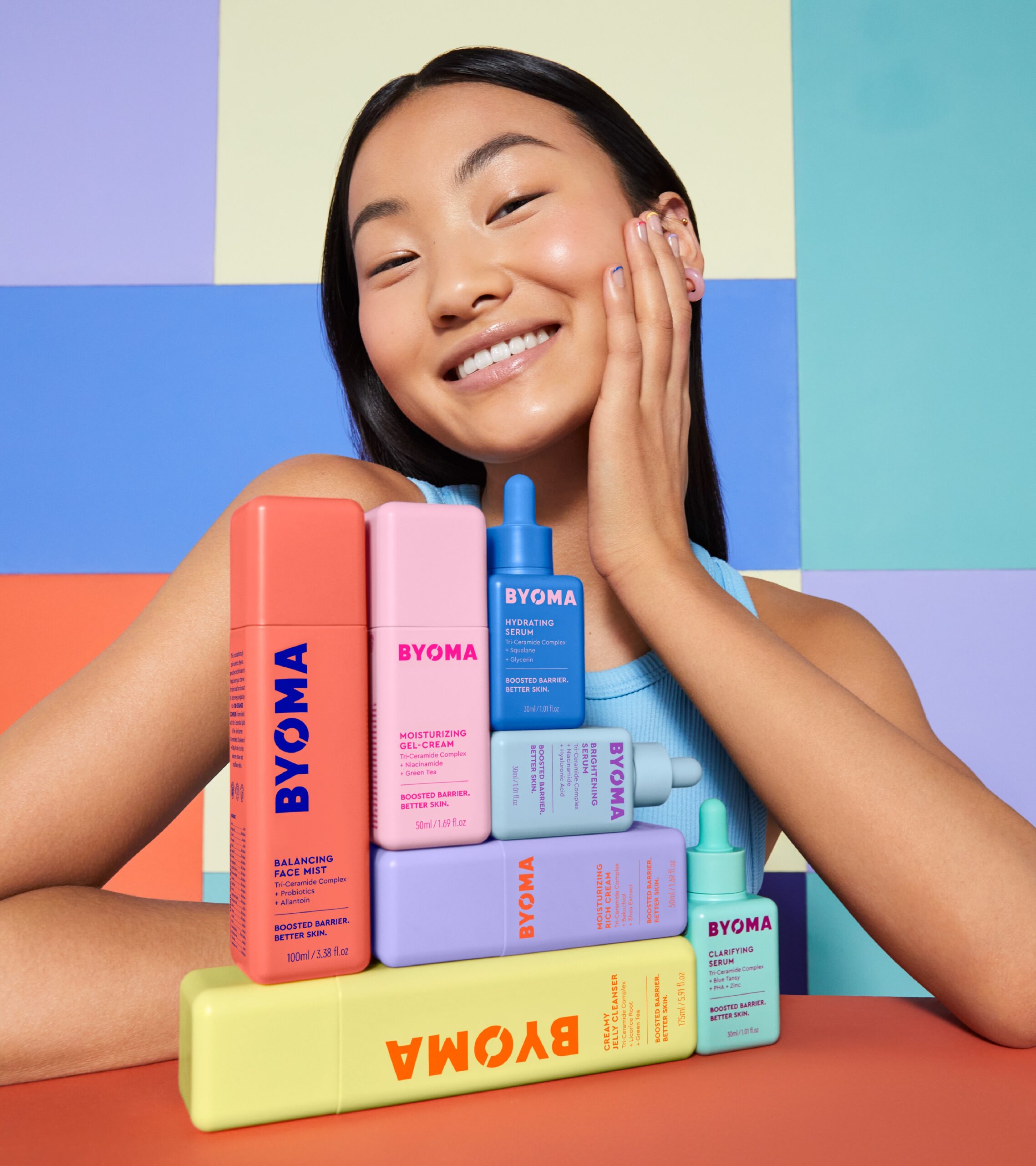
We worked collaboratively with Marc and his team to create a bold, vibrant and energetic identity and design that speaks to the idea of the next generation of skincare for both the industry and the young audience it wants to attract.
The split device of the ‘O’ in the logo is a nod to the brand’s mission of breaking beauty barriers with breakthrough formulas. The modern typography and iconography lend beautifully to displaying the brand’s pioneering science, ingredients and innovation all wrapped up in a shelf-popping joyful and sleek packaging design – one that ticks even more boxes with young consumers by removing excess packaging and providing refillable products at a good price point.
